This week, we have two new featured entries from our New Talent 2023 competition! These two works are feats of great design with strong brand identities, beautiful typography, thorough research, and unique ideas. Each piece has a multitude of elements to get lost in, whether you find yourself in a dreamlike trance or up in the stars.
Opening Up The Space Frontier To Everyone
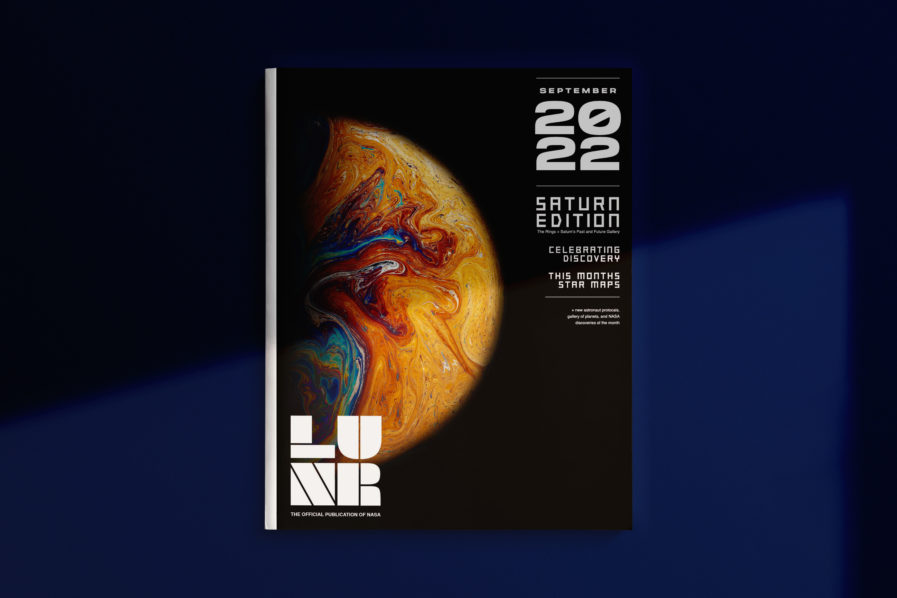
This first New Talent entry comes from Texas Christian University student Ellen Brown. Her entry originated from an assignment by professor and designer Bill Brammer (FUSION29), who instructed students to create a magazine that matched a target identity and audience. Brown created “LUNR Magazine” (above) to represent NASA, with all its magic, wonder, quantum physics, and scientific discoveries presented to readers through relevant stories, photography, and design choices.
The layout of LUNR Magazine successfully takes viewers out of this world and into the awe-inspiring edges of outer space. Brown’screative process started with researching magazines that had similar target markets and pulling inspiration for methodology and relevant placement of information. Then, she chose magazine topics and created a full grid to place images and text in the spreads since it was just as significant to control information and visual elements. Legibility and readability are a large part of successful publication design, therefore utilizing her grid gave Brown the ability to keep these two aspects while also creating visual surprises through vibrant photography, small detailed secondary elements, and organized typography. The fonts and text format choices remain consistent throughout the magazine, only changing colors when the background color shifts. The similarity between the typographic elements doesn’t mean the magazine is always predictable. Quite the contrary! Throughout the magazine, Brown uses vibrant photographs and small graphic details (i.e., page numbers) to keep the design fresh and engaging.
LUNR Magazine serves as a prime example of the power of design and layout. Brown’s layout skills are self-evident in the carefully crafted typography and the story-and-photo arrangements. The design is also clear and distinct from many other magazines, resulting in a publication that makes skimming through the pages as enjoyable as diving in headfirst.
Transformation of an Idea into a Product
In order to create a successful brand or product, the first thing one needs is to have a clear understanding of the target audience and what they’re looking for. At the same time, you also need to be aware of the design elements that’ll make your project stand out. The layout, typography, and images you choose should all reflect the product and brand you have envisioned.
Chloe Zhang had to keep this in mind when she took the ArtCenter College of Design’s first studio course that integrated a graduate thesis project. The course was led by Professor Gerardo Herrera, known for his unique design work and branding/UI design work at Design Studio Nova, who gave a branding assignment that blended both practical research skills and artistic design choices while emphasizing the importance and the connection between research, strategy, and analytics to create the most meaningful and intelligent design. Furthermore, there was an emphasis on both covert and explicit meanings, uses of form, typography, and imagery, while also maintaining a focus on one clear, singular message. For the students, it became a question of how to balance the need for reliable research with the desire to create a visually appealing and relatable product.
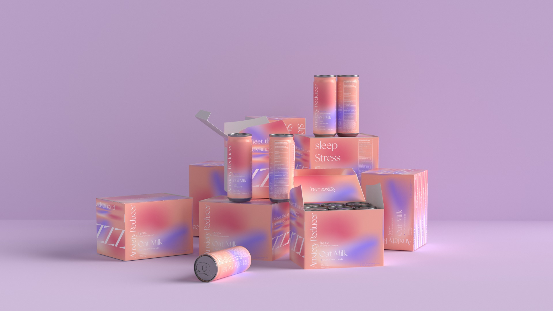
In response, Zhang masterfully branded a project entitled “hypna” (above). The concept for the company was to create a theoretical sleeping supplement designed to help individuals enjoy a deeper sleep, wake more energized, and restore their natural circadian rhythm. The branding for hypna’s products takes on a modern and minimalist approach, applying vibrant shades of purple and pink on the primary packaging. An expanded color palette was applied to other products in the line, including edible oatmeal cookies set in purple and yellow and anti-anxiety strips in blue and yellow. With hypna, Zhang proved she understood her assignment and utilized research and design to create a meaningful sleep product.
The design of a product’s branding and packaging can have a significant impact on its success. No matter if it’s a magazine or a sleeping aid, if it’s well-designed, it can stand out on store shelves and generate word-of-mouth buzz. This article provided a brief overview of some of the elements of successful product branding and packaging design. If you have a well-designed editorial or product you want the world to see, be sure to enter it in the New Talent awards by Jan 10.