Whether you prefer a hot cup of tea or a rich glass of wine, drinks always taste better when they come in beautiful packaging. Today’s featured entries prove that!
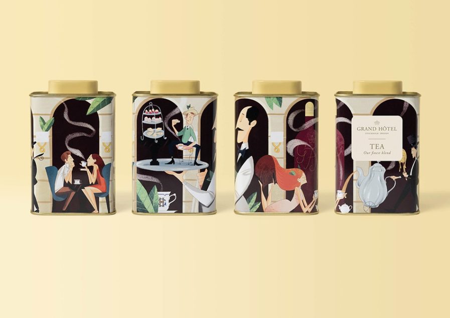
Priority, a design firm from Sweden, had a grand time designing “A Grand Tea” (above) for their client, Grand Hôtel Stockholm, who they’ve been working with since 2011 creating and designing material that communicates the transition from an old hotel from 1874 to a modern hotel with an exciting heritage relevant for the 21st century. As the only five-star hotel in Scandinavia, the Grand Hôtel Stockholm offers several restaurants and a bar – The Cadier Bar – where guests can enjoy the Grand Hôtel Afternoon Tea experience. While guests have been able to buy the hotel’s tea to take home with them, Grand Hôtel wanted to update the design with a more conspicuous design for the newly introduced illustration concept. The illustration concept was created to de-dramatize the luxury hotel and to make it more approachable for a wider audience.
With this in mind, Priority and Creative Director and Illustrator Jan Vana created a set of illustrations for the new tea packaging, each capturing the ambiance and the interior of the Cadier Bar. The illustrations are a mix of dreamlike moments and factual things showcasing what it feels like to experience afternoon tea at Grand Hôtel. They include two different perspectives of the Cadier Bar – the larger is the café-like part with the color scheme inspired by the sand stone-colored walls and arches with people on a date, eating sandwiches, pastries, and scones and drinking a neverending flow of tea. The smaller packaging illustration focuses on the lounge chairs at the windows where guests sit for a long time, reading, talking, and winding down into the late afternoon with a cup of tea. The tea information label is hot stamped in gold and mounted afterward on each packaging. This solution enables various teas to be used with the same design but allows different labels colors to differentiate between teas.
The result is a playful and creative packaging that creates a product fit for kings and at the same time carries the Grand Hôtel brand in a strong and fun visual way. The packaging and the illustrations have become favorites among staff and everybody at Grand Hôtel.
