Whether it’s the newest holiday chocolates to buy for your loved one or a health kit that’s really helping those in need, these package designs are supporting us in all the ways we need. With creative designs that are showing off their mastery, we can’t wait to share these looks with you!
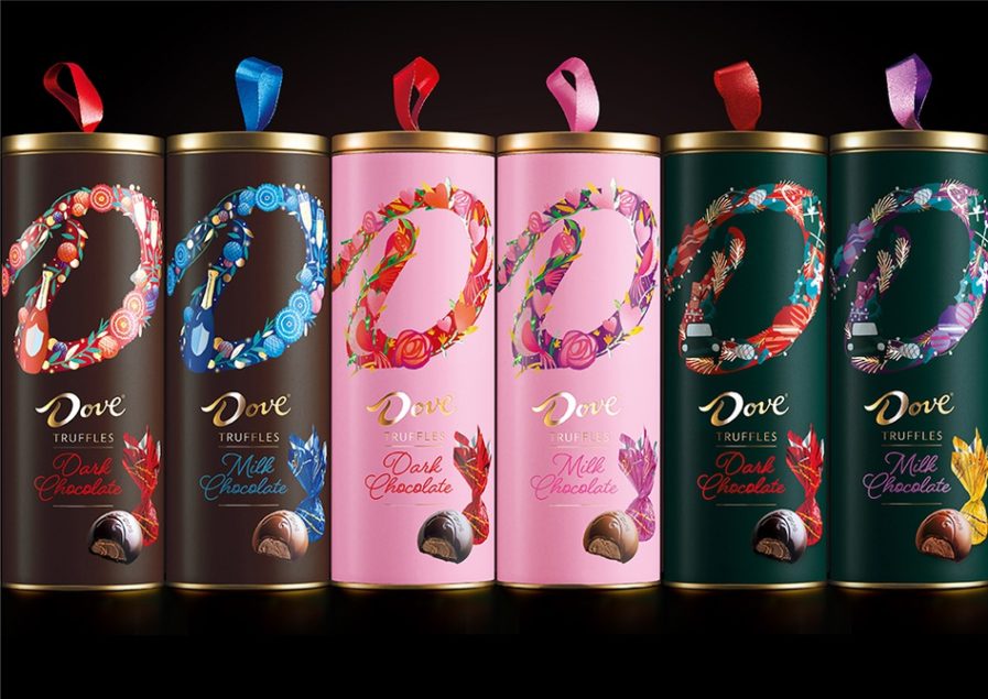
“Dove Truffles” (above) was designed by Craig Barnes for Mars’ seasonal line of gifting chocolates. Barnes wanted to create a recognizable, unique, and desirable design system for Dove’s wide range of gifting chocolates that would hold all the products together under a singular look and feel. The US market had specifically requested Barnes to create two seasonal designs and one permanent design to keep customers engaged all year round. Each product design included the infamous “D” for Dove, made slightly different based on unique stories created by in-house illustrators, and was brought to life on the packaging using foil, matte, and gloss finishes. This new packaging system for the seasonal and personal lines of Dove chocolate has taken the brand from ‘old, gold, and cold’ heritage cues to an aesthetic that is dynamic and continually offering innovative new expressions for any pleasure-seeker to explore and enjoy.
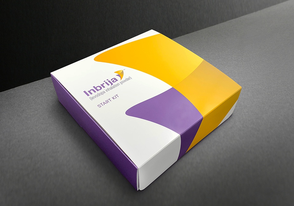
“INBRIJA” (above), is a design that has really set out to help people. Brett Kinkel and Charles Wolf have created a welcome kit for first time users and patients prescribed the drug Inbrija, made by Acorda Therapeutics. Aiming to create a positive experience and provide comprehensive support materials, this packaging design includes a pop-up tab that reveals the kits components, each individually wrapped for easy removal. Among the kit’s components are Doctor Visit Readiness Cards, Prescription Support Services Refrigerator Magnet, and an Inhaler Carrying Pouch. This kit was created as a sort of welcome mat to using the prescription, but the design team and Acorda ensured that it would be something patients could return to and use throughout their Inbrija experience.
The packaging itself was designed to inspire confidence in the product and the patient’s ability to use it from the moment they open it up. This was done immediately, as the first thing the user sees when they flip open the lid is an inspirational quote and the word “HELLO!” in large lettering. The product was also made to be clean, appealing, and easy to navigate, which the designers followed up on with an instructional video that walks the patient through the usage of the product. These instructions are also written up and enclosed in the packaging to give the user a variety of formats for consuming the information. Overall, Kinkel and Wolf’s work was quite the success, as indicated by a focus group with ten Parkinson’s patients who claimed that the kit was well thought out, easy to open, efficiently put together, and provided all the necessary support materials they would need.
If these incredible designs caught your eye, be sure to check some more out at graphis.com!