Power and Restraint in Art Catalog Design

The “Witch Hunt” catalog by Still Room (USA) for the Hammer Museum and the Institute of Contemporary Art, Los Angeles (ICA LA) has garnered significant recognition, including a Graphis Design 2023 Gold Award. This prestigious honor speaks to the catalog’s success in channeling the raw energy and feminist rage of sixteen critically acclaimed artists into a design that is both visually stunning and conceptually nuanced. Designer Jessica Fleischmann’s approach to the project demonstrates the power of simplicity and restraint, allowing the artworks and curatorial essays to take center stage while providing a bold and colorful framework that invites readers to engage with these timely themes. The result is a publication that serves as a lasting record of an impactful exhibition and a statement in its own right.

By: Jessica Fleischmann

“Curator Connie Butler begins her essay for Witch Hunt with a declaration of rage: ‘All my life, I’ve had rage. Living as a woman in the United States under patriarchy breeds it.’ These words embody the impulse of the 2021-22 exhibition Witch Hunt, which was simultaneously at the Hammer Museum and ICA LA, where ‘sixteen critically acclaimed artists employ[ed] feminist, queer, and decolonial strategies to explore gender, power, and the global impacts of patriarchy.’

“In designing the catalog for Witch Hunt, I wanted to frame the strong, complex works of sixteen feminist artists with strong yet simple space. While we are not strictly minimalists, Still Room’s design ethos is intuitive and targeted—minimal intervention for maximum impact. The main questions for designing the catalog for this exhibition were: 

  • On a conceptual level—How can a book’s design channel feminist rage and artists’ expressions of it? How can rage be honored in an appealing way to draw readers in and support processing the thinking behind that rage?
  • On a practical level—How can simplicity honor multiple voices? How does a designer provide a structure that supports the work of sixteen wildly different artists, especially when some pieces are being made specifically for the exhibition and, at the time of printing, had yet to be seen?

Witch Hunt is the second exhibition catalog that Still Room has designed for the Hammer Museum, the third time we’d worked with chief curator Connie Butler, and the first time we’d worked with Anne Ellegood and the ICA LA, though we’ve been in each other’s orbits for years. The familiarity with each other’s work and process and the trust that developed over years of working together enabled a communication shorthand that helped me develop a design concept rather rapidly while also allowing room for creative exploration. Knowing what Connie values in catalog design and with Anne’s open-minded support enabled me to pitch some bold and unusual ideas and receive input that allowed me to fine-tune a boundary between expressiveness and restraint.

“We met in person just twice before the Covid lockdowns, and these meetings were instrumental in developing the design concept and overall visual language. The initial concept meeting with the curators, before the list of artworks or even the artist list was finalized, drove some of the design directions. So design ideas came from the exhibition’s thesis more than the exact artists or works included. The resulting catalog for Witch Hunt demonstrates how we listen closely to our clients, delve into their content and goals, and then develop a design system that’s unexpected yet distills the essence of their vision.

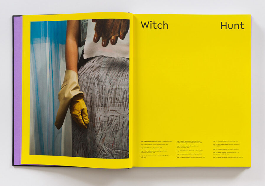
“Even before opening the book, multicolor stripes along the page edges and inset text pages indicate a collective and unified vision. Referencing a female body, the book has an obvious center, with narrower, uncoated white essay and information pages nestled between colorful, coated paper that holds artists’ work. The color-blocked sections are clearly visible on the page edges, allowing the reader to easily navigate the book. Following a cover featuring a witchy puff of smoke from a performance work framed by ‘feminist’ violet endpapers, the book begins and ends with an iconic image from each artist, framed by a bright, urgent yellow full-bleed background. The system of containers then moves on to alphabetically-organized 10-page sections for each artist, each with its own bold, full bleed, saturated color background to frame the works, printed on coated paper for maximum detail. 

“Each artist section starts with a brief introduction on the left-hand page, followed by images. This structure pushes the book’s front matter and back matter (curatorial and institutional texts) to the book’s core in a section that is ½ inch narrower than the rest of the book, on uncoated paper, nestled in between the artists’ projects. The typeface is Lelo, one of the few contemporary sans serif fonts by a female type designer, Katharina Köhler, at Camelot Typefaces. The symmetrical nature of the book is reiterated in the typographic decisions—in the ‘front matter,’ a vertically divided title frames centrally placed curator and institution names; on the table of contents, larger artist listings sandwich essay titles set in smaller type. Symmetry and bifurcation are rearticulated through the typesetting of essays in two columns and titles justified across the full-text block width, often creating other center gaps.

“The design allows the reader to actively participate in this splitting, opening the book at its center to read the essays and delving into the ‘object’ of two colorful halves to access the content held within. The divided structure provides space for artists’ works and curators’ words. At the same time, this structure acknowledges women’s constraints under patriarchy, with succinct reference to the female body.

“The balance between the works of diverse, even brash, artists and a strong exhibition theme drove many design decisions towards strong, simple moves that simultaneously amplify and get out of the way. We typeset a single weight of a clean-yet-expressive sans serif font in a relatively straightforward manner, with subtle choices in page layouts that create a distinctive reading and viewing experience. Grounding each artist in their own vibrant, unorthodoxly bright color world clearly distinguishes each artist’s body of work from the next. This group of artists’ work is exceptionally bold and robust and could stand up to this treatment. (In art catalog design, the norm is neutral backgrounds for artwork. It is unusual to place artists’ works on vibrant grounds). Each artist’s page background color scheme includes three closely related shades of the same color to prioritize the artwork when printing and allow for potential color shifts between pages while on press.

“A ‘witch hunt’ is a search, not just for the witch, but for the subversive. The artists in this exhibition channeled their rage into expressing radical visions of living in the context of feminism and patriarchy. An exhibition may be fleeting but lives on through the page’s architecture. It anticipates a time when the exhibition is not new or recent but part of history. ‘Herstory’ in the making. As designers, our task is to bring the energy of this work into a publication that carries this work into unforeseeable futures, taking the rage and joy of this work to the page. In doing so, returning to Connie Butler’s words, ‘Indeed, we hope it may incite and nurture outrage as a productive tool towards change.’

“There is strength and power in simplicity, in stepping back as a designer and giving the works presented in the book a beautiful, bold, colorful space to inhabit that allows the artists’ and curators’ strong voices to the project in all of their glorious, complicated layers. Clean typography respects both the writer and reader, while color field sections give each artist their space within a larger group. Concise, perhaps even curt, the design transforms the heat of rage into a hot, bright, clear space to explore these vital works.”


Check out Still Room’s website here.

Social Media: Instagram


Click here to check out more of our Design 2023 winners. If you want to enter our current Design 2024 competition, click here.

Author: Graphis