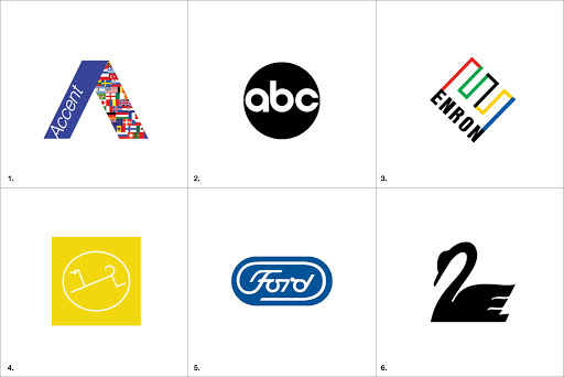
This week’s Graphis Master is Paul Rand, an American graphic designer who created a multitude of logos for corporate businesses. He had a lengthy and successful career making a name for himself as one of the most creative thinkers in the design industry. Many of his logos are inspired by the Swiss style of graphic design.
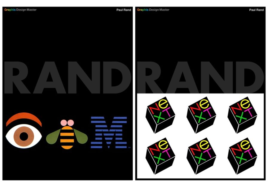
Rand’s design for IBM (above left) utilizes familiar icons to create a fun brand image that drives readers to actually try, read, and comprehend the meaning of the logo. His work for NeXT computers (above right) brings the letters to the forefront and highlights them against the black cube. The name of the company stands out to the viewer and the colors harmonize with each other. These simple approaches are effective in creating long-lasting brand logos.


