With our Poster 2022 book now available to everyone, we thought it would be a good time to look back at some of the coolest winners this year, each of which focuses around a certain aspect and type of art.
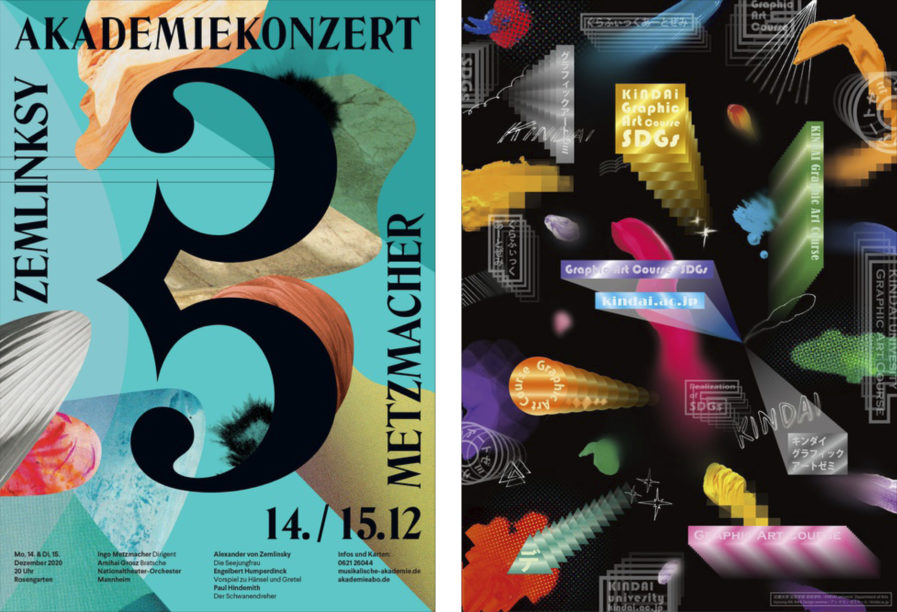
Our first winner is “Academy concerts season 2021/22” (above, left) by Ariane Spanier of Germany. Created as campaign posters for the 2021/2022 concert season for the classical concert series “Academy Concerts” of the Orchestra of the National Theatre Mannheim, the design is characterized by collage-like visual compositions that continue the idea of visualization to classical music. While color, shape, and movement played a major role in the design in the previous season, the focus is now on a variety of structures, cutouts, and arrangements of different colored elements. Although abstract in appearance, the textures in the forms create and support associations with movement and sound. There is an impression of coming together or drifting apart, just like the musicians, the instruments and tones in the orchestra in ever new constellations and intensities create the experience of classical music.
Spanier was happy to say that the client was very pleased with the design. However, due to the pandemic, most of the concerts were canceled and the posters were not placed in public space. Thankfully, some of the designs found their way to smaller announcements in print or online and on CD or DVD recording covers, as the orchestra did their best to work around the obstacles of this tough time for classical music performers.
“KINDAI Graphic Art Course” (above, right) was submitted by Kiyoung An and Mei Kitamura as an advertisement for An’s graphic art course at Kindai University. Founded in 1925, the school is a private nonsectarian and coeducational university based in Higashiosaks, Osaka, Japan, with campuses in five other locations. Originally, Kindai University had two programs, the School of Engineering and the School of Commerce. Its School of Literature, Arts, and Cultural Studies is still fairly young, being opened in 1989, but it is thriving with excellent design as seen with this poster.
Against a black background, brightly colored squares and rectangles bounce around, leaving little paths in their wake. Mixed in are white square outlines, non-square shapes, and organic elements such as doodles and splotchs of paint. Within the squares and rectangles is “Kindai Graphic Art Course” and the school’s webiste, inviting viewers to hop online and check out the course. The final product is a cross between a handful of confetti and a vintage screensaver that is not your average class advertisement, but draws your attention and makes you wonder what the class is like.
