These new packaging designs are taking creativity and artistry to a whole new level! Breathing new life into the products they’re made for, we’re really loving these designs here at Graphis, and we hope you do too.
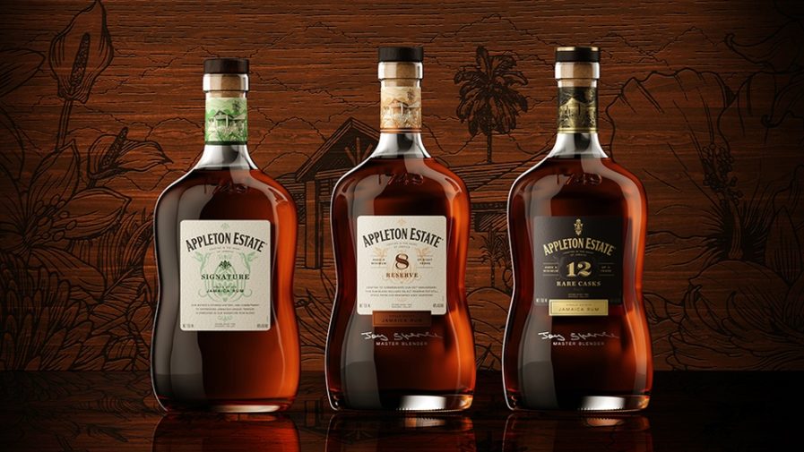
“Appleton Estate–Crafted With Joy” (above) was designed by Rick Slusher of Superunion for Appleton Estate’s rebranding. A company that started making rum in Jamaica’s Nassau Valley 250 years ago, Appleton Estate has long perfected the beautiful gold and jewel-like liquid with notes of orange peels. However, Appleton Estate recently faced a problem many other companies would know well: their product had grown stale, and consumers weren’t buying them like they used to. Rick Slusher and Superunion stepped in to fix the issue just in time for the company’s 250th anniversary.
Starting by visiting Nassau Valley, the design team discovered the spirit, joy, and pursuit of excellence with which the rum is made, and decided to celebrate that with their new design. Slusher chose to deliver a completely new look with a sleek, elegant glass bottle, featuring Nassau Valley’s verdant hills. The design also includes the year “1749” as a reminder of how long Appleton Estate has been bringing quality rum to us. The label design was created to feature the rum’s distinct distillation process: the utilization of Jamaican limestone-filtered water. It also includes a simplified brand mark as a way to improve legibility, which was the designer’s tactic to improve sales. As for the label, it was made with a toothy, uncoated paper to give it a handcrafted feel. Slusher also opted to create a new insignia for the design, a combination of five iconic Jamaican emblems that narrate the influence of the country on Applegate Estate. Finally, the bottle received an all new wooden cork with a gold and copper color scheme.
The rebranding was quite a success, as sales increased by over 34% even amidst the global pandemic. The new look was so popular that it was named the “drink of lockdown” by the UK’s Wine and Spirit Trade Association!


