Posters are always a fun and interesting art form thanks to the variety of subjects they can depict in a slew of different ways. If anyone knows that for sure, it’s our Platinum and Gold-winning designers from our latest Poster Annual!
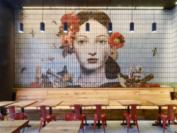
Platinum winner Yin Zhongjun offers a contemporary take on “The Monkey King” (above, left) a world-famous mythical figure in the famous Chinese literary book Journey to the West. This version is an aesthetically chaotic abstraction, holding tight to the essence of the Monkey King and his epic journey. Zhongjun explains that the poster is an “experimental deconstruction of Peking Opera elements and modern art,” allowing him to have vast freedom in his presentation. The poster does a great job of displaying the conventions of movement present in Peking Opera, as well as the bright colors and fanciful displays. Zhongjun’s poster was not only successful in our annual, but also received good reviews amongst the general public. Combining multiple artistic and creative elements to create an expressive and nostalgic piece, the poster is well-deserving of the Platinum award.
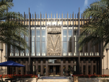
Antonio Castro combines classical music and rock to create a sharp and resounding poster (above, right). “B250-Let There Be Rock” was created for Negra 40, a community of independent artists in Mar de Plata, Argentina, and was developed to commemorate the 250 year anniversary of Ludwig Van Beethoven’s birth. Castro explains his approach for the design, saying that, “Beethoven’s music has transcended time, cultures, and disciplines. His music has achieved a global reach that affects not only musicians of all ages but artists in general . . . if asked to describe Beethoven’s music, I would say that it is thunderous. With that in mind, and in trying to compare a contemporary genre of music with that of Beethoven, I thought of how rock and roll has also transcend time and cultures, and one of the bands that I believe has achieved that, is the Australian Rock band AC/DC. . . . The poster was inspired by AC/DC’s Let There be Rock album cover released in 1977, and the icon/logo design by Gerard Huerta.”
Castro’s poster lives up to his attempt to convey thunderous and timeless music, as Beethoven’s shadow is made more powerful by the juxtaposition of Huerta’s design. The poster is a visual representation of Beethoven’s greatness and the sonic intensity of his music with a fun, modern twist.
