Have you read every book you own and need something new? You’ll want to make space on your bookshelf for these two fantastic books, curtesy of our New Talent 2022 Awards competition!
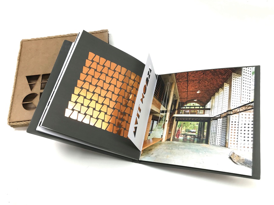
Taneesha Iyangar, a student studying at Savannah College of Art & Design, grew up in Mumbai, India, with a sibling who was an architect. These childhood influences gave her a founded understanding of design and helped her discover her passion for vernacular architecture and human-centered, sustainable design. So, when given a brief from professor Peter Wong to design a book that elevated the experience of visual communication with strong imagery and valuable existing content, Iyangar used her love of buildings to design and print the book “Vernacular Responsible Architecture” (above).
As the title suggests, the book speaks about the importance of embracing vernacular architectural practices, many of which have been lost. Some of the subjects included are architects like Anupama Kundoo and Elora Hardy and buildings such as ‘Wall House’ in Auroville, India, and ‘Sharma Springs’ in Bali, Indonesia — both structures in which innovative architecture combines with vernacular methods to exemplify elegant and sustainable design. As for the book’s appearance, Iyangar went with a hand-made yet sophisticated aesthetic. She used plenty of die cuts, three different typefaces for display, titles, and body text, and chose a color scheme of browns and golds. Overall, the final book is a beautiful piece of work that, Iyangar hopes, will bring awareness to the need for human-centric and environmentally friendly design and architecture.


