Dysfunctional Couples + 3D Vampires: Poster 2023 Winners & 2024 New Entries

Plays, TV shows, and concerts all provide great entertainment value, but you know what’s also fun to see? The different kinds of promotional posters and what all sorts of designers do to create them!

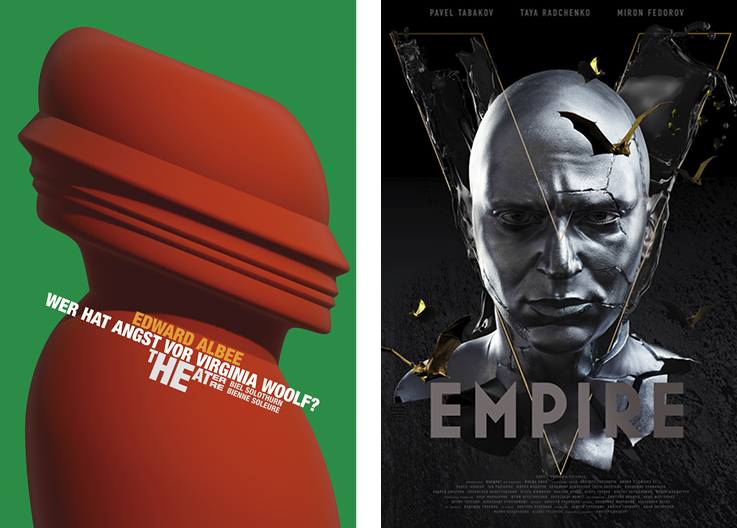
Wer hat Angst vor Virginia Woolf? (Who’s Afraid of Virginia Woolf?)” (above, left) is a play created by American playwright Edward Albee. When the Theater Orchester Biel Solothurn put on a production of the show, they asked designer and illustrator Stephan Bundi to create the promotional posters. The story of the play, which examines the dysfunctional marriage of a middle-aged couple, Martha and George, compared to the relationship of a naive college couple, Nick and Honey, drove Bundi’s 2023 Platinum-winning design. To represent the entangled relationship between the couples, he depicted two human profiles seemingly melded together as the focus of the poster. Despite facing away from each other, the two figures remain stuck to one another, hinting at the clear connections between the two couples despite their outward contradictions in the play. While Nick and Honey seem like a happy young couple in contrast to George and Martha’s fading, resentful relationship, Albee makes the point through the characters that all couples, no matter how ideal they appear, can have issues, misconceptions, and lack of communication in the relationship. 

Another Platinum-winning promotional poster from our 2023 competition was designed by the team at LOGAN for Sony Columbia Picture’s “Empire V (“Ампир V”) 2022” (above, right). The movie is based on the Russian cult novel by Victor Pelevin, which is a biting satire of hegemonic society that follows the main character’s journey into darkness when he gets initiated into a world ruled by corrupt vampires. Wanting to explore all the main characters, the design team created a series of animated posters that transformed each character into stunning digitally sculpted 3D avatars, enabling the designers to realistically emulate human features such as hair and skin. These portraits were brought to life with the help of animation software to make digital billboards, moving posters, and a social media campaign in addition to traditionally printed posters. 
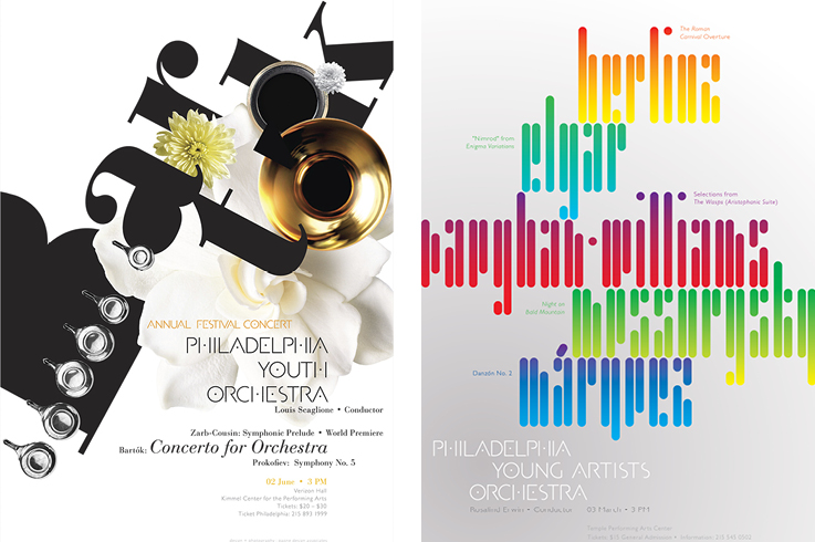
Founded in 1939, the Philadelphia Youth Orchestra (PYO) is a premiere musical institution and is one of the oldest and most celebrated youth orchestra organizations in the United States. Created for young classical musicians, the PYO has been offering professional music lessons and performance opportunities to aspiring instrumentalists. The following poster duo was designed by Gregory Paone and Joshua Bankes of Paone Design Associates to promote the PYO’s musical performances at the Kimmel Center for the Performing Arts, a world-class performing arts center and home to the Philadelphia Orchestra. The posters, submitted to our 2024 competition, artfully interpret the spirit of the featured musical selection of each performance.

The first poster was created for the theater’s Annual Festival Concert, which annually presents new and talented “solo voices” and was named after Hungarian composer Béla Bartók’s orchestral work “Concerto for Orchestra” (above, left). Using bold, yet elegant typography design and creative layouts, Paone and Bankes cleverly incorporated images of flowers as well as different parts of musical instruments into the composition, including the keys of a clarinet and the bell of a trumpet. In addition to the layout, PDA created the orchestra’s proprietary typeface which is utilized as a display font in the posters and program books.

Paone’s and Bankes’ other poster is their “Philadelphia Young Artists Orchestra Winter Concert Poster” (above, right), which promoted a show that included five disparate works by five internationally diverse composers. To harmonize the visual presentation, the designers created a modern typeface with emboldened color as the grounding for the poster’s artwork to conjure the collective spirit of the repertoire. Each composer’s name is featured in a unified yet provocative configuration. Similar to their first project for the orchestra, the typeface Paone and Bankes created for the poster was also used as the primary font for the concert program and books.

You can check out the full collection of our Poster Annual 2023 winners here. To enter our 2024 Poster Annual Awards competition, click here.

Author: Graphis