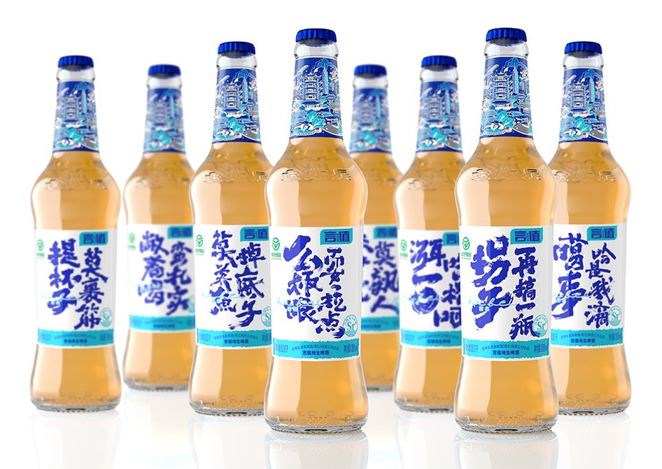
Ever wonder how designs for your favorite canned or bottled beverage are thought up? These masterful designs show us the originality and creativity that make up the patterns that stop us in our tracks.
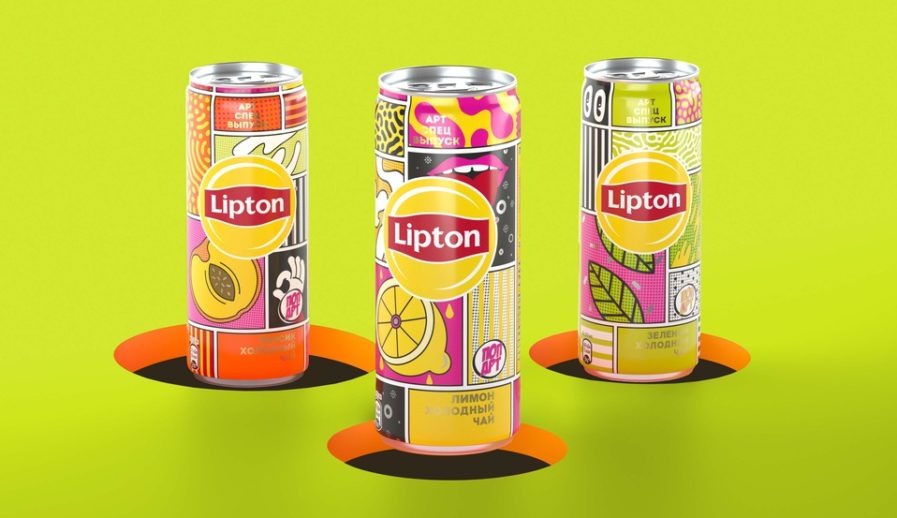
One such design, “Lipton Pop Art” (above) by PepsiCo Design and Innovation, is the epitome of this idea. Made to stand out among other soft beverage options, “Lipton Pop Art” brings a comic book feel to the grocery store aisle. Each unique design is paired with one of Lipton’s many flavors, such as black tea with peach and lemon flavors and green tea, and was used on Lipton’s special 250 ml cans that are currently only available in Russia. Instead of more traditional red, yellow, and blue, the design team worked with bright and inspiring patterns as a way to exude Lipton’s spirited and imaginative brand personality. The pop art style served these Lipton cans well as a way to grab potential customers’ attention, and despite the limited availablity, these cans are something we can all enjoy!
