These posters are really changing up the way we think about design! Whether they award winners from last year or new entries in our current competition, these amazing designers are quite the visionaries, but instead of just talking about them, we’d rather show you.
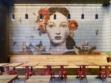
The first poster we’d like to show you, “Chaos Walking” (above, left), was designed by Leroy and Rose of the United States for Lionsgate’s upcoming film starring Daisy Ridley. The design company wanted to create something big and mysterious for what will likely be the next YA dystopian hit at the box office. The biggest task for these designers was creating imagery for “the noise”, which is a power in the film where women are able to read the minds of men. It was important that this be featured on the poster, but they wanted to avoid making it look cheap or comical. They eventually settled on a depiction of fire above the male lead Tom Holland. This decision was mostly made due to the clients’ enthusiasm for the gold color palette, which really seemed to work for the poster design!
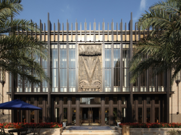
With a design that has made us really look at the artistic process quite differently, “Panejamento” (above, right) is a huge success. Designed by Jorge Araujo and Ana Mota of ¼ Studio in Portugal for Galeria Ocupa!, the goal of this work was to announce a sculpture that featured large concrete volumes and an exhibit that changed every day by the artist’s design. Such movements of these large structures created cracks within them, which Araujo and Mota wanted to emulate in the poster design. To do this, they commissioned a local fab lab to 3D print the title with the model of the sculptures they sent along. Once done, Araujo and Mota rearranged the letters in the way they found most fitting, and took a photo of it. The photo was edited according to design plans, and the result was the poster you see before you. The client loved the end result and even commissioned a publisher to give it exposure!
