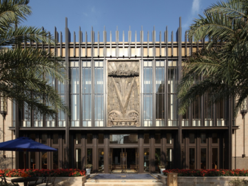
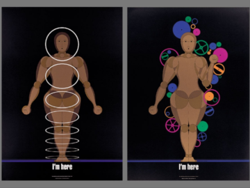
What happens when you merge the stark beauty of concrete architecture with the fluid grace of typography? For designer Zhiyi Zhu, this question sparked a transformative journey that would earn her gold at the 2025 Design Awards. In reimagining the exhibition branding for legendary architect Tadao Ando, Zhiyi discovered that sometimes the path to capturing an artist’s essence lies not in meticulous planning but in the freedom of play. Her story reveals how letting go of perfectionism and embracing experimentation can lead to deeper, more authentic design solutions.
By: Zhiyi Zhu, Graphic Designer, IF Studio
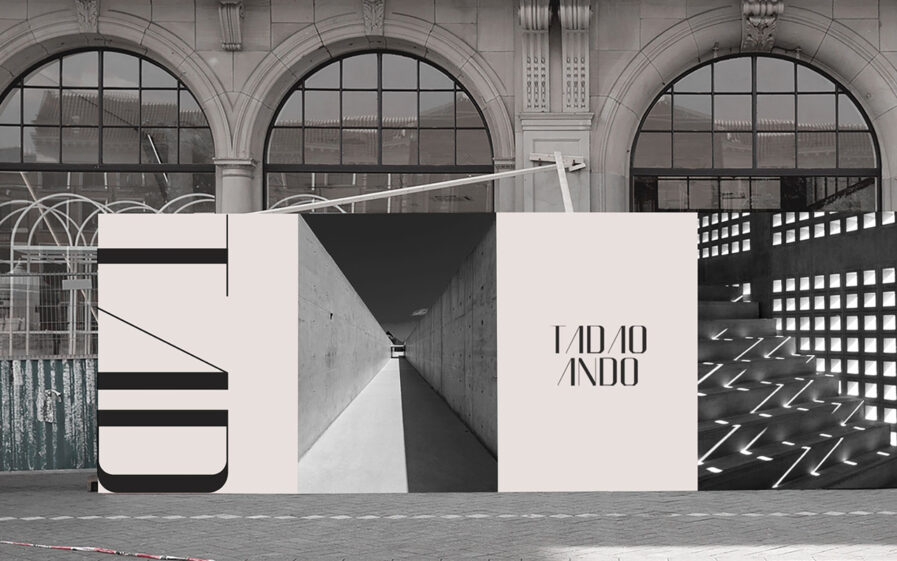
Tadao Ando is a well-known Japanese architect. His work is a marriage of reinforced concrete and natural light that creates aesthetic spaces that balance architecture and the natural. These spaces evoke a sense of tranquility and balance. My goal was to capture the same emotions and associations that his spaces provide but through graphic design.
This was a redesign project for a school assignment, and we needed to make a branding for Tadao Ando’s exhibition. What immediately caught my attention were the tactile details in Tadao’s work: the dotted textures of concrete surfaces and the striking use of geometric forms—squares, circles, triangles, and rectangles. My initial approach was pretty straightforward: I used simple dots and lines to make a typeface to mimic the materiality of his works.
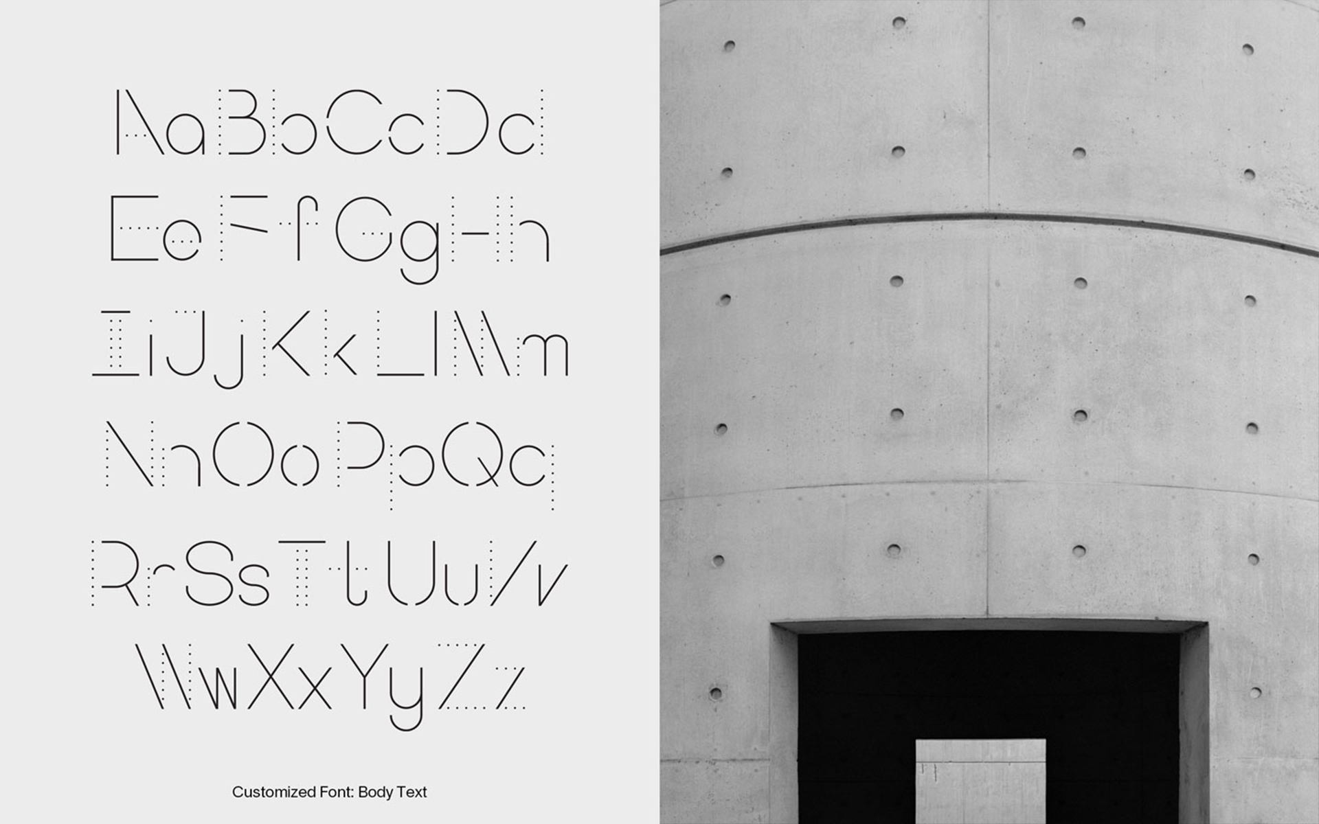
At first, I was satisfied with the typeface I designed; it felt clean and nicely represented Tadao’s works. But as I continued to study his work, I heard a voice in my head saying: “This could be better.” That inner critique, which all designers are familiar with, drove me to dig deeper. One of the fascinating parts of being a designer is that the work never feels truly finished, especially for projects I deeply care about. Even when the file is named “Final_v22_5,” there’s always a part of me that wants to tweak it just a little more.
I wondered if there was some way to find a deeper connection between the typeface and Tadao’s work, but I didn’t know how to go about it. I read articles about him and tried to explore different ideas, but those never got out of my head and made any progress.
The breakthrough came during my internship at IF Studio. My first task was to do a social media campaign for IF’s 10th anniversary. I felt overwhelmed at first; there were so many elements to work with, and I couldn’t figure out how to tie them all together. That’s when Toshi, the founder and creative director of IF, gave me a simple piece of advice: “Play with it and have fun.” It sounded almost nonsense at first. However, things started to happen when I started messing around to play with things and not overthinking too much.
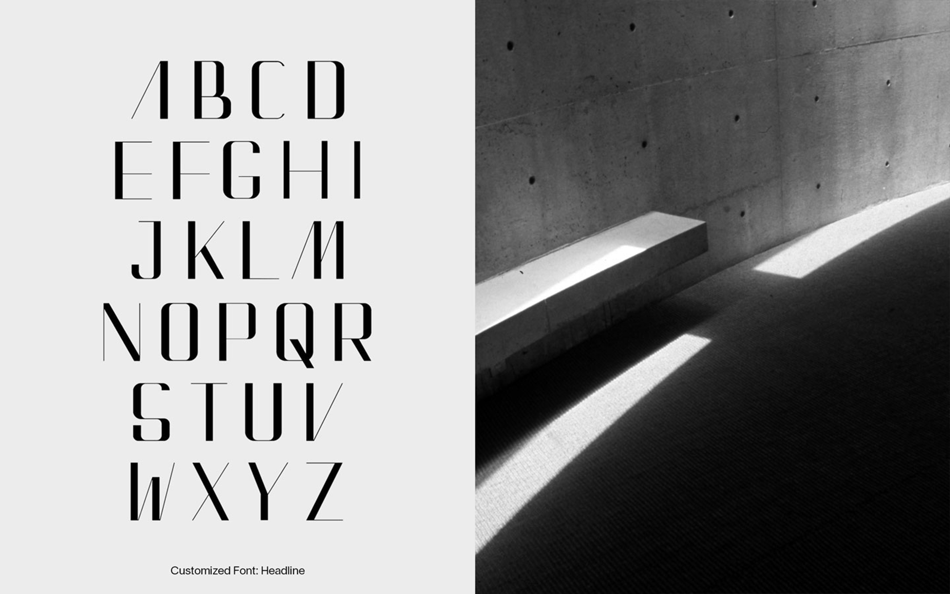
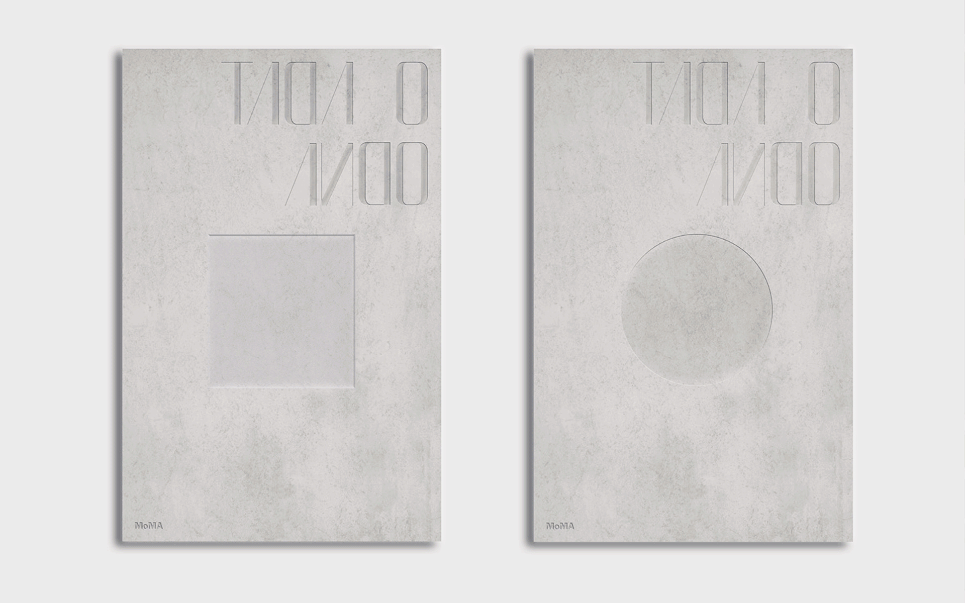
I applied a similar mindset to Tadao Ando’s branding project; I took a step back and let the simplicity of his work guide me. I put away all those complex concepts and started to play it around. For the typeface, I used a calligraphic pen to hand draw the letters repeatedly like a kid, trying to ensure the contrast and angles were the same contrast between light and shadow as found in Tadao’s works. With this fresh approach, the result was a typography with a voice and overall branding similar to Tadao’s work.
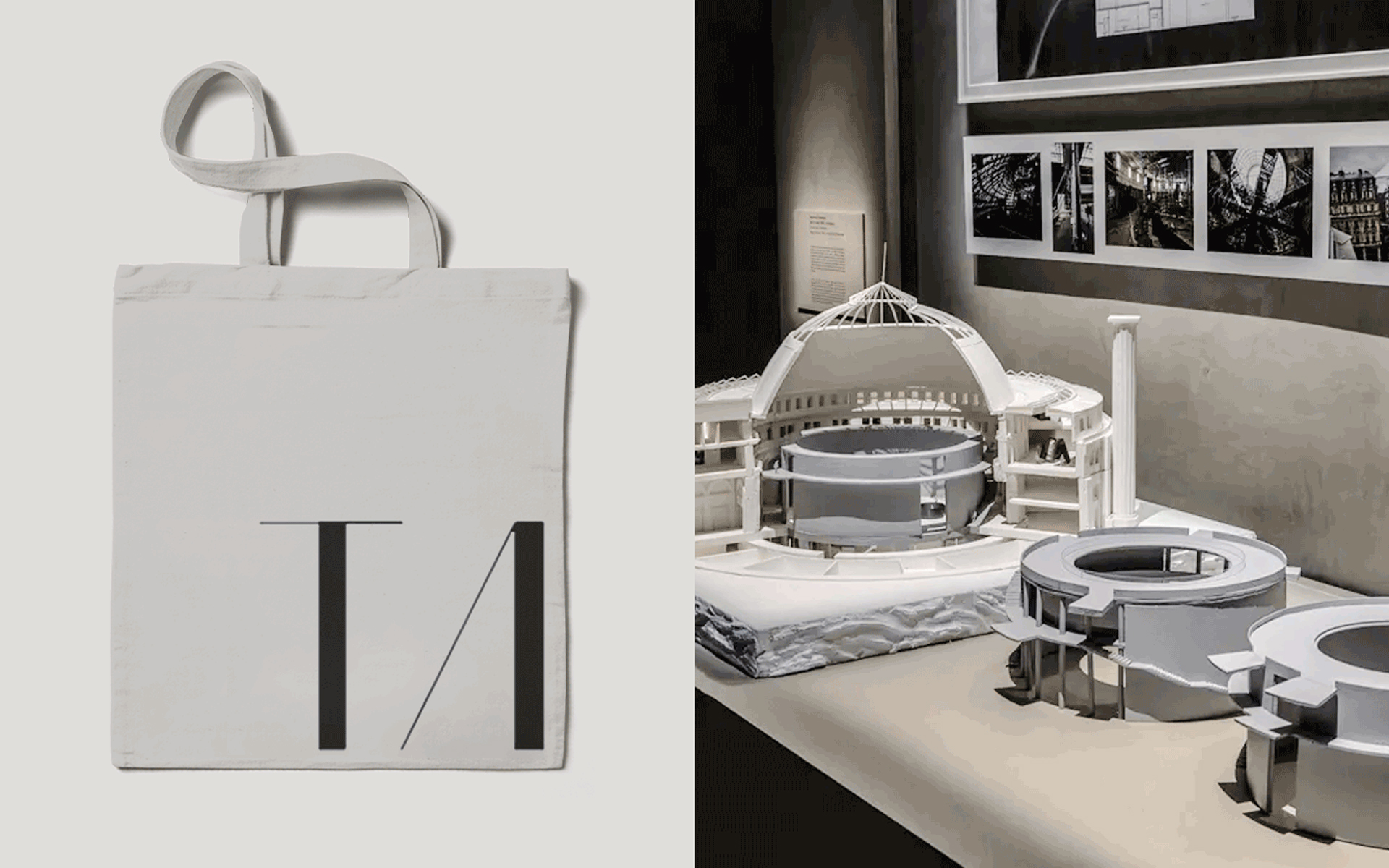
Typography didn’t seem that important initially, but I’ve realized a lot can be conveyed through simple typography choices. As I design and choose different typefaces for different projects, I always ask myself: What kind of personality do those flat letters have? An elegant lady wearing designer-brand clothes? A teenager playing video games? This question always helped me to make better design choices.
For this branding project, the first typeface I created focused on the surface details of Tadao’s work, while the second set captured its essence. That distinction between surface and feeling is something I think about in every project now. This experience has influenced how I approach future projects. I’ve learned to trust in the process, and perhaps most importantly, I’ve realized that play and experimentation are as valuable as research and planning.
Zhiyi Zhu is a full-stack designer and proud dog mom of two. A true believer in the magic of design, Zhiyi strives to create experiences that serve as a bridge between the audience and the story. With a multicultural background, she believes that great design has the power to unite people from diverse cultures, evoking shared emotional experiences. She enjoys the creation process, constantly exploring new technologies and tools, and always looking for ways to combine different elements to craft more engaging and artful experiences in her work.
