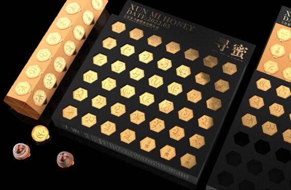
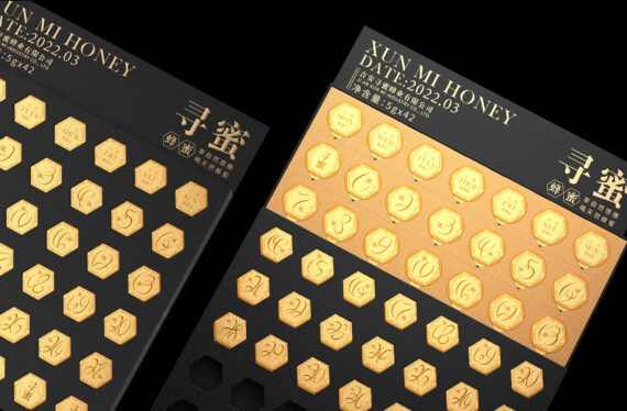
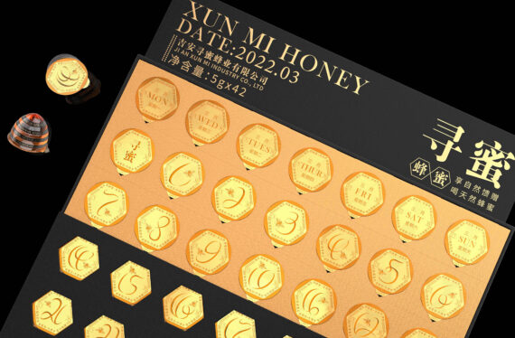
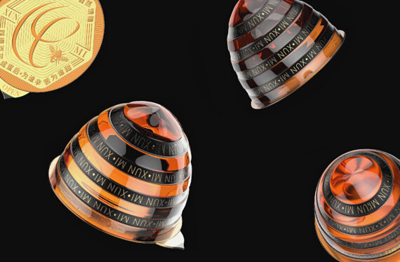
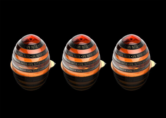
“Beehold” Roking Art Design’s Buzz-worthy Packaging

By: Luo Qin

The packaging design of this honey product is based on the consumption habits of young people at the moment. It aims to create a honey packaging design that can make products stand out in the era of homogeneity. The hexagonal elements in the packaging create a unique and visual thematic element to honey, as well as giving the different honey products cohesion and uniformity through the golden yellow and black color palette. The packaging design of the disposable packaging of the small can not only carries it but also solves the product after the opening of large cans. The numbers that are visible from the hexagonal cutouts, going from 1 to 31, are inspired by the daily trajectory of bees seeking honey; the hollow packaging allows for these digits and the product production month to be visible. Once the container is opened, the packaging fixing the honey in place can be folded to create a calendar-style layout that encourages consumers to have a piece daily. The homogeneity of similar products in the current society is becoming more and more serious; it is increasingly complicated to quickly find the products you want on the dazzling commercial shelves. In the Chinese market, information such as the product’s shelf life or the production date is very small, especially on the exterior packaging. These issues make the product inaccessible to older consumers and those with vision-related disabilities given how difficult it can be to find such related product information—and almost all honey products on the market are similarly packaged. In turn, this can also bring about wastefulness, as consumers may forget the honey’s ideal shelf life and discard it after only a few uses, or once the honey’s taste changes due to ineffective and sparse usage. 

Based on the aforementioned problems I encountered in daily life, the packaging concerns Roking Art Design sought to address within this design are mainly divided into. First, the market is saturated with homogeneous packaging styles, making it difficult for consumers to distinguish between honey brands and to find special product characteristics. Secondly, important information (such as the product’s shelf life) is typically present in fine print, rendering it illegible and hard to find; this brings us to the third point: consumers may not remember or be able to see these insights, resulting in product waste. ; A final concern is that the majority of honey products on the market are packaged in larger portions, or even in bulk capacities—the human body must not consume too much on a daily basis, so this choice by producers can negatively affect product intake, and having bulky packaging can cause the quality of each portion to deteriorate long-term.

We found the design process to be quite smooth once we considered how to make this honey product stand out against competitors. As a commercial designer, you need to have a certain understanding of the processes such as proofing and printing in the later period, but also be ready to think about how to formulate and realize an effective design plan with cost-conscious materials choices and visually pleasing results. Oftentimes, the customer may not have definitive desires or expectations from a design until we present them with a plan and it clicks into place. I believe the designer’s profession is all about bridging the gap between customers and the products they seek. When finding methods to improve a client’s packaging and make it distinctive from competitors’, our job is to analyze the status quo of similar products on the market and to constantly guide customers so that they will gradually have a clearer impression of how we reached these design choices. 

As an unknown start-up brand, in addition to its own product quality, design is particularly important for distinguishing oneself in the era of product homogeneity. The final packaging design emphasizes the attributes of honey through visual cues so that consumers can know at a glance what the product is and reduce their cognitive costs; Additionally, our designs for the Ji Am Xun Bee Industry’s honey packaging are inviting to all consumer age groups due to their sleek and fashionable modern look. 

I think the designer should be a lifeist—oftentimes, our creativity and inspiration come from life, whether it be through bringing shapes and colors found in nature into our concepts (such as with our hexagonal, black-and-yellow packaging alluding to bees and honeycombs) or through applying solutions to the problems we encounter in everyday life using these products. As we all know, the essence of design is to find and solve the problem. 

In the field of packaging design, we are headed toward a direction of sustainable development that will be more concerned about the future, and the craftsmanship that has a greater impact on environmental pollution will inevitably be eliminated. We will be more interested in developing sustainable products using environmentally friendly materials such as degradable and recyclable packaging,  as well as rethinking our approach to design, production, and circulation—our future objectives should be to use the product’s entire life cycle to reduce environmental pollution as much as possible. As a designer, you need to continue to learn and improve your comprehensive ability in order to keep up with the pace of social development and improve your daily life.


Luo Quin is a product packaging designer from China. She graduated from Hunan Urban College in 2018 and has been engaged in product packaging design since she joined the industry in 2019. She has served many well-known first-line brands, such as Jinmailang, Guizhou Xi Jiu, Luzhou Laojiao, Blue of Yanghe Dream, Shuijingfang, etc.

Social: Behance


Discover more award-winning Design 2024 entries here.

Author: Graphis