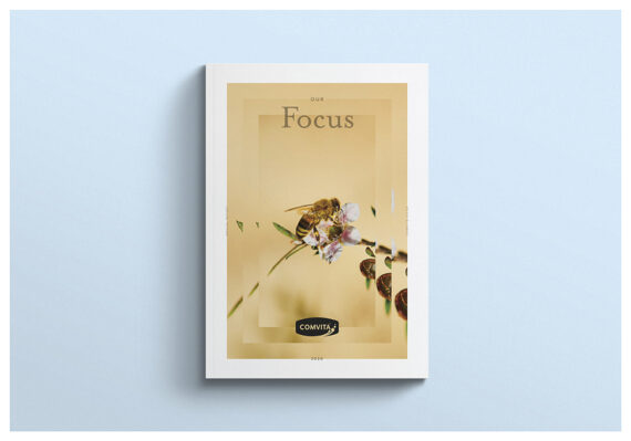
Embark with us to the Southern Hemisphere, where we land in New Zealand, to hear about Insight Creative‘s strategy and creative for “Comvita’s 2024 Annual Report,” which is abuzz with innovation and meticulous design, securing an esteemed Graphis Gold Award in Design. Orchestrated by Creative Director Brian Slade, this report transcends conventional financial summaries to become a hive of strategic storytelling. Crafted to engage and connect, it invites stakeholders into the heart of Comvita’s revitalization and expansion. Throughout its pages, Insight Creative narrates a saga of resilience, strategic insight, and the transformative potential of clear communication.
By: Brian Slade, Creative Director, Insight Creative
At our heart we are creative storytellers, helping our clients tell their stories in ways that engage their audiences, changing perceptions and behaviors, to drive the business outcomes they need. This is nowhere more prominent than in annual report design. A well-considered and designed report helps retain existing investors, attract new investors, and drive value in the business. Given that a company’s share price is driven by investor sentiment, a strong storytelling design can add significant financial value to a business.
Telling a strong story that changes perception to drive shareholder value was very much the challenge when we took the brief for Comvita’s 2020 annual report. Our response was to be as strategic, in every design decision we made, as our client. Comvita is a leading global honey brand. A series of challenges in the late 2010s saw them lose a bit of focus on their core business, leading to some less-than-ideal business performance. These results were reflected in reduced shareholders’ confidence and a significant decline in the share price. A new CEO, with a bold new turnaround strategy, was the start of a renewed focus on delivering the transformational outcomes Comvita needed. The annual report provided the perfect vehicle to share Comvita’s vision and the plan for getting there, and to build the confidence that would see investors, staff, and the wider community alongside them on the journey.
We got our head around where Comvita was, their three-part strategy, and the results investors should expect at different points along the way. We quickly resolved that this needed to be a message-driven approach that was open, direct, and accessible in its language and design. We knew we needed to send a strong, bold message to the market about focus, a well-considered strategy, and transformational outcomes.
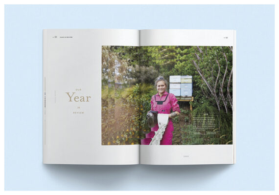
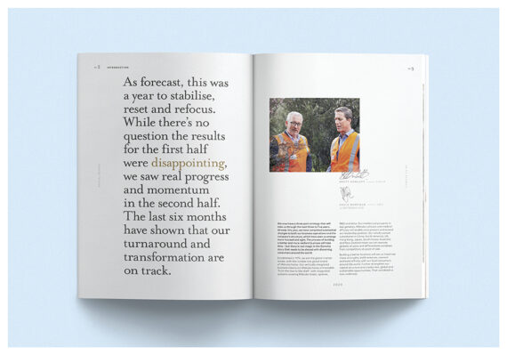
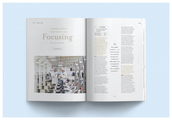
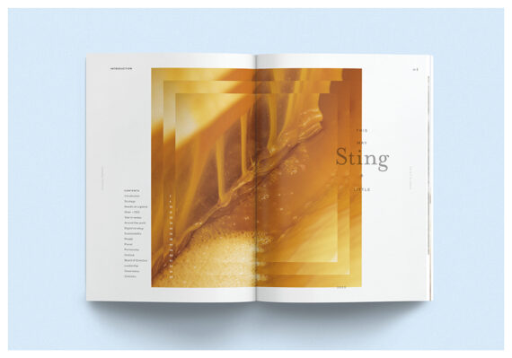
Disarming and honest headlines such as “This may sting a little” set the narrative up to deal with key issues in a very direct way. We recommended a frank, plain English and long-form Q&A for the CEO and chair’s section. These connected with stakeholders, asking the hard questions they needed to know and delivering full and transparent answers without the usual corporate speak. We paired this with open, real photography of the chair and CEO to reinforce transparency. We used the report’s opening spreads to clearly and succinctly outline the three phases of the turnaround strategy and to build belief in Comvita’s ability to deliver transformation. The visual treatment of this section was deliberately differentiated from the rest of the report, providing the engaging storytelling layer and the wayfinding to more details later in the report.
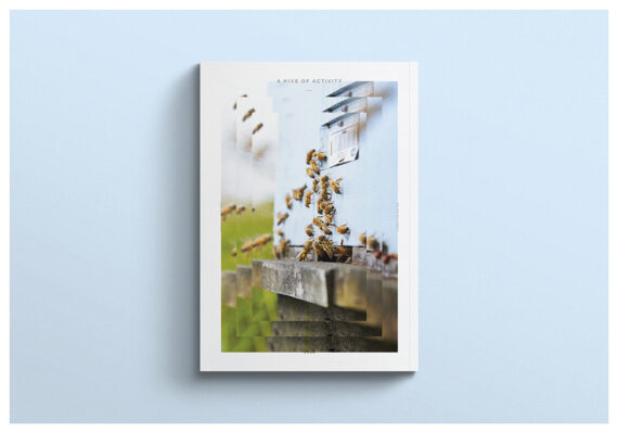
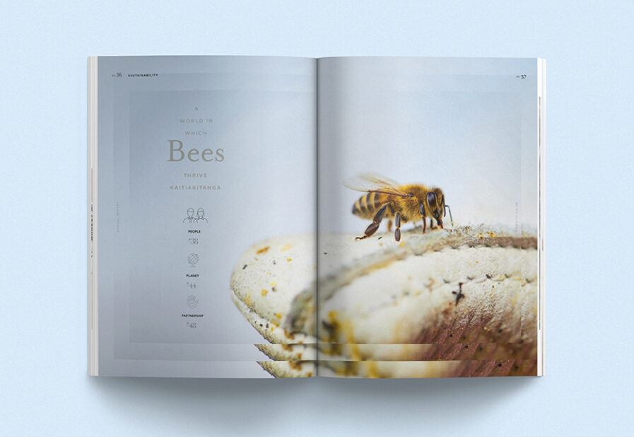
The three-phased strategy also informed the visual execution with each hero image utilizing a three-layered treatment to reflect the strategy and to reinforce an overall message of focus. A serious color palette and fine keyline infographics and icons offer a sense of structure, consideration, and planning. To further support an air of transparency and openness, the typographic treatment is bold, clear, and accessible, using a balance of serif and sans serif to deliver a quality feel aligned with Comvita’s premium positioning. Layering the content with engaging headlines, callouts, top-line statistics and figures, breakout panels, and infographics allows a highly scannable experience, letting users jump in and out as it suits them. These features, along with clear hierarchy and navigation allowed the pace of the report to be varied within different pages and sections, further enhancing the reader’s ability to engage with the strategy.
Comvita received strong positive feedback on the report from their staff, investors, and wider stakeholders. One of the board members described it as “the best report Comvita’s ever produced” making the report a tangible demonstration of a new approach to delivering transformational results. They quickly noticed a change in attitude towards Comvita, with stakeholders immediately embracing a more confident outlook for the company.
But that wasn’t the end of the story. Like Comvita’s three-phased strategy, this report was the start of a three-part storytelling approach to annual report design. We designed the first year’s report with a clear view of how we would evolve the story and design in the next two years to align with the outcomes Comvita’s strategy would deliver.
The most obvious evolution was physical. The first report was on uncoated A4 stock, the next two reports saw an upswing in both size and stock quality; a metaphor for the strategy of delivering quality growth. A further extension of the original design thinking saw the three-layered shape become circular in year two to represent growth. It evolved into a hexagon in year three to reflect the wider reach the business had achieved and to showcase the wider impact Comvita was making on consumers, well-being, community, and nature. We also evolved the overall tone, from focused, structured, and planned in year one to more confident and forward-looking in year three. This was achieved through the photography selection and by advancing the typography and color palette, one step forward, and then two steps.
Over the three years, Comvita has undergone a total transformation, cementing its position as a leader in global honey. Through the annual report, investors have come on this journey with them. The share price is the single clearest indicator of just how big and successful the journey has been. In early 2020, the share price was around $1.67. By late 2022, the share price had risen to around double.
Insight Creative is one of New Zealand’s leading strategic creative design agencies. With nearly 50 years of experience and a large portfolio of both public and private clients, they deliver effective work that drives results for their clients. Their work across print, digital, and physical spans brand, employee, and stakeholder engagement, marketing campaigns, and spatial experiences. Brian Slade is Insight Creative’s creative director, leading an experienced in-house team and a large network of design partners, across New Zealand.