Design Firm: Kitchen Leo Burnett | Designer: Marianne Sæther | Client: The Royal House of Norway
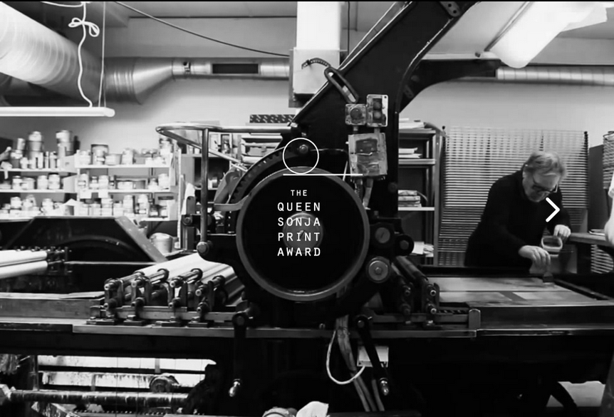
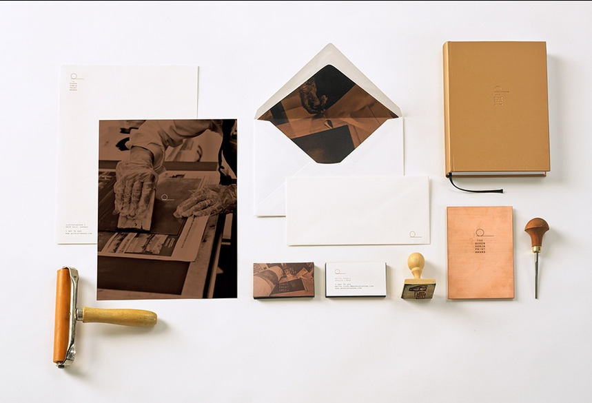
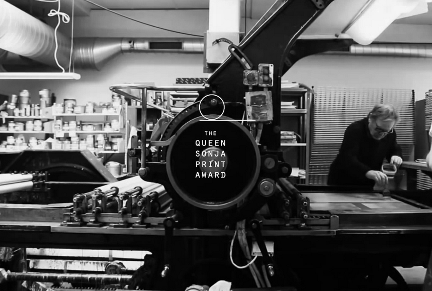
The striking Queen Sonja Print Award logo hails from Norwegian advertising agency, Kitchen Leo Burnett. The identity pays tribute to the old crafting tradition of printmaking, a timeless image that remains relevant in a contemporary design industry.
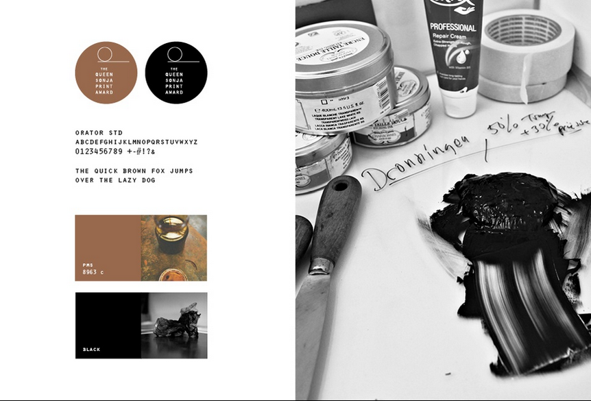
The logo, which was recently submitted to the Design Annual 2016 competition, was based on a common graphic tool, the drum that adds pressure to the copper plate, which is against the color pigment that transfers to the paper. “The logo has a subtle visual resemblance to the letter Q for Queen,” the company wrote on their Graphis Portfolio. “The lettering in the logo is chosen for its perfect almost identical square shapes. This in turn relates to the technique of printmaking, where layers of plates, pigment and paper is placed onto each other to create a print.”
Kitchen Leo Burnett is an advertising agency founded in Oslo, Norway by American advertising executive Leo Burnett. As a member of the Leo Burnett family, their work reaches a global audience. TheQueen Sonja Print Award was created under the direction of art directors Torkel Bjørnstad Sveen and Marianne Sæther, account managers Ellen Sørnes and Suzanne Lorck, designer Marianne Sæther and account director Rune Roalsvig. Queen Sonja Print Award was founded by H.M. Queen Sonja with respected Norwegian artists Ørnulf Opdahl, the late Kjell Nupen, and Swedish printmaker Ole Larsen. Kitchen Leo Burnett is a new Graphis contributor. Learn more about their work here.
The Graphis Design Competition features some of the most compelling and influential design of the year from across the world. Gold and Platinum awards, along with winning entries, will be published in the Design Annual 2016. Submit your work to the competition here.

