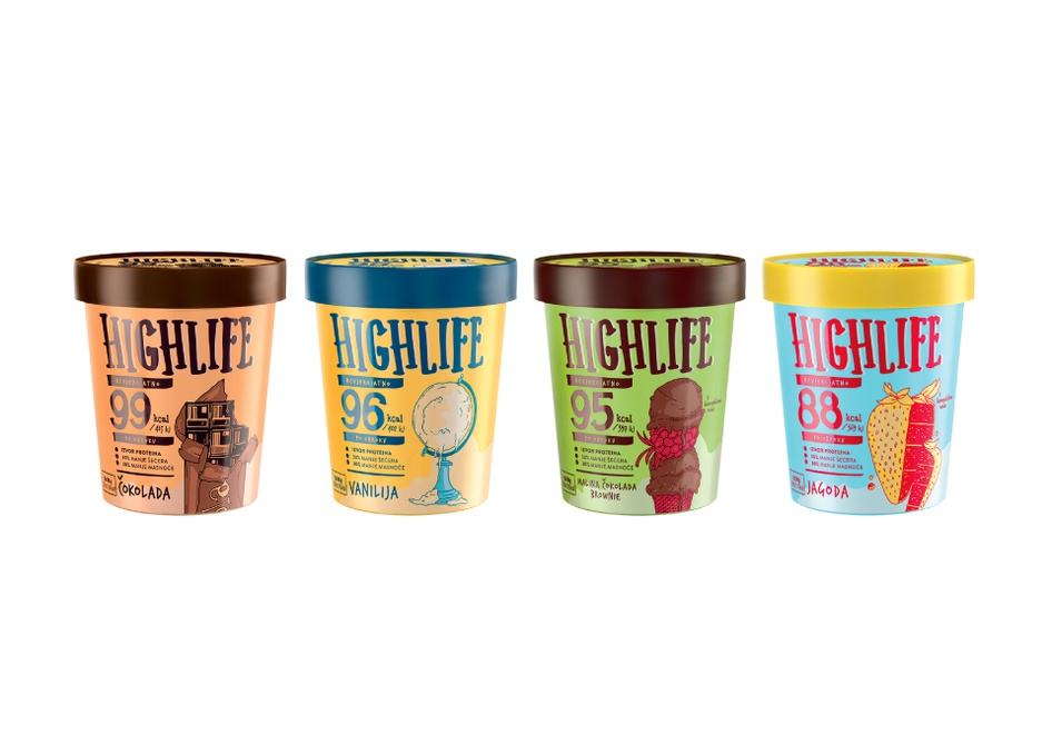
Creativity is key when it comes to an eye-catching package design. After all, it’s the first thing a consumer sees when purchasing a product; therefore, it needs to be attention-grabbing in order to be successful. Packaging typically reflects a company’s goals, mission, or values while making a consumer feel like a part of the community. And there’s no greater community than coffee and ice cream lovers, who get a treat with this week’s entries.
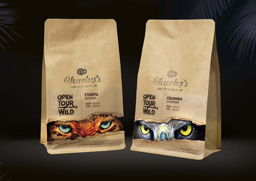
Chucky’s Coffee & Culture was named the sixth-best coffee house in Europe in 2018, as the place is a hub for young creative locals and opinion leaders. The biggest part of their business is selling their own special selections of coffee blends; therefore, a clever package is needed to influence buyer’s decisions. Chucky’s Coffee & Culture partnered with Miroslav Krustev of Garlic Sofia to create the design, “Open Your Wild” (above), which plays on Chucky’s belief that coffee allows you to be you and to be wild. Krustev chose twelve exotic animals matching the specific origin of every coffee blend and focused on their eyes, creating an illusion that a wild animal is looking straight at you from within the ripped bag. Purposefully using direct eye contact keeps the viewer constantly engaged with the label, symbolic of how coffee keeps you going through the day. The packaging was effective and successful, not only receiving a lot of attention from loyal customers and attracting many new ones but also resulting in Chucky’s launching three more coffee blends in just two months.
