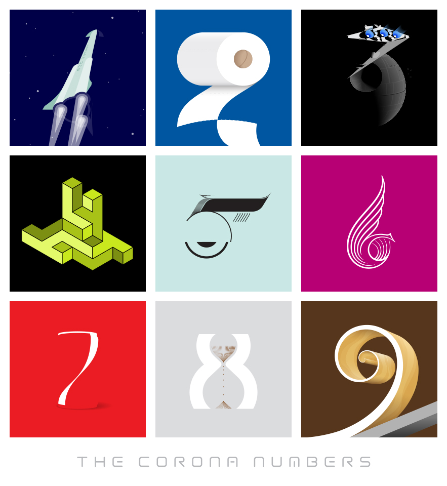
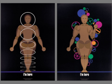
It’s no secret that the coronavirus pandemic has been a difficult and trying time for everyone worldwide. But it can also be a source of creativity, inspiration, and innovation. Roger Sawhill and his design firm UP-Ideas won Gold for their work on “The Corona Numbers” (above), an interactive graphic that tells stories about each number associated with coronavirus, from one to nine. For example, number one is represented by a rocket and symbolizes loneliness in space—a fitting representation of the isolation felt during quarantine. Number two is represented by toilet paper, which became a hot commodity when shortages were rampant during the pandemic. Number three represents the original trilogy of Star Wars movies as an homage to all things nostalgic in times of crisis. And so on through all nine numbers!
What makes this project unique is its creative use of symbols and its ability to capture emotion and feelings experienced during the pandemic—from loneliness to nostalgia—while still maintaining a sense of professionalism and sophistication that only comes with years of experience in graphic design. Furthermore, Sawhill was able to complete this project within just nine days! This speaks volumes about his impressive skill set and his dedication to creating something meaningful amidst difficult circumstances. It shows how creativity can still blossom even under immense pressure, and beauty can be found if you look hard enough for it.
UP-Ideas design firm’s project has rightfully earned them recognition in the form of a Gold award. This project goes beyond visually engaging; it captures emotion and meaning. They set a high standard for design worldwide amid these unprecedented times, showing us that creativity does not have to suffer under challenging circumstances—it can actually thrive! All hail the power of visual storytelling!
Australia’s Toben Creates A Flavor Profile Like No Other
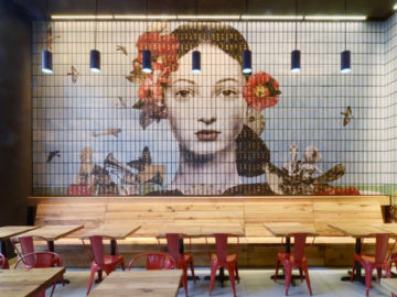
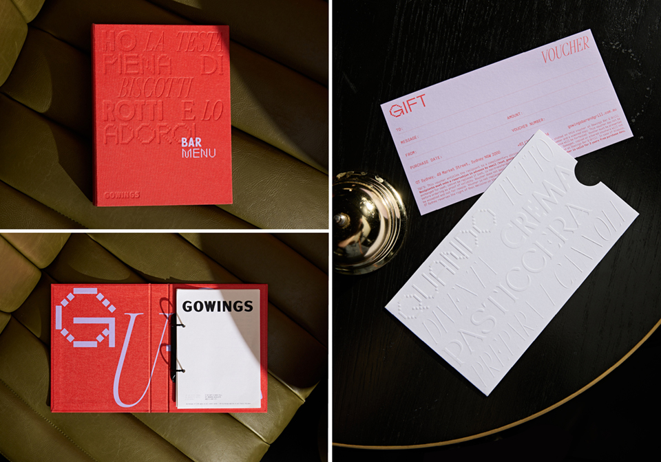
Australian designers Thorsten Kulp and Geoff Courtman of Toben sought to elevate the image of “Gowings Restaurant” (above), a bar and grill with an outdated, masculine ‘bar and grill’ aesthetic, by breathing new life into its brand and transforming it from drab to fab!
Toben’s identity for the restaurant pays homage to the rich history of the restaurant in the Gowings Building on the one hand while stepping into unexpected creative territory on the other. It was time to revitalize its identity with an infusion of contemporary style. The creative is inspired by food and beverage creative director, Sean Connolly, who brings together the hip swagger of a New York steakhouse with delicious flavors from Little Italy. The distinctive creative vision of Toben’s campaign marries the contrasting yet complementary typographic motifs inspired by historic Gowings touchpoints into print, promotional and collateral materials.
Eye-catching utilization of sophisticated design elements, from the abstract shapes of coasters that represent the different departments in the building to the matte embossed spiral-bound menus that adhere to the vibe of their newfound contemporary space, elicits zest and new life for the restaurant. Their captivating logo gives the brand visibility and excitement. At the same time, the lively and expressive color palette expels the outdated bar and grill tones, inviting a dynamic and refreshing shift for their clientele.
All in all, the many facets of Gowings come together to form a vibrant, unexpected, and distinct identity, shifting the restaurant into a more contemporary, inclusive, and welcoming space for visitors, leaving the nostalgia of traditional ‘bar and grill’ aesthetics behind. The ambitious collaboration between Sean Connolly and Toben has given Sydney insiders a newfound excitement surrounding Gowings, creating a new dynamism in this space that honors its history while staying true to Connolly’s dynamic culinary style. All that remains is for us to wish you bon appétit!
To check out other Design 2023 winners, click here. And to enter our current Design 2024 competition, click here!