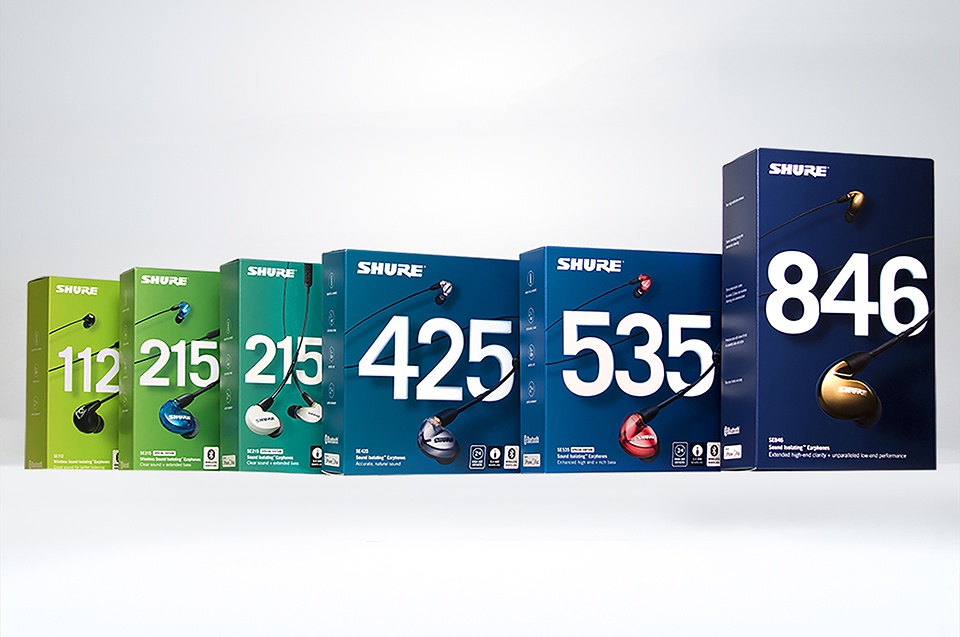
Whether for food or for headphones, packaging designers can approach the creation of packaging in similar ways yet come up with visually different and stunning products. This week’s Packaging 10 competition entries show just that!
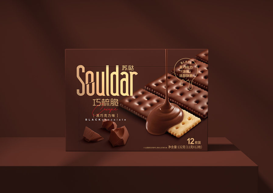
The first entry is “Souldar Cracker” (above) by Chinese designer Yeqin Chen. For this assignment, Chen detailed the challenges and goals of food packaging, saying, “When consumers pass the aisle, the time for the products to be seen is only for 0.2 seconds. Our challenge is inducing the appetite of consumers in this brief moment while at the same time clearly conveying the product’s properties, characteristics, flavor, etc.”
Chen kept this in mind when creating the packaging for the Souldar Cracker. For his approach, the left side of the packaging has a concise and clear layout with an allocation of products far or near, in limited space, to create a vision to expand space. Top-down rainfall chocolate sauce changes the packaging from static to dynamic and creates the most easily transfer appetite of telepresence. Specular highlights on the surface and the show biscuit’s primary colors make a color contrast in the large area formation while giving the sense of freshness and high quality. Choosing brown and gold as the main colors helped represent product flavor and visual perception characteristics. In response to Chen’s design, the client, Dali Foods Group, said, “The clean packaging reflects our brand and products with its simple, approachable and bold design. We are thrilled with the new system, and so are our consumers.”
