In a crowded market, it’s easy for new products and brands to get lost in all the noise. In the following New Talent submissions, these design students show us how distinctive and innovative branding design can help products and companies stand out from the rest.
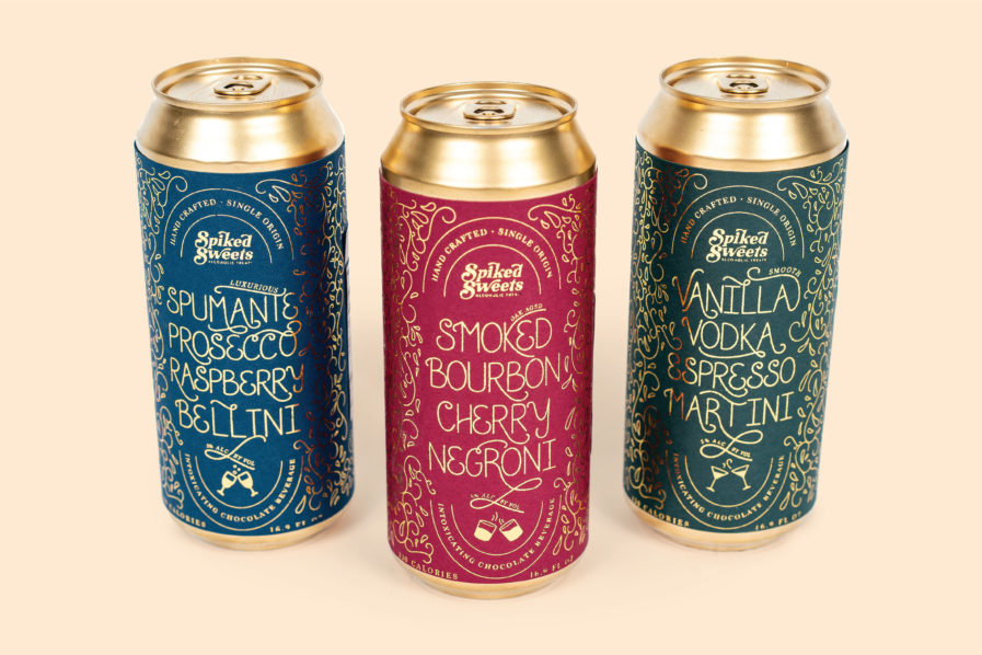
The first submission is “Spiked Sweets: Alcoholic Treats” (above) created by Olivia King, a graphic design student attending the Kutztown University of Pennsylvania. King set out to create a luxury line of alcohol-infused chocolate confections, including chocolate bars, hard seltzer drinks, and bourbon. For the confection line’s packaging, she assembled a unique jewel tone color palette of emerald green, jade blue, and deep red to reflect modern luxury and warmth. She also paid particular attention to the handmade typography and illustrations, producing intricate gold botanical patterns that matched the interior foil as well as the gold-toned aluminum cans of the seltzer drinks.
To take the product design to another level, King took the opportunity to use heat-activated foil and a laminator. As she explains, “When printing with a laser-style printer, there are heat-activated elements in the toner that bind with the foil and adhere to one another.” In addition to the foil technique, King also physically mocked up all packages and created a fabric-lined wooden box, coasters, a bottle of bourbon, and a jar of cherries to create a box set for the bourbon flavor. “The idea is that if this product were to be sold online, the customers would be able to order gift boxes for the individual flavors.” Seeking a career in packaging design, King had a lot of fun completing the project and was pleased with how the brand turned into a coherent and attractive identity that signals a high-quality product while standing out in the online market.
