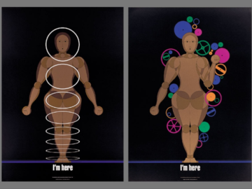
Antiques and Advertising Techniques: Latest New Talent 2022 Entries

The old and the new simultaneously come to life in today’s entries for our New Talent 2022 Annual, with these students’ design practices embodying the medium’s evolution, from photography to digital illustration, and their subjects, a consumer evolution from antiques to caffeine. 

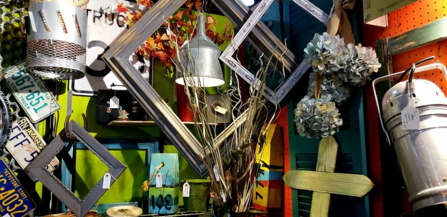
In “Antique Shop” (above), Liz Delapaz, a student at Texas Christian University, photographs a still-life shot of an antique shop to capture “a demonstration of controlled chaos.” Under the supervision of professor Jan Ballard, Delapaz’s fascination in the interactions between different colors, textures, and sizes of objects was brought to light. And by carefully selecting a corner of the store that housed materials that complemented each other while still holding to their own uniqueness, Delapaz conveyed all the ways in which eclecticity can be organized. 

The homogenous, earthy color palette coupled with almost-identical quadrilateral shapes made the portrait more digestible, and eased its subjects into the domain of chaos Delapaz was looking for The end result is a “network, a community, of objects that interact and complement each other, inanimate yet bursting with movement and excitement.”
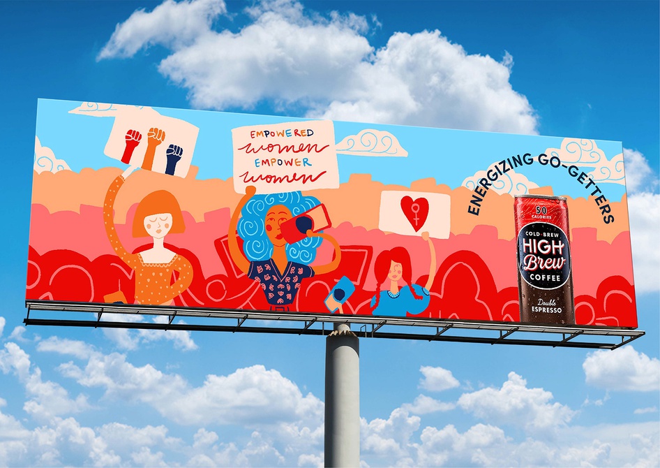
On the other hand, Michaela Bollinger, another student at Texas Christian University, opts for a more millennial approac, with her series “High Brew Coffee Advertising Campaign” (above) embodying all the Pinterest or Instagram-like aesthetics that have come to define modern graphic design. As part of an assignment for professor Bill Galyean, Bollinger was required to create an ad campaign for a brand or product she felt passionate about. An avid consumer of High Brew Coffee, Bollinger proceeded to create a multimedia ad series consisting of social media content, magazine inserts, billboards, and even street art. 

With her consumer clientele in mind, Bollinger crafted a bright, bold ad series targeted towards “go-getters, trendsetters, and do-ers.” The end result is an aesthetic mashup of millennial colors, typography, and minimalist illustratio, to create a modern brand for the modern opportunity seeker. The series’ attractive and eye-catching layout encapsulates Instagram’s virality factor, and embodies all the necessary elements required to have someone share your post. 

As our New Talent deadline approaches, don’t forget to submit your own entries into graphis.com

Author: Graphis

Leave a Reply

Your email address will not be published. Required fields are marked *