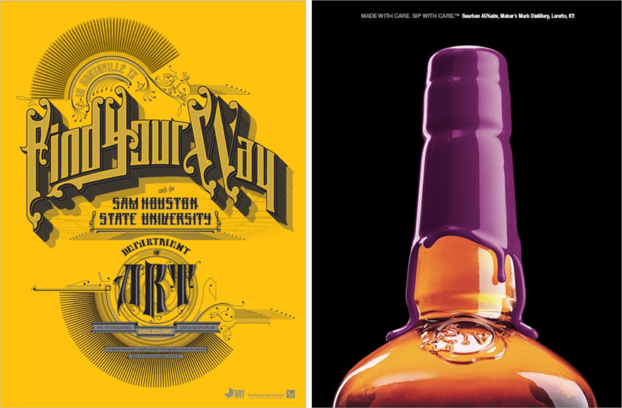
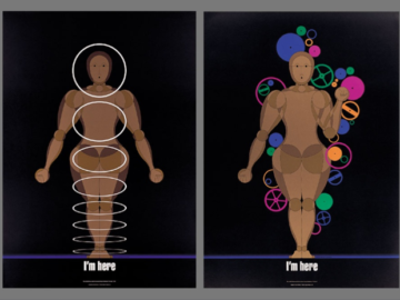
ABOVE (left)— ecesarrivera (Huntsville, Texas) for Sam Houston State University | Designer: Cesar Rivera | GOLD AWARD
IN THEIR OWN WORDS:
“The assignment was to create a poster to help recruit potential art students — targeting high school as well as university transfer students — and raise awareness of the Department of Art at Sam Houston State University.
The style was based on typography from Victorian-era maps from the late 1800’s and early 1900’s because the university was established in 1879. Typography, pencils, paintbrushes, a lens shutter, and a 3D mesh grid were used to represent the five programs in the Dept. of Art: Graphic Design, Fine Art, Art History, Photography, and Computer Animation respectively. The custom typography-focused poster is a 2-color (black and silver), silk-screened job on French Paper (Pop-Tone, Lemon Drop). The poster stands out from the multitude of other art program posters that potential students are exposed to as they navigate their academic choices.”
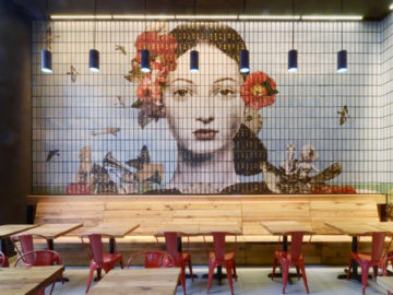
ABOVE (right) — Doe Anderson (Louisville, Kentucky) for Maker’s Mark | Chief Creative Officer: David Vawter | Art Director: Tim Kennedy | GOLD AWARD
IN THEIR OWN WORDS:
“Our social media approach is to stay relevant, topical, and conversational as well as to drive conversation, engagement, and to demonstrate to our audience that there are real people behind our brand of handmade bourbon and not a faceless corporate media machine.
Like everyone else we were stunned and saddened by the death of Prince on April 21st, 2016. Within 30 minutes of learning the news, we expressed our feelings to our audience the best and simplest way we knew how.
This Facebook post received the highest number of shares in the history of the brand. Comments were 97% favorable, with many of them calling for us to create an actual bottle with purple wax. We have no idea whether Prince was a Maker’s Mark fan, but now we know for sure that a ton of Maker’s drinkers are Prince fans.”
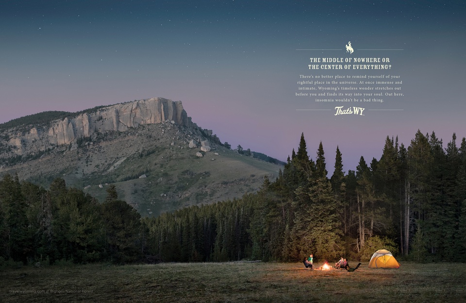
ABOVE — BVK (Milwaukee, Wisconsin) for Wyoming Office of Tourism | Photographer: Jason Lindsey | Executive Producer: Darlene Stimac | Creative Director: Matt Herrmann | Executive Creative Director: Brian Ganther | Art Director: Katelyn Tierney | Senior Producer: Jessica Farrell | Senior Account Executive: Bridget Wirth | Account Executive: Marie Haas | Retoucher: Taylor Strohmeyer | Account Director: Victoria Simmons | GOLD AWARD
IN THEIR OWN WORDS:
“Wyoming has a breathtaking landscape, iconic national parks, and ample opportunity for adventure. And while our audience was adventurous in the physical sense, those reasons alone weren’t enough to draw them to the state. How could we give them new, more compelling reasons?
Our audience’s innate curiosity and thirst for deeper, more meaningful experiences told us that they needed equally compelling intellectual reasons to visit Wyoming. The ‘That’s WY’ campaign gave them those reasons. Photography brought the landscape’s epic intimacy to life, and thoughtful, philosophical headlines connected with the audience’s intellectual side.
For every dollar invested in the ‘That’s WY’ campaign, the return to Wyoming in visitor spending was $275 — a 36% increase over prior year ROI.”

