A poster’s subject is the main draw of the design, but these Poster Annual gold winners and current competition entries show how a poster’s subject can be used to convey a variety of information to the viewer.
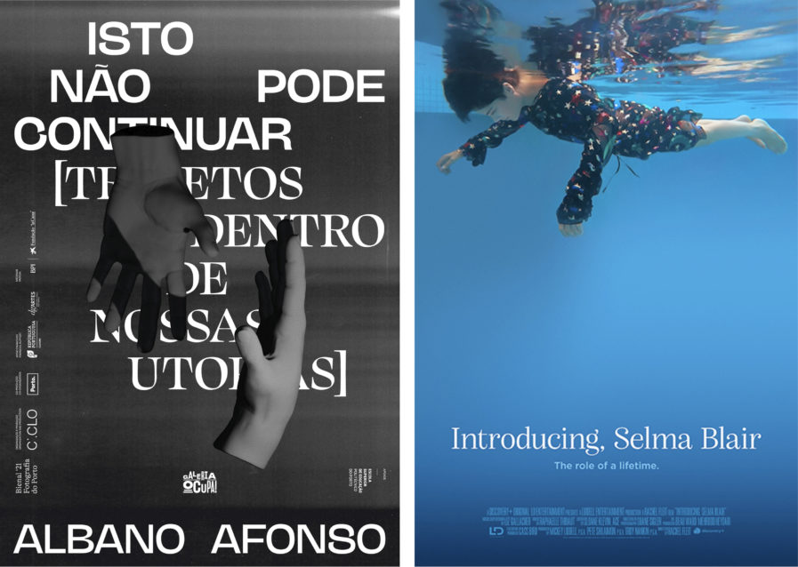
Our first gold winner is “Isto Não Pode Continuar” (above, left), a poster from 1/4 Studio that was created to advertise Porto’s Photography Biennal, an exhibit by Albano Afonso at the Galeria Ocupa!. Afonso’s exhibit used light as a pictorial element to create landscapes of light and shadow, intended to make the viewer focus on both the macro and the micro, the light and the dark, and the landscape and details in order to challenge their perception. The artist created installations that used a variety of objects to obscure part of the projected themes, so to represent all of the installations, the studio decided to use an element that was common to all of them, but also invisible: the hands of the artist. The hands refer back to the making of the pieces, as well as the idea of the route (making your own path), a concept that was central to the exhibit. Each 3D-modeled hand projects shadows while revealing and obscuring the title of the exhibit at the back. The typographic composition was built using a grid and two typefaces, creating a winding path.
Our other gold winner comes from Graphis Master design firm ARSONAL with their poster for the documentary “Introducing, Selma Blair” (above, right) produced by LD Entertainment. The documentary follows actress Selma Blair after being diagnosed with multiple sclerosis and offers an unflinching look at her life as a woman and mother as she navigates her debilitating disability. The poster is meant to deliver a bold statement about the raw vulnerability of Selma’s journey in the film using provocative imagery that was unique, but not glamorous. To accomplish this, ARSONAL focused on strong imagery from the film, looking for powerful caught moments that revealed Selma’s journey of personal acceptance and resilience living with a disability, while also reflecting her unique style and grace. They eventually chose to show a moment from a scene where Selma was floating in her pool in a Yves Saint Laurent dress. The image was unique, attention-grabbing, and reflective of the film’s purpose, literally and figuratively submerging the notion of glamor and celebrity to encourage the audience to focus on Selma, the woman, as she stays afloat, navigating her path to peace and serenity living with multiple sclerosis.


