Between beautiful images and clever logos, there’s always something of interest in our Design competitions, whether it be from last year or current.
“Sometimes, Cigar is Just a Cigar” (above) was created by American designer Carmit Makler Haller of Carmit Design Studio. Submitted into our Design 2022 competition where it won Gold, Haller made the image as a self-initated project but also something she could use to promote her design business. Against a dark background, a woman with lipstick red lips smokes a cigar that’s been lit a while ago and is almost out, given the amount of ash on the tip. From below, a carbon copy of the woman comes up and hold the bottom of the cigar in her mouth, close enough that the two look like they’re about to kiss. It’s a sensual yet tasteful piece, and it shows off both Haller’s design skills and her Adobe Photoshop abilities; it’s almost impossible to tell the image has been manipulated!
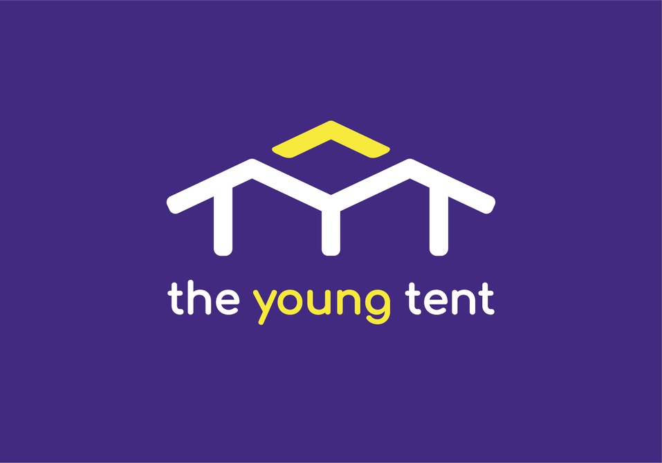
The Young Tent is a newborn alliance of political youth organizations in South Korea. Realizing they needed to find a specialist who could set up their suitable brand strategy and design an influential visual brand identity to successfully launch them, they contacted designer Jang Won Lee. Through multiple conversations, Lee got a sense that the group was totally different from other traditional and old-fashioned political groups in South Korea thanks to its young members and that the group’s brand would mostly be exposed to the public as a “special event.” His goal, therefore, was to refine, polish, and develop their brand style, then design their brand identity that can contain the brand style.
The most important thing for “The Young Tent: Brand Identity Design” (above) was that Lee wanted the branding to work primarily as “event identity design” while also as “business identity design.” Going off the group’s name, he made a tent-shaped that could convey the idea of “gathering and having a fun time together” and incorporated the English initals – T, Y, T – for an additional graphic element. With a dark purple background and white and yellow letters, the logo is a stand out; the executives of The Young Tent were delighted to have their clear brand strategy and visual brand identity, and they expressed their gratitude that they could expand their operations as the new brand conveyed their philosophy efficiently.
To check out other Design 2022 winners, click here. And if you have a great design you want to enter into our Design 2023 competition, click here.