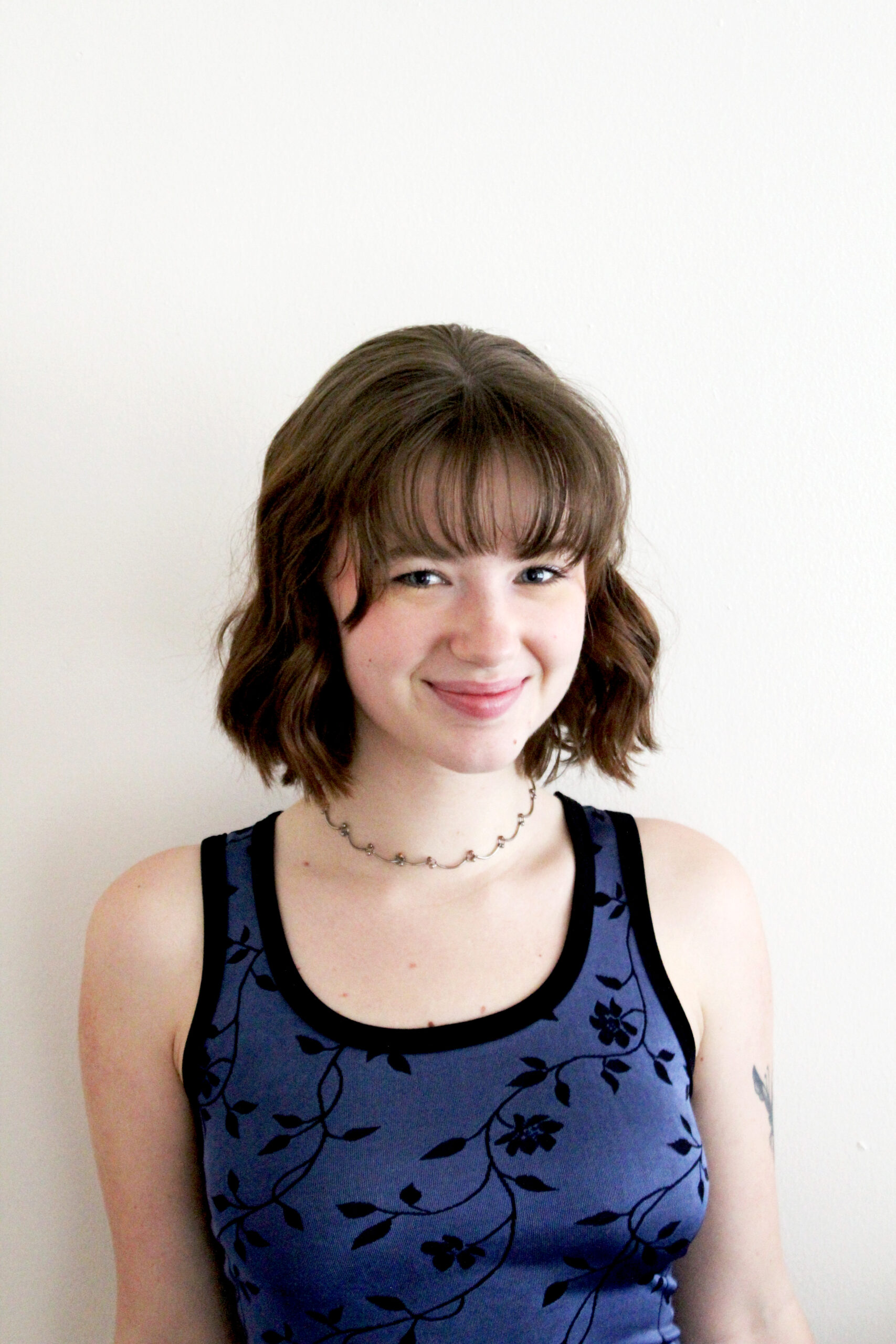
Grace Howard, fresh out of Portland Community College, turned her graphic design passion into a Platinum Award-winning masterpiece in the 2024 New Talent competition. Her project is a bold magazine named Pixie that fuses her love for music with innovative design. Drawing inspiration from Bjork’s eclectic style, Pixie boasts custom hand-drawn typography, dynamic layouts, and vibrant imagery that capture the Icelandic artist’s whimsical essence. Grace’s cohesive and daring design earned her top honors in editorial design, showcasing the power of creativity and determination.
By: Grace Howard, Graphic Designer & Former Student, Portland Community College
Hello! My name is Grace Howard, and I’m a recent graduate from Portland Community College’s graphic design program in Portland, Oregon. The design classes at PCC taught me the ins and outs of design—from the origins of type, printing strategies, and a deep understanding of the Adobe programs to the importance of having a creative process, the value of research, and how to effectively communicate a message in a visually interesting way. Through this program, I discovered my true love for design and the importance that creative work has on how we engage with the world around us.
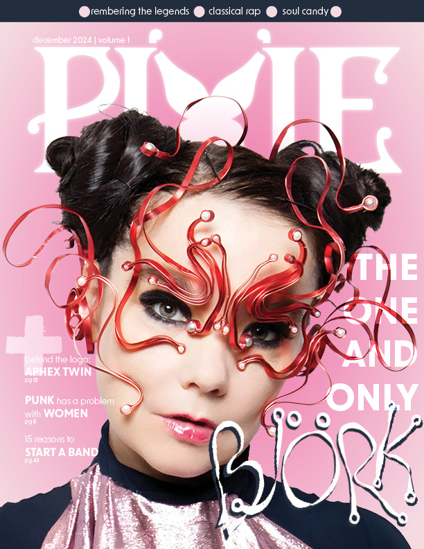
In the program’s second year, we were required to take a magazine design class taught by Nathan Savage. In this class, students are tasked with creating a 12-page magazine with a front cover, two feature spreads, and at least one department page. The goal of this project was to find creative ways of combining typography and images while also relaying necessary information. This was my first time doing editorial design, and I was definitely feeling a little intimidated! I knew from the early stages of the process that I wanted to create a magazine that focused on music and musical artists—music has always played an important part in my life and has always been a passion of mine. When thinking of a subject for Pixie Magazine, Bjork stood out to me as the obvious choice. Bjork is known for her out-of-the-box creative approach that really shines not just through her music but also through how she presents herself. Her eclectic makeup and outfits provided me with tons of inspiration regarding fun typography and interesting layouts that replicated her energy.
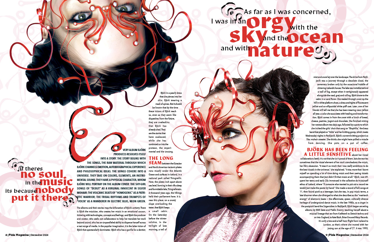
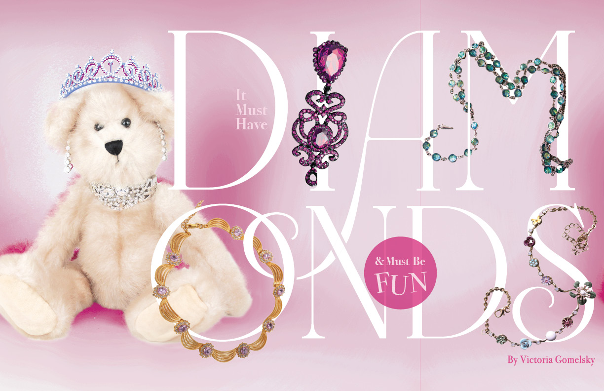
After I settled on my subject, I began the next phase of the project—research. I looked into her artistic background, listened to countless hours of her music (“Cocoon” has to be my favorite!), and clicked through hundreds of photoshoots of the Icelandic icon. I finally landed on this specific series of her wearing this really interesting, complex red mask and felt instantly inspired. While sitting in a local coffee shop with three classmates, I took a pen and paper to start drawing out my ideas. I finally landed on creating a custom, hand-drawn type that aimed to replicate the intricate curves of her mask. Loose, organic shapes that flowed effortlessly, ending in small circles like the pearls in the mask. I scanned the letterforms into my computer, then color-matched them with the red from the mask and arranged them to resemble the metallic sheen seen on the original mask. To create a feeling of cohesion with the letterforms and spread, I took each individual letter of the type I created and arranged them chaotically behind Bjork. I kept this same mentality when tackling the second part of the spread, which involved actual copy, by adding the pattern lightly in the background and creating a drop cap that matched the style of the custom type.
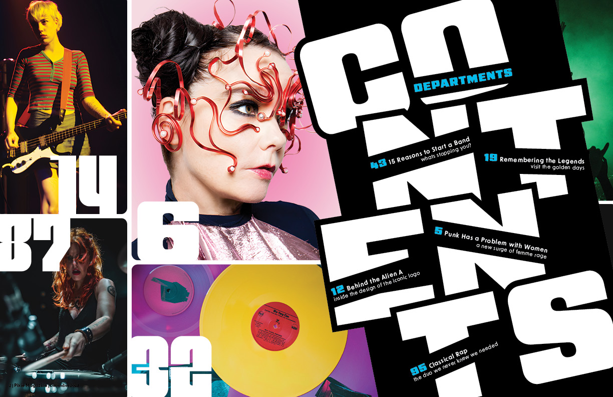
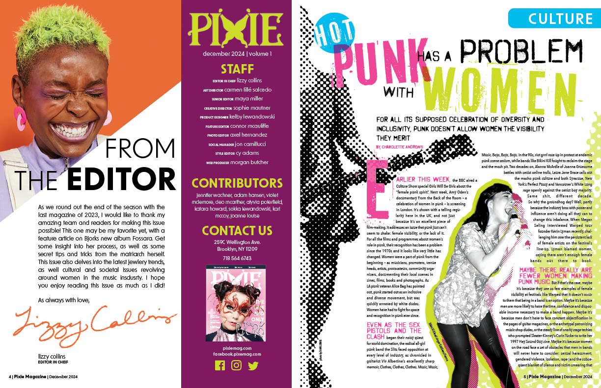
After finishing up the two features, I began working on the rest of the magazine. I used the same photo of Björk on the cover that I did in the spreads and chose a similar background color with a slight radial gradient to give it a soft, ethereal feeling. I also placed the custom type on the cover to tie it in with the attached article. For the table of contents, I played around with a condensed, bold sans-serif and realized that the word “contents” had an even amount of letters in it. I broke the word into four lines and played with different angles and overlaps of each line to create a playful arrangement of the letters. To further push a dynamic design, I angled the letters across the entire page and fit the departments into the title. For the first department page, I used a combination of halftones, electric colors, and grunge fonts to translate the feeling of punk culture. I decided on the coloring for the editor’s note/masthead in a way that would blend well with the neighboring department but also be able to stand on its own. I feel the two pages mesh really well together but also have their own personalities. For the final department on the back, I challenged myself by trying to fit a lot of copy into a circle in a way that worked. To help the text flow better, I opened up the circle to have the copy flow out of it in some areas while being constrained in others. The use of putting the accompanying photos into circles as well further adds to the breaks and harmony within the design.
This project was such a creative challenge that I welcomed it with open arms and learned so, so much from it. I discovered how to work through intense creative blocks and learned how to begin trusting myself as a designer. I feel that with a lot of creative work, there is always a feeling of doubt that comes with the things you create. It can be hard to lean into your ideas and experiment with things that may be out of your comfort zone. You never know if something will work if you don’t try it first, and regardless, you’ll probably learn something along the way! This thought process helped me a lot when I would start to feel stuck or discouraged—just keep pushing, and something will come along. Through this perseverance, I was able to create a really successful magazine. I was met with a lot of positive feedback from my professors and peers, as well as friends and family outside of the design world. Winning a platinum award for this magazine was a way to prove to myself and other students that good, engaging design can come from anywhere as long as you have the passion. As I go into my career, I hope to remember to push myself, trust my gut, and not be afraid of taking creative risks for future projects. Overall, this process taught me so much about myself as a creative as well as different aspects of editorial design. I have such a strong love for graphic design, and I hope to one day work in magazine design to create more engaging spreads in the future!
Grace Howard is a passionate and creative graphic designer based in Portland, Oregon. She believes that when designing, the research, process, and evolution of an idea is one of the most influential parts of the design. Grace has a knack for hand drawn typography and illustration, often adding these elements into her design work. When she’s not designing or illustrating, she enjoys cooking meals for her friends, spending time with her two cats, and taking long walks around Portland’s historic neighborhoods.