When it comes to designing posters, symbolism can go a long way. Drawn from what the poster’s for, it can be subtle or overt, but either way it helps draw viewers in and keep their attention. This week’s batch of new and award-winning posters will have you staring at them for a long time!
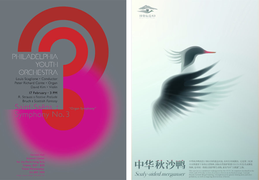
Gregory Paone, the creative director of Paone Design Associates, LTD., challenged himself to achieve his bachelor’s in fine arts, with a concentration in graphic design, from The University of Arts in the United States. Known for his colorful poster designs, one of his most frequent clients is the Philadelphia Youth Orchestra, who like to hire him to create promotional posters for their concert series. His “Philadelphia Youth Orchestra Winter Concert” poster (above, left) from our 2024 competition combines various elements such as size, hue, and balance, all of which was inspired by Saint Saëns’ “Symphonie No. 3 Avec Orgue”, which was included in the concert. As Paone puts it, “This masterpiece, originally written in two movements, provided inspiration for the poster’s artwork, where chromatic patterns play a pivotal role in both movements. Each singularly powerful voice of the organ is presented as color moments in the poster — a subtle, darker role in the first movement, and a noble and powerful role at the end of the second.” The curve of the circles offset the thin san-serif font Paone developed for the posters and program books. All together, the poster is both infomative and artistic, catching your attention with its shapes and colors.
The Qaidam, a basin in China filled with forests and wetlands, is home to many beautiful animals such as the scaly-sided merganser bird. However, thanks to an increase in pollution and hunting, the bird became an endangered species, according to The International Union of Conservation of Nature. To combat this, the Haixi Government of Qinghai, China, reached out to designer Mengxi Cui and asked her to design a series of posters to bring awareness to the animals of the region. “Save Animals in the Qaidam” (above, right), which won Gold in our 2023 Poster competition, depicts five different animals, such as the aformentioned scaly-sided merganser and the snow leopard, with simple lines and little detail. Parts of the animals seem to fade into the soft pastel backgounds as if walking into a fog, a visual metaphor for how the animals are disappearing as they become endangered. Thankfully, Cui says that the project was a success and attracted a lot of viewers, bringing this issue to their attention.
