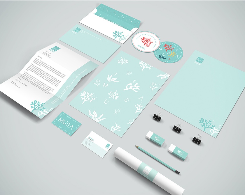
Need a new favorite resturant to grab some great food? Have to write a letter and looking for some fancy stationary to write on? The latest entries in our New Talent 2022 competition have you covered with their unique, interesting design work.
If you aren’t familiar with Vietnamese food, Madame Vo‘s is a good place to start. Located in the East Village of New York City, Madame Vo opened in 2017 as one of a handful of contemporary Vietnamese establishments. Its owners, couple Yen Vo and chef Jimmy Ly, were inspired to open Madame Vo thanks to the plentiful Vietnamese food Vo ate when living in Houston, Texas, as well as Ty’s childhood helping his parents run their banh mi shop, Paris Sandwich. SInce opening, Madame Vo has been a great success, to the point the couple opened New York City first Vietnamese BBQ place, Madame Vo BBQ, in 2019.
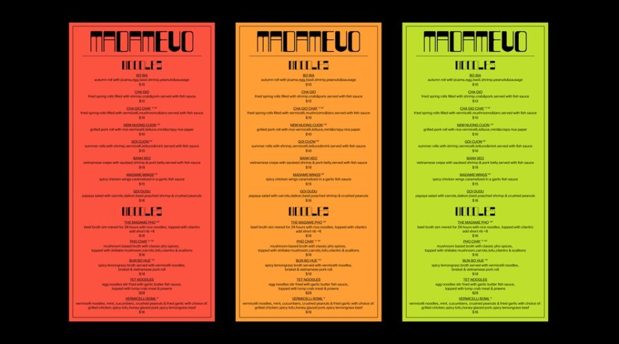
“Madame Vo Rebranding” (above) is a visual identity rebranding project. Zitong Zhao, the student behind new look, needed to not only redesign the logotype, but also other promotional materials. Zhao used the resteraunt’s food for inspiration, looking to their famous pho, a soup with noodles and bold flavors, for creating the type; with how the letters are composed of thick and thin lines, it looks as if the words are spelled out with noodles. For the bright color palette, Zhao again looked to their colorful foods, using shades of red, orange, and yellow-green. Overall, it’s a satifying new visual identity that suits a great place to eat.
