This week’s new Packaging 10 entries revamp the look of one of the most well-known energy drinks and a budding hard seltzer brand.
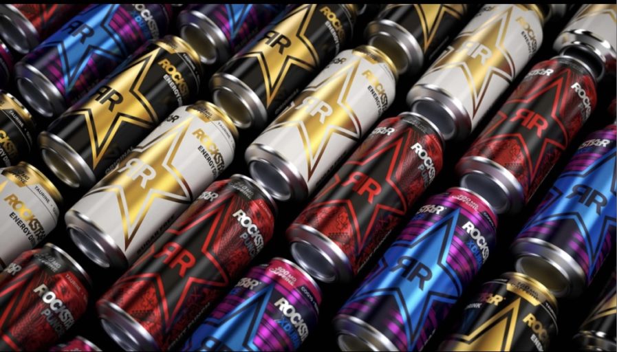
Designed by PepsiCo Design & Innovation, “Rockstar Energy Redesign” (above) sees its first brand “remix” in over a decade: “We re-engineered our iconic star logo to be modern. Timeless. Premium. Our new packaging architecture leverages the star as a supergraphic that connects cans on shelf with advertising in field to create a bold billboard that transcends touch points.”
The packaging does well to visually display the high energy level Rockstar beverages ensure to provide. It’s hard not to be drawn in by the bright, glossy artwork and logotype, coming with an array of different stylized cans. It also made changes to enhance the consumer experience: “We developed an innovative ‘paired’ product imagery which gives us … easy information navigation for consumers. We brought key information to the top of the pack and created an iconographic caffeine level system so customers can shop across the portfolio based on their energy needs — caffeine levels are something other energy drink brands relegate to the back panel.”
The launch of these updated cans was a huge endeavor. The brand pulled out all the stops with its first television commercial and integrated 360 campaign, and was equally successful in Rockstar’s goal to create a standout and personalized new look on par with the brand’s image and credibility.
