From a showcase of beauty to a plea of change, a call to protection to a message of hope, this week’s featured designs in Graphis’ Protest Posters 2 competition are all about nature — both earthly and human.
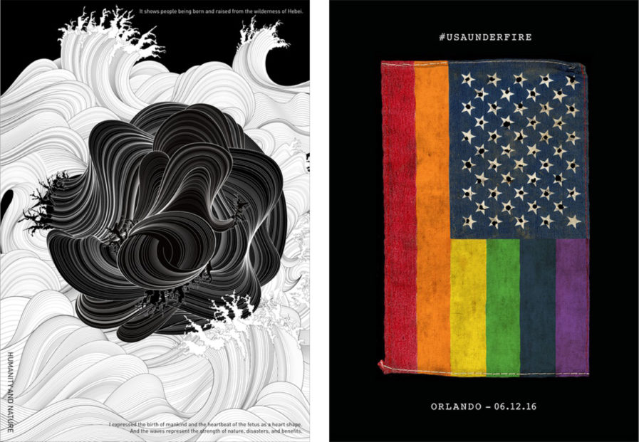
“Humanity and Nature” (above, left) was designed by Hajime Tsushima from Tsushima Design for the 4th Hebei Tourism Industry Development Conference of Shijiazhuang. The conference took place in Shijiazhuang in China from October 14-16, 2019, where the “Hebei in World’s View” International Poster Exhibition was also held. The theme of the exhibition was “Hebei and Hebei,” with “Humanities and Nature” as the core content, and aimed to showcase Hebei’s unique and profound cultural traditions as well as the rhythm and natural scenery of the province. To capture this, Tsushima worked with various graphic designers from around the world. The poster shows people being born and raised from the wilderness of Hebei; the designers wished to express the birth of mankind and the heartbeat of the fetus with the shape of a heart. The waves, meanwhile, represent the strength of nature and disasters, as well as the magnificent Hebei scenery. The poster was successfully shown in the exhibition, where it was enjoyed by all who attended the event.
Next is “#USAUNDERFIRE” (above, right), created by Patricia McElroy and Dermot Mac Cormack. The husband and wife duo founded their own visual design studio, 21xdesign, in Pennsylvania in 1997, where they specialize in branding, printed material, websites, and interactive experiences. The couple was compelled by the Pulse Nightclub shooting in Orlando to make a poster that would bring attention to gun control and the role guns play in these tragic events. McElroy and Cormack knew they wanted to feature an American flag, and went through many iterations, from illustration to photo recreations. One day, came across a cardboard box that contained a small, old weathered flag and immediately knew they wanted to use it. Rainbow colors were photoshopped in along with bullet holes to complete the poster. While the typography is minimal, it’s a powerful reminder of both the poster’s purpose as well as the time and location of the tragedy. The finished result speaks directly to the Pulse shooting while also asking a fundamental question about sensible gun control.
