Feeling down and need a mental or physical stress reliever? These two designs are sure to help!
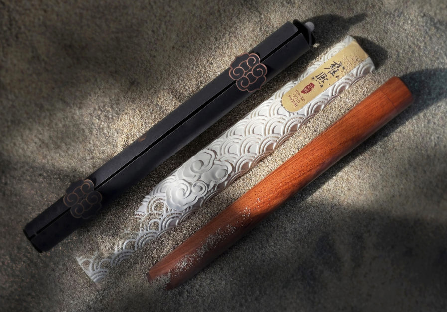
Our first design for today is the “Yongxi Gold Phoebe 2 in 1 Incense Holder,” designed by En Ke of TSD Design Inc. TSD Design, or Shanghai Transcend Design, is a team of brand marketing experts operating out of Shanghai, China. They specialize in various aspects of branding like website construction, visual design, architectural space design, and photography and television. Their clients include the makeup mogul Avon New York and Victorinox, a Polish manufacturer most well-known for its Swiss army knives.
In addition to being beautifully designed, with both the incense sticks and tubes made of precious wood and wrapped in black environmental protection paper, the incense holders have a dual function: storage and space to burn incense. The design also makes use of the rich history behind incense; in ancient times, “golden phoebe” incense was exclusive to the royal family but is now enjoyed by everyone.
However, the design did not come easily. En struggled in his attempt to combine minimalist modernity with a respect for tradition. In order to strike a perfect balance, he based the structural design off of bolt-type western firearms and implemented a cloud pattern found on the Nine Dragon Wall of the Forbidden City. As a result of En’s combination, the incense holders were given China’s National Innovation Invention patent in 2019, as well as praise from the incense collection industry and community.
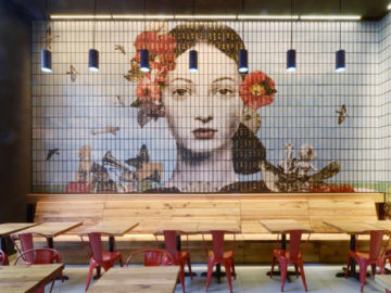
Looking for that springtime motivation to work out? Look no further than CLARITY FITNESS DECATUR, GA., designed by a collaboration between Jan Lorenc of Lorenc + Yoo Design and Matthew Finn of Cognitive Design. Lorenc has won several awards in his design career, including two Silver Awards in Graphis’ 2017 Poster Annual. Finn, the founder of Cognitive Design, has also won his share of accolades, including being named Healthcare Design’s 2016 HCD 10 Researcher.
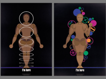
Gyms have definitely evolved in the past twenty-five years, and it is this change that inspired Lorenc and Finn in their design of Clarity Fitness. Lorenc and Finn also sought to incorporate body-positive imagery within their design: Finn and his team took antique bathroom scales and smashed, torched, and hung them as a taxidermy-style display. An exhibit of smashed scales reminds people that their weight doesn’t equal their worth and challenges them to find a personal “why” for coming to the gym. COVID-19 and its effects also provided additional motivation, as their finished design had to both incorporate opportunities for cleanliness and air purification and look appealing to in-person and online users.
The team also wanted their messaging to come through in other ways. While the demolished scales gave off a major message, the signage throughout was integrated into the simple yet modern interior design, keeping the overall space simple and bold. As a result of their collaboration, the project functioned as a unique environment and provided a safe, body-positive space.
Feeling inspired? Check out our main website to see other Design Annual 2022 entries. Remember to submityour entries before it’s too late!