2024 Poster Design Awards: D-Space and Free WiFi, Free Coffee, Free Work

2024 Poster Design Awards: ‘D-Space’ + ‘Free WiFi, Free Coffee, Free Work’

Hoon-Dong Chung’s ‘D-Space’ Balances Future-Oriented Design with Contrasts for Graphis’ 2024 Poster Design Awards

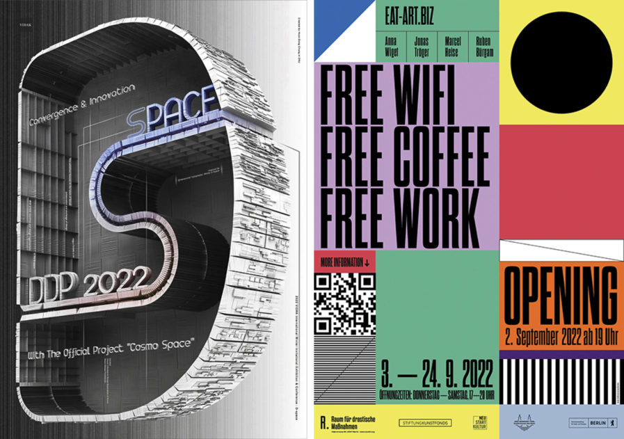
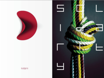
This recent entry to the 2024 Poster Design Awards competition by Hoon-Dong Chung, a designer from Dankook University in South Korea, caught our attention, and we couldn’t wait to learn more. The poster design was created for an international exhibition, ‘D-Space‘ (above, left), which focused on future-oriented design. In this blog post, we’ll delve further into the details of Chung’s ‘D-Space’ submission, examining how he seamlessly wove together contrasts and future-oriented design principles to create another outstanding work of art. So let’s take a closer look at the work of this talented designer!

By: Hoon-Dong Chung

“In December 2022, I had the opportunity to attend an international poster exhibition hosted by the Visual Information Design Association of Korea in South Korea. The exhibition’s theme was ‘D-Space,’ related to future-oriented design (or future-oriented design environments).

“3D typography has long been an interest of mine. Perhaps some designers (or people) are familiar with my work. The same context applies to my piece ‘3D Type Exhibition‘ submitted last year. ‘D-Space’ is shaped to emphasize the cyclical (or communicative) nature with the letters ‘D’ and ‘S.’  Compared with ‘3D Type Exhibition,’ ‘D-Space’ has various contrasting characteristics such as emptiness and filling, openness and closure, achromatic and chromatic, matte and glossy, opaque and transparent, and darkness and brightness. 

“In addition, the morphological approach in 3D is also contrasting. I considered differentiation from my previous work because my design philosophy is ‘contrast is harmony.’  The contrastive approach’s influence is revealed within one work and, at times, exchanged among multiple works. In the process, I gained expanded possibilities as a result, too. 

“In short, I intended to highlight two things while designing ‘D-Space.’ One was to express a future-oriented theme, and to make something different from my previous work. At the end of the day, these two goals came together (or merged) into one.”


Studio Lindhorst-Emme+Hinrichs’ “Free Wifi, Free Coffee, Free Work”

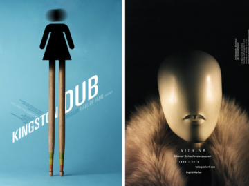
This Poster 2024 submission by Studio Lindhorst-Emme+Hinrichs (Germany) showcases the power of design to communicate the concept and essence of an exhibition for an artist group during a gallery weekend in Berlin. Their entry highlights the impact of the visual language and hierarchies in promoting the exhibition. Let’s explore more about their design in this blog post.

By: Studio Lindhorst-Emme+Hinrichs

“‘Free Wifi, Free Coffee, Free Work‘ (above, right) is a project by the artist collective Eat-Art.Biz. The title of the project is a reference to urban co-working spaces in which, between free wifi and coffee consumption, the individual becomes a working black box. The exhibition and performance took place in the 10-year-old established alternative gallery, Raum für drastische Maßnahmen (Room for Drastic Action), and in the context of Gallery Week 2022 in Berlin. 

“‘Free Wifi, Free Coffee, Free Work’ transformed the gallery into a hybrid place, changing the exhibition space into a multifunctional living, working, and presentation space for three weeks. It was a kind of hub, which at first sight reminds us of a co-working space. Within this space, situations that bend the boundary between exhibition space and mundane reality are created. 

“Very quickly, it became clear that a purely graphic/typographic solution would be more than appropriate. In addition, all four members of the artist collective and us designers found a design aligned with their concept but free from their content to be best. The focus was thus on color, graphic surfaces in play with each other, and of course, the use of type in the overall interaction with the colors, textures, and shapes. To attract attention in Berlin, we have also made sure to design a poster that can unfold its effect over a large area. The further use for invitations, mailings, and even a car in this design pasted as an “art shuttle” was not only feasible with this design but also purposefully striking. As an animated social media version, the poster rounds off the overall package.”

For more design inspiration, check out the winners of 2023’s Poster Design Awards: Great Designs In Different Forms: Poster 2023 Award-Winning Works and New Entries.

Bio

Studio Lindhorst-Emme+Hinrichs is run by Lea Hinrichs and Sven Lindhorst-Emme. It was founded in 2011 by Sven as Studio Lindhorst-Emme in Berlin. Lea and Sven worked together on projects for quite some time before they renamed the office at the end of 2021 and have been running the studio together as equals ever since.


Have a poster you’re proud of? Submit it to our Poster 2024 competition here.

Author: Graphis