Responsibility for Space and Time: Boris Ljubicic Featured in Graphis Journal #371

With Graphis Journal #371 available for preorder, let’s look into the wonderful array of designers, advertisers, photographers, and more in this latest issue!

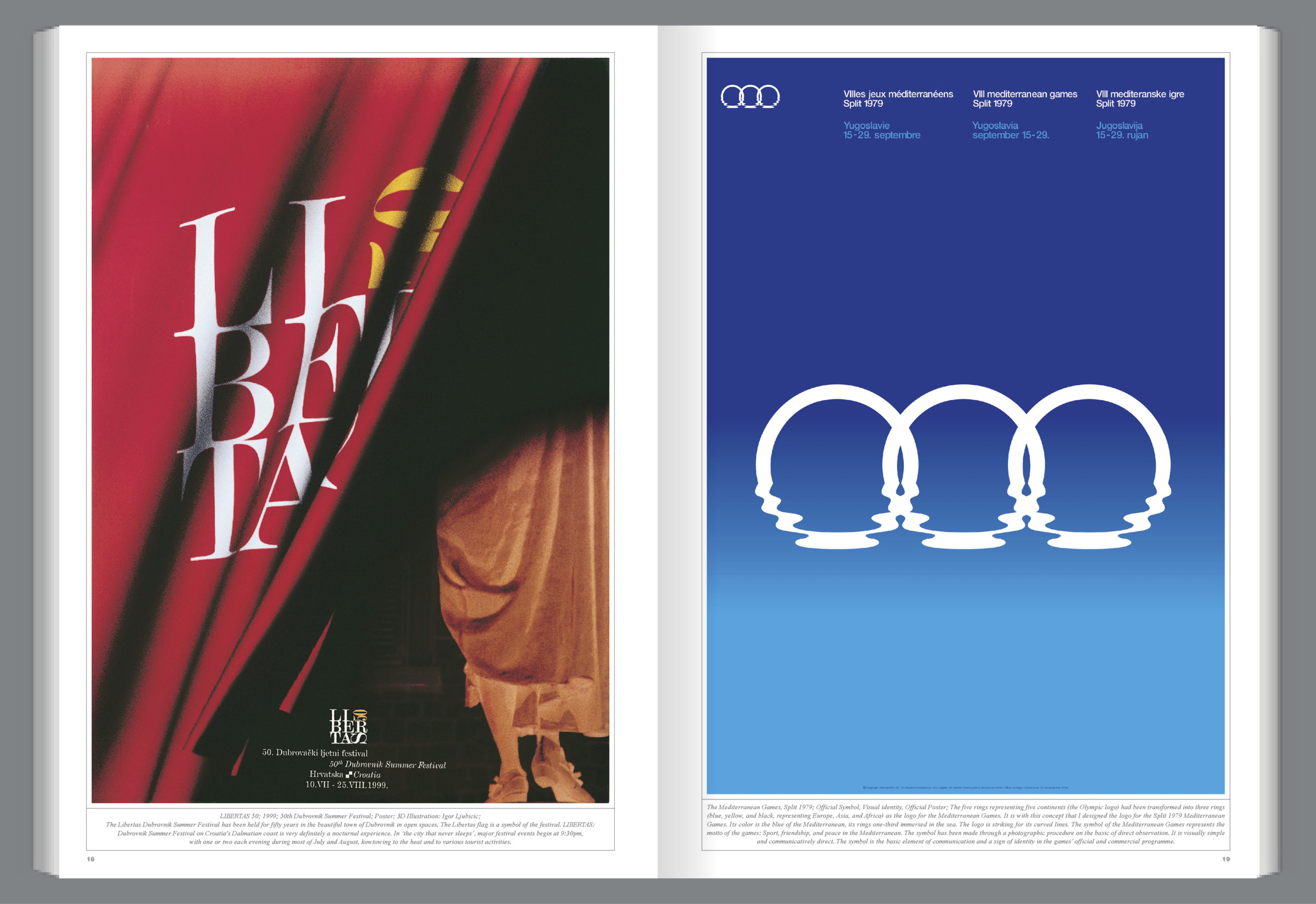
Coming in from Croatia, Graphis Master Boris Ljubicic graduated from the Academy of Fine Arts in Zagreb, where he had studied painting. Dedicating his time to graphic design and visual communications as a freelancer, he broke onto the design scene with his logo for the 8th Mediterranean Sports Games in Split (1979) (below, right). He went on to open his design firm, STUDIO INTERNATIONAL, in 1986, where he continues to work as an art director while his son, Igor, runs the studio. A recognized explorer of visual communications and design, his work covers all design categories from visual identity, typography, and billboards to books, TV, and web design. Not only are his works exhibited in half a dozen most significant international competitions, but they also regularly appear in international magazines and specialized publications that influence future design.

According to Ljubicic, his works are “dissimilar, challenging, and confusing”. He also likes to including messaging in his designs to make them double-coded. For example, his self-portrait (above), which he created as promotional material for an exhibition of his in the Museum of Arts and Crafts, fuses two different photos of Ljubicic, one clean-shaven and the other with a beard, together. The image works to correspond with the exhibition’s title, Square & Circle; those are two basic yet opposed geometrical shapes, just like the planes of Ljubicic’s face.

Here is a snippet of his QA:

What is your work philosophy?

My motto is “Responsibility for space and time. That means improving or redesigning as much as possible, and if projects are not designed or commissioned in that way, I initiate them myself. My philosophy is an incorrect mathematical formula, 1 + 1 = 1, which is a mistake, but mistakes can be very creative. Synthesizing two or more opposing elements into a new, comprehensive picture so that they blend into a new project where no traces of the previous process remain — that is true creative art. Design implies combining the seemingly incompatible. One example is Goroslav Keller’s book Dizajn/Design, for which I designed the cover and created the title. In the former socialist state of Yugoslavia and the Republic of Croatia, design, as a term and practice, did not exist in the full sense of the word, and the broadest strata of society did not understand, accept, or appreciate it. The cover of the book was designed as an educational concept and approach to design where one word reveals the other as a Croatian and global (English) term. I think I was able to successfully achieve this kind of synthesis several times during my career.

Who is or was your greatest mentor?

I never had mentors. When I was studying at the Academy of Fine Arts in Zagreb, we did not even have design as a subject in the curriculum. Through design magazines, I was introduced, relatively late, to the work of Wim Crouwel from Total Design, Alan Fletcher from Pentagram, London, and Shigeo Fukuda. I was attracted to the different approaches they used. Wim Crouwel is disciplined, and he pushes his design past the point of what’s possible. Alan Fletcher is a charming illustrator who can seduce you with his immediacy in processing ideas. Shigeo Fukuda is a surrealist designer and quite original in the context of Japanese design. Although each one is quite different, they all influenced my work, which is itself very disparate in approach.

What part of your work do you find most demanding?

The concept, because I build everything on it. The best example is the visual identity I designed for the Croatian Radio Television (HRT). Television as the medium of communication is populist by nature, and the designer needs to adapt to it. However, the TV medium also allows the visible design to enter the public space. With the design of the HRT logo with two squares placed on the letter “T” my intention was to define the visual identity for all of Croatia, as a state and beyond. The logo used to rotate on the screen on three separate TV channels literally 24/7. A large and comprehensive graphic standards manual was also designed and applied to various contents.

What professional goals do you still have for yourself?

I would like to write a few books on design and define my personal approach to design.

Pre-order your copy of Journal #371 at graphis.com.

Author: Graphis

Leave a Reply

Your email address will not be published. Required fields are marked *