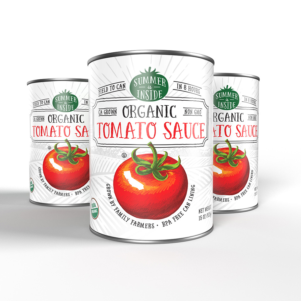
Designer Tim Gatto was tasked with redesigning Saracina Vineyards wine packaging after the owners of the vineyard, the Taub family, had just acquired a brand new property loaded with potential! To coincide with this, designer Jamie Stark had the opportunity to design both eight and twelve pack boxes and labels for organic, canned tomato products sold by Costco.
Gatto’s conception of “Saracina Package Redesign”(above) was designed to reflect the balance between the new property’s rugged terrain and the winery’s elegant and modern architecture. The varied textures of the artwork paired with the sans-serif font mimic the built components on the land at the winery. Gatto’s goal of this redesign was to give the consumer a feeling of place by creating an interpretation of visiting the winery, even if you pick it up at your local liquor store.