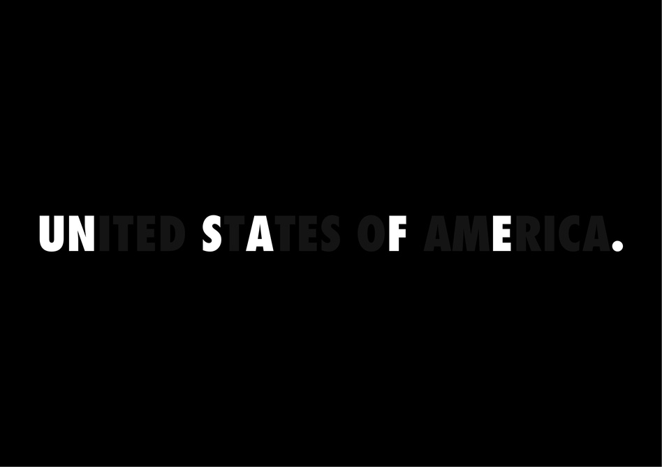
With many countries across the globe experiencing civil unrest and protests due to issues like racism, police brutality, and more, much of the world’s population have had different responses. These responses are exemplified by designers from Ghana, Japan, and the US in this week’s Protest Posters 2 entries.
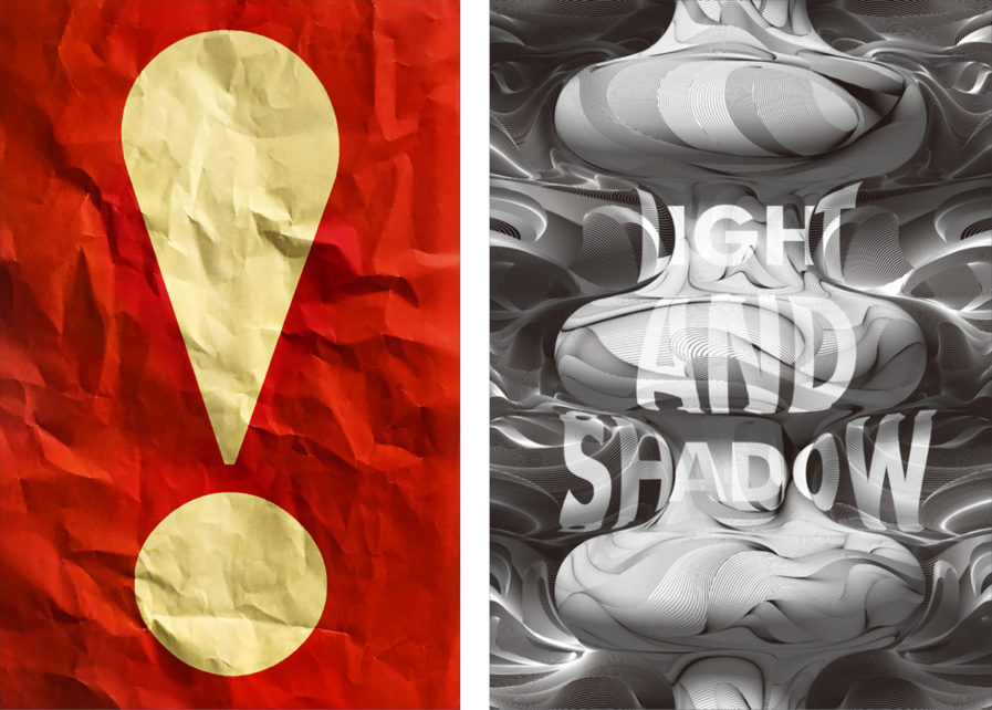
American designer John Sposato created our first entry, “Protest!” (above, left). This poster was created as a promotion for the book, Protest! The Posters That Changed The World 1968-1973; published by Editions Du Chêne, it is a collection of vintage posters from an era of international political turmoil and social change. Sposato said that he used wrinkled and distressed paper for this design to “suggest the historical, archival nature of the book’s contents.” He also added that the exclamation point was enlarged to “symbolize the dramatic impact of the poster form for protest.” As a result, the author of Protest! The Posters That Changed The World 1968-1973 was delighted by his design. While his work was used to symbolize past protest posters, “Protest!” can continue to be used today as it celebrates the spirit of protesting and standing up for what you believe in.
The next design is titled “Light and Shadow” (above, right) and was created by Japanese designer Hajime Tsushima for the Peace Poster Exhibition held annually in Hiroshima. For his design approach, Tsushima used black and white to create an effect of lights and shadows. His inspiration came in part from stars, and how when they run out of fuel, they no longer shine and end up dying. “Light means the birth and death of life,” says Tsushima. “And when there is light there is a shadow.” He believes his poster has conveyed a message of peace to many people; everyone’s star goes out eventually, so why not live in harmony?
