
(Above) DNA Design for Andy Millard, Steel & Tube | Creative Directors: Phil Dunstan-Brown and Grenville Main | Strategy Director: Sherryn Macdonald | Designer: Greg Dyne | GOLD AWARD
IN THEIR OWN WORDS:
“For Steel & Tube — a longtime DNA client (21 years and counting) — DNA have delivered a new brand to coincide with the company taking a new structure to the market. We undertook customer and staff research which informed how we strategically set a definitive leadership proposition for the company and one that would define their standing and offer in the market.
The restructure was significant — a game-breaking strategic initiative set within an industry structure that operates with very little differentiation. The re-brand offered Steel & Tube a tangible vehicle to help signal positive change and demonstrate a new market promise — internally and externally. This positions Steel & Tube as one company, a cohesive unit with many different facets and the broadest capability in the market.
The ‘Stronger in Everyway’ positioning was developed to herald a confidence and determination that has catapulted Steel & Tube to the market leader status within their industry sector.”
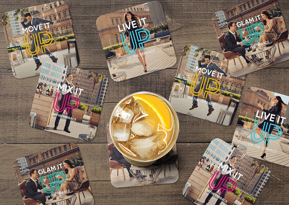
(Above) Blaze Advertising for Dexus | Photographer: Juli Balla | Creative Director: Rory McLean | Art Director/ Designer: Costa Popolizio
IN THEIR OWN WORDS:
“The Terrace, located on the 15th floor at One Farrer, is a premium outdoor venue space in the heart of the business precinct in the Sydney CBD. The venue is designed for corporate events and social functions. Dexus, GPT and Lendlease (building managers) required a brand and campaign to help build awareness of the venue, which launched in February 2018. In order to promote The Terrace, we developed a brand tool kit that comprised of an identity, messaging and photography.
The ‘Up on The Terrace’ phrase was developed to reinforce the height of the location. The lockup can be tailored to suit a diverse range of events — i.e. ‘Glam It Up on The Terrace’ (formal events), ‘Move It Up on The Terrace’ (corporate events), ‘Live It Up on The Terrace’ (social events) and ‘Mix It Up on The Terrace’ (cocktail functions). Taking visual inspiration from the One Farrer logo (the identity of the building which The Terrace is located), the use of elegant double lines was utilised in the word ‘UP’ to create a tasteful look and portray it as a venue of distinction.
The key selling point of The Terrace is the up-market location and also being the largest outdoor venue of its kind in the Sydney CBD. To visually bring this to life, the art direction takes its cue from fashion photography, combined with the beautiful architectural surroundings to create a look that was aesthetically appealing.”


