From tough jackets packaged with cool science and a worthy cause to tasty tea and their bilingual bags, here are this week’s featured Packaging 10 entries!
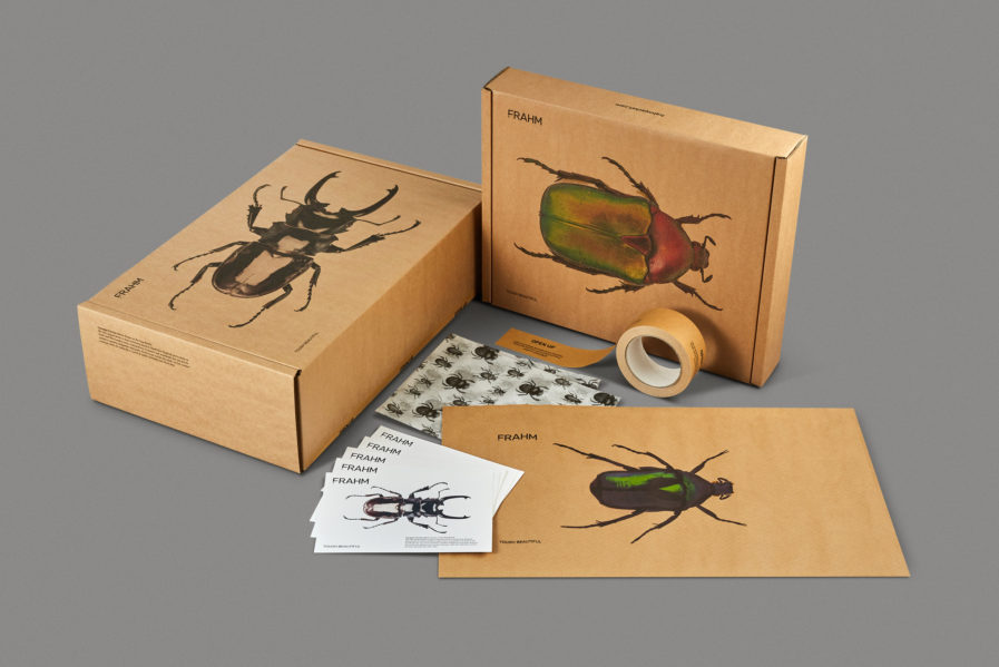
Our first featured design today is “FRAHM Jacket Packaging. Tough Beautiful.” FRAHM are a small, family-run business in the United Kingdom, and pride themselves in making the most beautiful, technical and detailed jackets. As a reaction to mass-market clothing and fast fashion, they work as an online-only business, where customers place a pre-order for a small batch of designs. FRAHM also speaks openly about mens’ mental health – every jacket purchase supports the charity “Mind.”
FRAHM was looking to update their packaging to make it environmentally friendly and memorable, and to do so they turned to designers Jamie Ellul and Phil Skinner of Supple Studio in Bath, England. Both designers have gained their share of accolades; Ellul is a Fellow of the Chartered Society of Designers and has been awarded eighteen D&AD (Design and Art Direction) awards, and Skinner was selected as one of Design Week’s Rising Stars. Their solution to FRAHM’s desire to rebrand while still reinforcing their “Tough Beautiful” mantra? Macro shots of beetles native to the UK– some of nature’s most tough and beautiful creatures. Printed large scale on boxes and bags, complete with factual blurbs on the sides of the boxes and on inserts, the beetles also reflect the durability of FRAHM’s garments, as they are great for wearing outdoors in all types of weather. Ellul and Skinner sealed the deal with “Open Up” packaging tape that reminded customers of FRAHM’s support of Mind.
The new packaging created a “buzz” in the FRAHM community, with renowned menswear blogger @WellDressedDad calling it “the best packaging he’d seen in a while. Possibly ever!”
