A Life’s Worth of Letter Work: Michael Doret Featured in Graphis Journal #370

If you love letter work and typography, you’ll love the work of Michael Doret.

Michael grew up in Brooklyn near what are now the remains of the collection of amusement parks known as Coney Island. At the time, his father worked for MGM in Manhattan’s Times Square. Consequently, the inspiration for his work came from his early years growing up near the lights, signage, and brilliant colors found near his Brooklyn neighborhood, and which also surrounded his father’s office. Later in life he found similar inspiration in such diverse sources as matchbook covers, enamel signs, packaging, and numerous and varied artifacts of the mid-century America he grew up in. Over the years his work has earned dozens of awards, and Michael has lectured and taught workshops at many institutions. His book, Growing Up in Alphabet City, will be published in 2022 by Letterform Archive.

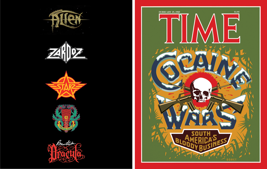
Micahel’s letter work and illustrations have a bold, vintage feel to them. His magazine covers, such as “Time Magazine Cover 4” (above, left) and “Time Magazine Cover 2” (below, right) combine eyecatching imagery along with bright colors that easily catch a potential reader’s attention. His logo work (below, left) ranges from incredibly detailed to more simple, yet each do an excellent job in promoting their brand to consumers.

Here’s a snippet of his QA:

Who is or was your greatest mentor?

I have had many people over the years who have helped guide and encourage me. My high school art teacher, Sol Schwartz, was probably the biggest and most influential mentor I’ve had. If he hadn’t seen something in me and strongly encouraged me to follow my path towards a career in art, I probably would’ve ended up being an attorney. In college (Cooper Union) two of my professors were wonderful mentors to me: George Salter, my calligraphy teacher, and Robert Haas, my typography teacher, at whose print shop I interned at on school nights. After Cooper, my first real job was as Ed Benguiat’s assistant. I learned almost everything I know about letterforms from him.

Who were some of your greatest past influences?

I cannot really name anyone in particular as an influence. I’m most attracted to work from the past that was done by nameless designers and sign painters who may have had some training, but mostly did creative lettering work that didn’t belong to any particular school of design or movement. Much of their work seemed to “break the rules” of accepted design practice — they didn’t know all the rules and didn’t realize they were breaking them. It is this work by people who designed matchbooks, neon signs, film posters, pulp covers, comic books, cigar box labels, car badges, etc. that I look up to and admire.

Who have been some of your favorite people or clients that you have worked with?

I’ve worked with many terrific ADs. Among the best of the best I would count Walter Bernard, with whom I worked when he was at TIME Magazine, and John Sabel, when he was at Disney.

You have a distinct style that combines different elements of lettering and illustration. How did you develop that style? What influenced it?

If I developed a “style”, it was on a completely subconscious level. I believe that the way my work appears evolved naturally, influenced by everything that surrounded me as I grew up in mid-century Brooklyn. I didn’t ever try to give my work a style, or make my work look like anything in particular. I’ve always been solving problems in the work that I do, and, to me, the look that the work has evolved naturally from the type of solutions that I came up with. 

Read more about Michael Doret in Graphis Journal #370. Pre-order now! 

Author: Graphis

Leave a Reply

Your email address will not be published. Required fields are marked *