There’s a lot to love about brands, from the way they present themselves to the stories they tell. These two designs boast both an awesome appearance and let us know what the companies behind them are all about!
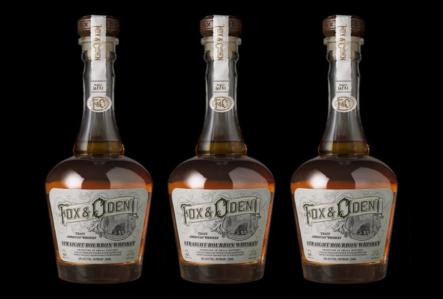
Fox & Oden, a Michigan craft distillery, got their name from both Michigan’s notoriously cunning red foxes, as well as the island of Oden, a majestic retreat off the northern part of the state. Inspired by the area’s deep immersion in nature, the distillers crafted their new, super-premium North American whiskey in tribute to the rugged bounty and raw beauty of their state, and they approached CF Napa with the task of creating the custom packaging. When devising their “Fox & Oden” (above) bottle design, the team knew it needed to embody the company’s rural roots while also maintaining a sense of luxury. This led to the creation of a custom whiskey bottle reminiscent of vintage whiskey decanters with its long bottleneck and curved body. For the label, the agency created a hand-drawn type with delicate gold foil accents to give the whiskey brand a bespoke sensibility while reinforcing its premium positioning. The label’s image of the namesake fox emerging through the tall pines echos the brand’s love of Michigan’s vast forests and explorable wilderness. For some final touches, the branding agency made a dark wood closure decorated with a jagged-edged paper label, adding the perfect amount of rustic charm to offset the bottle’s overall elegance.
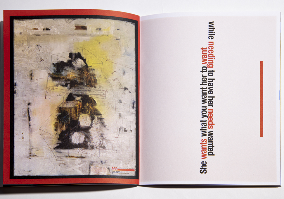
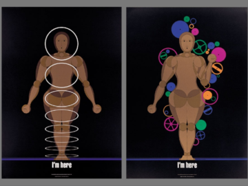
Rex C is a creative agency that specializes in “creative conformity,” which is the understanding and acceptance that our society contains certain constraints and ways of doing things. The agency prides itself on its ability to play by the rules while also delivering a product that’s shockingly on target and unexpected at the same time. Their most recent submission is a perfect example of that. Made as a collaborative project, “She*” (above) was born from the idea we should all treat our brands with true love. As the company explains, these are times when businesses “should take the pulse of their brands and assess where she is in her growth and health. Now is the time to emerge, perhaps to make the changes and take the chances she has always wanted you to explore.”
With that concept in mind, the Rex C team wrote a non-linear poem touching on many of the feelings and realities brands face today. In the spirit of individuality and how different minds would view similar thoughts, the agency gathered a group of some of today’s most creative and prolific professionals to interpret segments of the She* poem. The project result in a boxed, french folded, 30-page brochure with a poster and a short video for the company’s website and social media channels. Despite the worry that viewers wouldn’t understand the company’s intentions, people quickly saw the correlation and the concept behind the project and fell in love. The approach of taking the viewer on the journey instead of spoon-feeding them created a more powerful connection.
To see more of our Design Annual 2023 submissions, visit graphis.com!