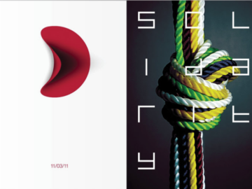
This week, we have a wide variety of winning posters from this year’s selection of Platinum, Gold, and Silver winners. Each of these posters brings something unique to the table in terms of both design and execution, showing there is no “one-fits-all” template for what makes a striking poster design.
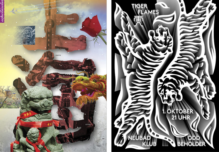
First up, we have a Gold-winning poster from designer Randy Clark. Titled “Shanghai” (above, left), this poster was created both for the China Museum of Art and the 10 x 10 International Invitational Poster Exhibition. Being a resident of China himself, Clark spent several days translating his love for the beauty of this country into a visual work of art. The result is a collage of striking imagery that manages to capture the artistic spirit of China, while also encouraging the viewer to study the poster to find new details they might have missed at first glance.
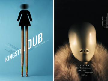
Our next poster is a Platinum award winner from German designer and Graphis Master Fons Hickmann. “Tiger Flames” (above, right), is meant to advertise a lo-fi music project of the same name. For their concert at Neubad Lucerne, the design plays with analogs of the band’s name, using tigers surrounded by flame-like shapes. The design also pulls elements from Asian package design, which is used to great effect. The poster combines these aesthetics with a 3-D perspective, giving the poster depth that creates intrigue. The black and white design contributes to this as well, leading the eye to get lost in the dark and endless crevices created by the designs.
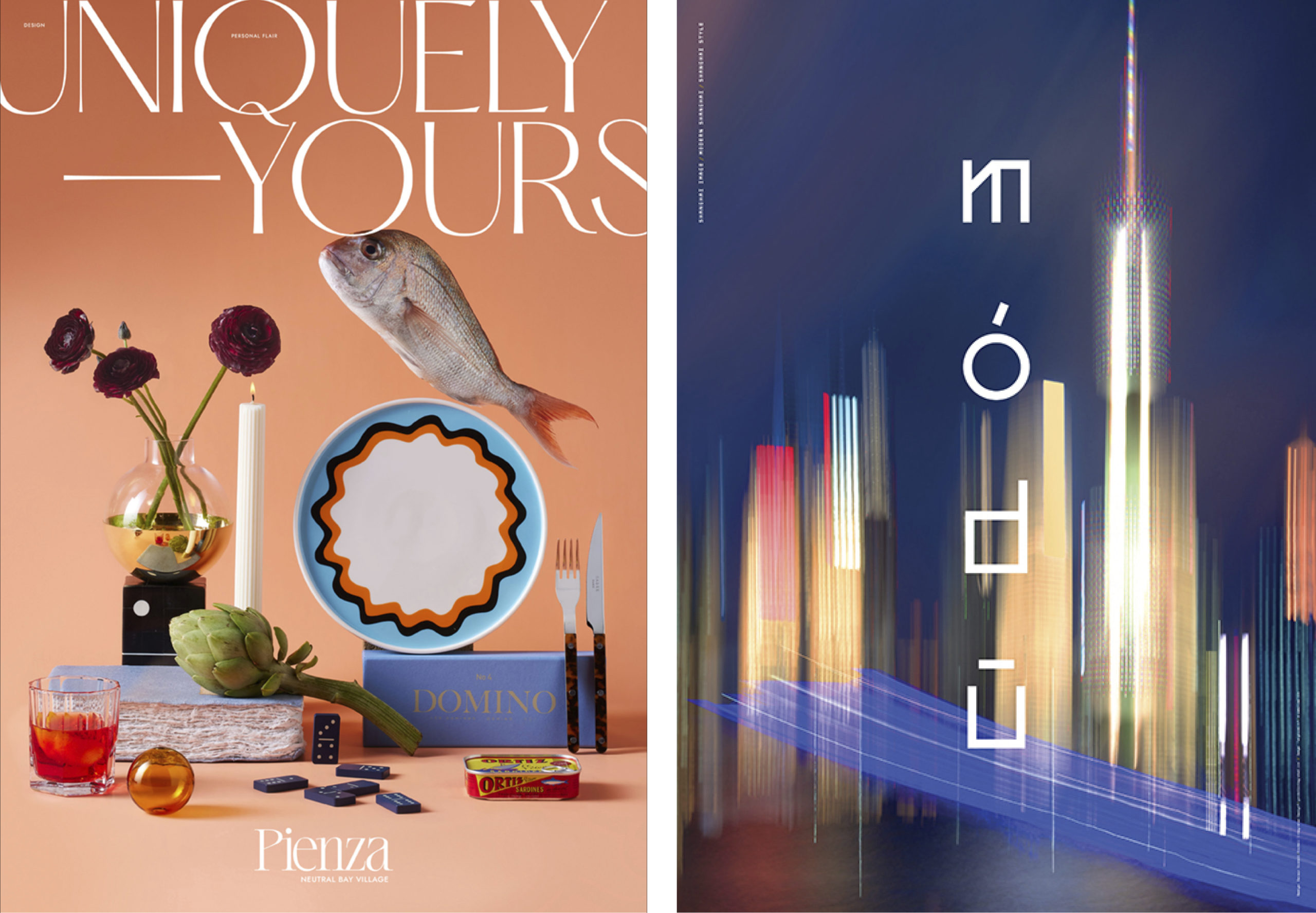
Thirdly, we have another Gold winner, “Pienza” (above, left), created by designer Martin Brown from the Australian design firm Hoyne. The Pienza at Neutral Bay Village is a series of apartments, advertised as “welcoming individual style, nurturing lifelong passion, and redefining apartment living.” To capture ideas of both individuality and familiarity, the posters in this series include a collection of random household objects, arranged in a manner similar to a still life painting. The variety of the objects highlights uniqueness, while the arrangement alludes to the elegance of the apartments being advertised. Objects are also seen to be floating in each of the posters, bringing to mind whimsy, freedom, and spontaneity.
Finally, we have the Silver-winning poster “10×10 Shanghai” (above, right), from Canadian designer Derwyn Goodall. It was created to advertise the 10×10 Global Poster Exhibition in Shanghai, and its purpose is to convey how the city of Shanghai is vibrant, exciting, stylistic, and modern. To accomplish this, Goodall leaned into one of the city’s nicknames, “Módū.” Módū, or “Magical City,” was first mentioned in Shōfu Muramatsu’s 1924 novel Mato, which portrayed Shanghai as a dichotomic city where both light and darkness exist. Goodall uses this description to create work that uses both light and dark to highlight Shanghai’s vibrancy. The skyscrapers of the city are abstracted into pillars of colorful light against an evening sky. The city looks inviting and ethereal, like a place in a dream, while at the same time appearing as a beacon of the future.
You can check out the full collection of our Poster Annual 2023 winners here. To enter our 2024 Poster Annual Awards competition, click here.