If you’re feeling thirsty for new designs, Graphis has you covered— this week’s featured Packaging 10 submissions are unconventional, refreshing, and ready to make a splash!
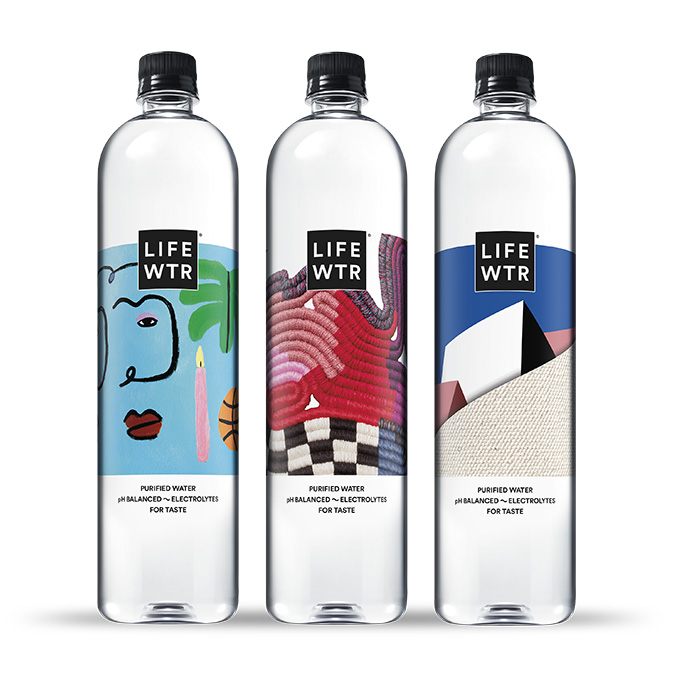
It’s important to stay hydrated, and what better way to drink water than from a beautiful bottle? This is exactly what PepsiCo Design and Innovation has done with their new water bottles series, “LIFEWTR Series 8: Unconventional Canvas” (above). LIFEWTR is a premium water brand that has always been committed to advancing and showcasing sources of creativity, serving as a source of hydration, inspiration, and as a platform for emerging artists. Design is at the heart of the brand; every few months, LIFEWTR focuses on a unique aspect in art and puts the spotlight on three new emerging artists. Access to art improves the quality of life in various communities, but not everyone has equal access to the arts. With Unconventional Canvas, LIFEWTR sought to encourage equal access by shining a light on artists who explore underutilized materials, subjects, and locations to bring art outside of traditional venues and reach new audiences.
LIFEWTR’s new series features the work of Lilian Martinez, Tofer Chin, and Sarah Zapata. While Martinez explores alternate histories wherein women of color are not excluded from specific cultural narratives through painting, sculpture, and works on paper, Chin’s practice is made up of a diverse range of mediums, from painting and sculpture to murals and public art installations, all of which encourage viewers to further their understanding of their physical surroundings by “reflecting on one’s internal architecture.” Zapata, meanwhile, is an artist and writer who examines gender and cultural performativity through the use of textiles, erotica, and performance. Zapata’s practice focuses on hand-coiling rope and yarn, a traditional process that was used to create structural water baskets.
As a part of LIFEWTR’s Canvas for Change campaign, LIFEWTR completed 60+ public art projects in communities nationwide to spread awareness of the importance of arts education in the United States. Projects were completed on a variety of unconventional canvases: bringing splashes of color to school buildings via murals, transforming roadside barns, adding designs on the walls of community centers, opening a mobile café, and more. As the series gains worldwide reach through LIFEWTR’s partnership with global art, Unconventional Canvas continues to extend beyond the U.S. to the Latin America/Mexico and UK Markets (where it is known as Arto LIFEWTR), establishing the brand in the global hydration market.
