Who doesn’t love a good drink and a couple of laughs? With this week’s Design 2022 Annual entries, Turner Duckworth takes tequila to smooth new heights, and Howard+Revis Design shows the funny side of a very serious job.
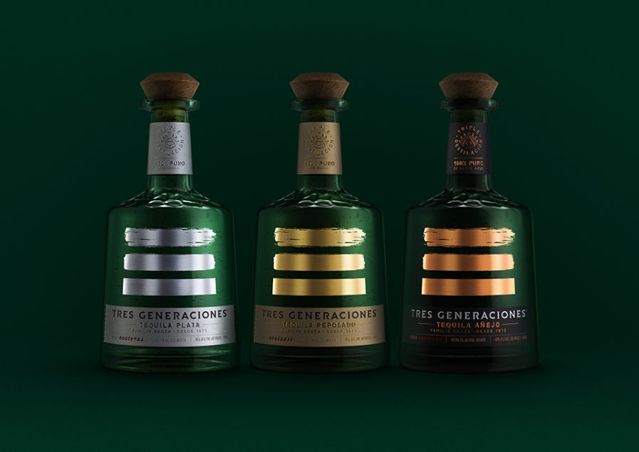
Founded in the 1990s and with headquarters in London, England, Turner Duckworth has always stood in defiance of the normal and the predictable, which is the backbone of the company’s guiding principle, “Love the Unmistakable”. Their work is simple, playful, and inherently social, tackling big brands like McDonald’s, Coca-Cola, and Little Caesar’s Pizza with their genius advertising, product design, and packaging. Their latest assignment was to breathe new life into the packaging and visual identity for Beam Suntory, an alcoholic beverage company, and their Tres Generaciones tequila, which Beam Suntory wanted to establish in the increasingly competitive tequila market.
Turner Duckworth designer Jared Britton created the final design, balancing the need for modernity with a 150-year family heritage. At the heart of the “Tres Generaciones packaging and VIS” (above) redesign is the three stripes icon and its transition from rough to smooth. Holding a dual meaning, it represents not only the journey of the three generations of Sauza leaders as they perfected their tequila over time but also the extra third distillation step in the production of Tres, which results in a more refined finish. Its prominent position and scale create drama, intrigue, and standout amongst the competition. The glass structure and brand color palette were inspired by the original green decanters first used to launch the brand, resulting in a bottle that disrupts the traditional tequila shelf.
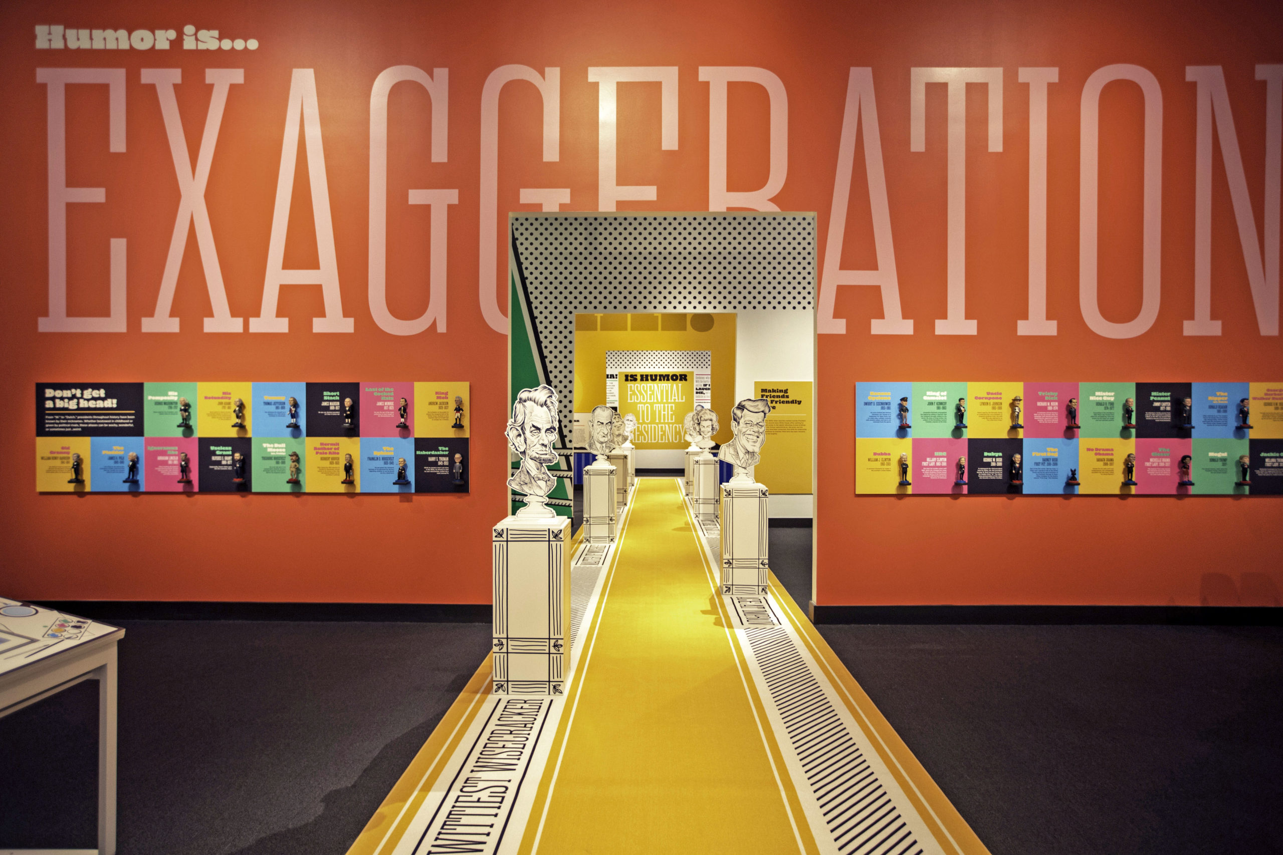
“President” and “humor” are two words you usually don’t associate together, especially if the former is short for “President of the United States.” That’s not the case with “Liberty & Laughter” (above), a humorous history exhibition. It was curated, built, and designed by Tracy Revis and Brenton Duhan of Howard+Revis Design, a design agency that creates content-driven design projects large and small, indoors and out, physical and digital. Composed of architects, 3D thinkers, graphic designers, researchers, writers, and project managers, this team can do it all, which was why the George W. Bush Presidential Center hired them for this exhibit. The main challenge, other than a difficult gallery configuration, was to strike the right tone for the humor — witty but not silly, biting but not mean, not too high brow, no low blows.
Liberty & Laughter features first family anecdotes, interactive guessing games, presidential debate “bloopers,” media clips of impersonators, amusing artifacts, political cartoons, custom caricatures, and more! The graphics are characterized by primary colors, super-scale type, dot and hatch patterns, and bold, black line work, giving the exhibit the feel of a walk-thru comic book. The repeating phrase, “Humor is…” is completed in a variety of ways, like how “Humor is…EXAGGERATION” introduces the notion of caricature and serves as the title for a wall of bobbleheads. All four galleries are tied together by the Pursuit of Happiness walkway, a carpeted runner with caricature pedestals “awarded” to the most humorous presidents and first ladies. Due to the pandemic, the exhibit was open to the public for less than a week. However, the project did receive a 2021 Award of Excellence from Communication Arts. Additionally, the client has plans to restage the exhibit in 2022.
Want to see more great designs that will tickle your funny bone? Check out other Design Annual 2022 entries now!