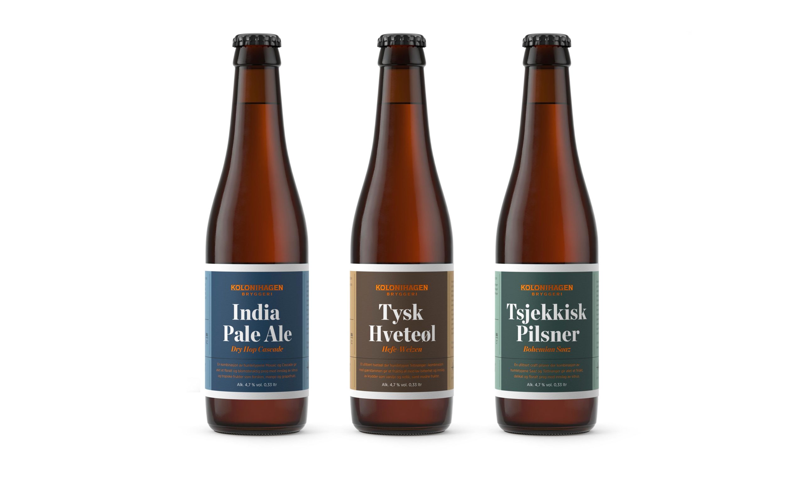
While beer and preserves are not typically paired together, their packaging is the topic of discussion for this week’s Packaging 10 entries.
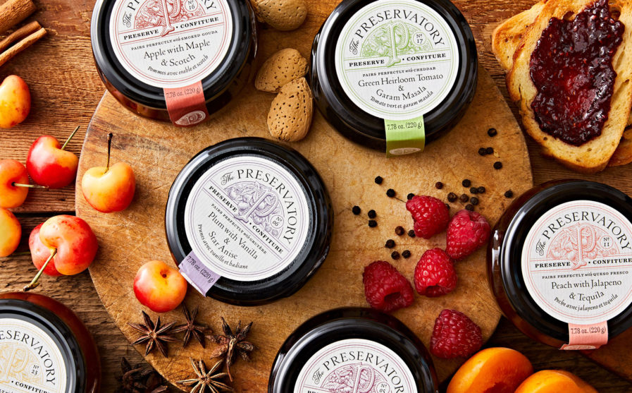
The first entry was designed by the Canadian agency Chad Roberts Design Ltd. and is titled “The Preservatory” (above) for their client of the same name; the designers of this packaging include Chad Roberts, Jacob Colosi, and Ian Lu-Fotheringham. The Preservatory creates its artisanal small-batch preserves with simple craftsmanship, using only the ripest ingredients that are mostly grown on their family farm. Consequently, the designers felt that The Preservatory required a brand identity and package design that reflected this. For their approach, they used carefully curated illustrations and elegantly refined typography to comprise a brand identity system that balances handcrafted farm quality with the sophisticated nature of The Preservatory’s gourmet products.
“We designed the packaging to be versatile so that it works across different seasonal offerings and sizes, covering over 35+ distinct flavors and preserve types,” said Roberts. “A family of identity lockups distinguishes between the seasons by incorporating varying fruit illustrations that feel lush, premium, and delicious. When making specially curated gift box sets for The Preservatory, we considered how to best display the selection of preserves that went with each box. A die-cut window exposes the labels on the vertical stack of 40g jars, clearly depicting the contents inside. The self-contained structure of the box is unconventional but functionally clever and sharp-looking to boot. We capitalized on a comprehensive identity system to apply the brand’s signature look to the packaging.” The packaging design was highly successful and versatile as it conveyed The Preservatory’s commitment to quality and craftsmanship.
