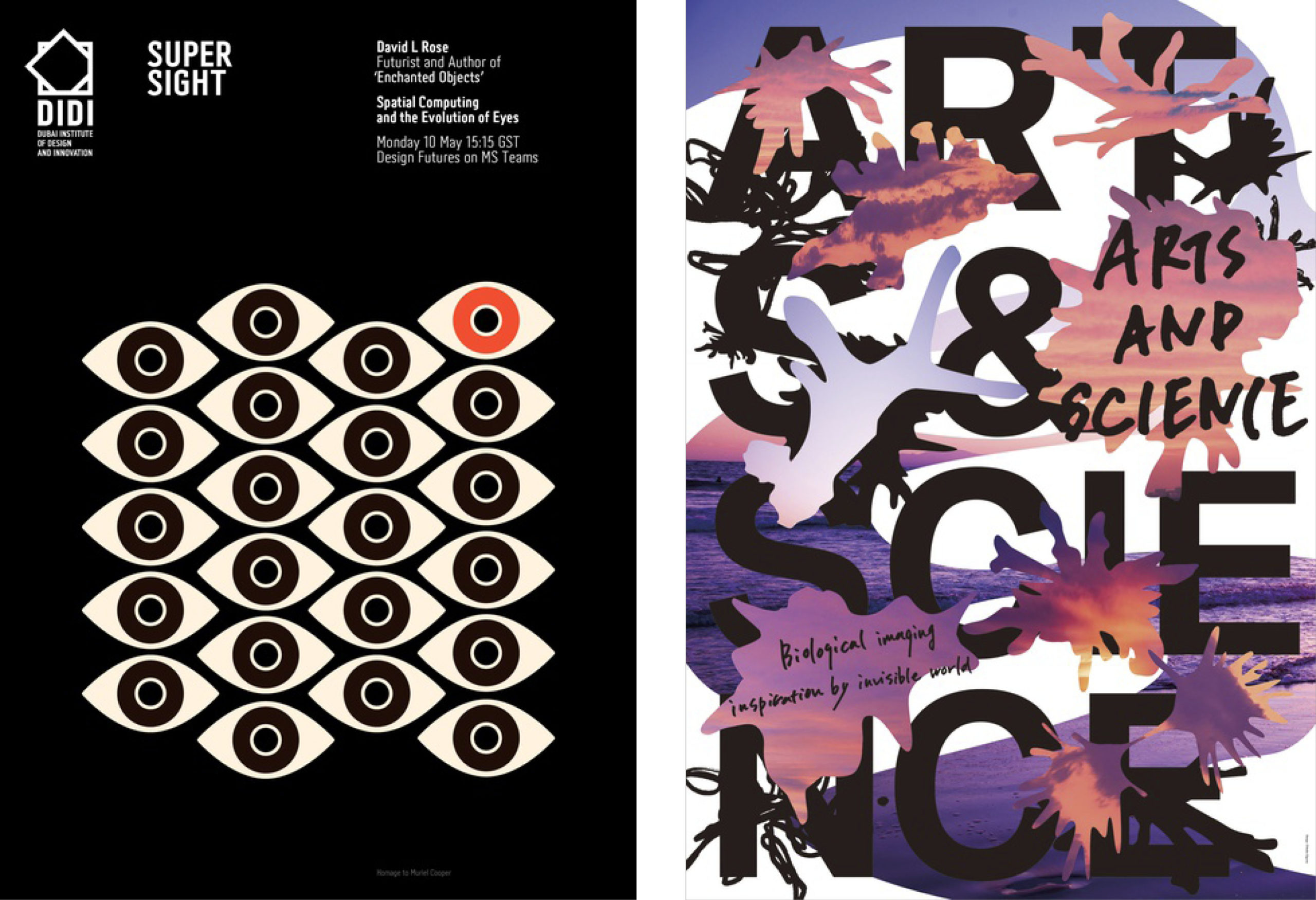
Is it that time of year already? Our Poster 2023 competition is open and accepting entries, so we decided to give you a very early sneak peek of what kind of entries are being submitted.
As a multi-disciplined graphic designer and artist, Michael Pantuso thrives at the intersection of creative thinking, artistic expression, and strategically inspired ideas. Throughout his career, he has managed his own design practice, partnered with the branding agency IDEAS360º, and held positions inside TBWA Worldhealth (formerly CAHG) and Discover Financial. Located in the Chicago area, he focuses on creating all the usual outputs of a branding agency — design identities, advertising, social media, print literature, websites, email, e-newsletters, photography, etc. for clients, collectors, and organizations that want to do more good and make a social impact. These include charities, not-for-profits, NGOs, educational and arts bodies, social enterprises, and for-profit businesses that want to do more good.
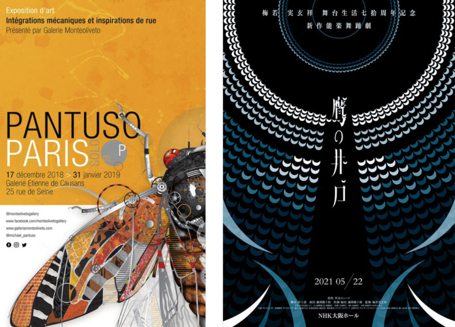
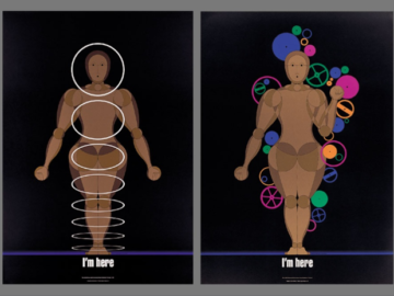
“Untitled” (above, left) is a set of promotional posters displayed in windows throughout the St. Germain Quarter, and was also made into a large banner that was displayed at the Galerie Etienne de Causans. They promote Pantuso’s “Mechanical Integration” artwork, where he explores nature and humanity through numerous fine art illustrations that integrate natural life forms with the inner workings of mechanical components. Part of that collection was recently celebrated as a solo exhibition that began in Paris, France, which was followed by a tour of Europe that concluded in early 2020. Much of that work now remains in galleries and private collections.
“New Noh At the Hawk’s Well” (above, right) by Youhei Ogawa is another promotional poster, this time for the play “At the Hawk’s Well”. The one-act show, written by the Irish poet William Butler Yeats, tells the story of Cuchulain, a mythological hero from Ulster in Ireland. Notably, it was the first English play to incorporate many of the characteristics of Japanese Noh, a type of dance-drama with minimalistic aesthetic principals concerning the costumes, scenery, and music. Japanese Noh performer Umewaka Minoru, a living national treasure, was going to remake and perform the play, and Ogawa decided the best of the best needed the best poster design.
At the heart of this story is a well with water that gives eternal life, with a sort of hawk fairy who protects the well as the main character. Ogawa uses both as for the motif for his work. Starting from the top center, half moons of shades of blue fan out like water ripples, growing larger the farther they are from the center. Blue curves decorate the botton, and white kanji fills the center. All together, the ripples of the water that spring from the well also double as the wings of the hawk, and when you look at the entire poster, the silhouette of the hawk emerges with the center kanji serving as a head. The fact that tickets are completely sold out for the show is a true evaluation of Ogawa’s poster and its influence.
