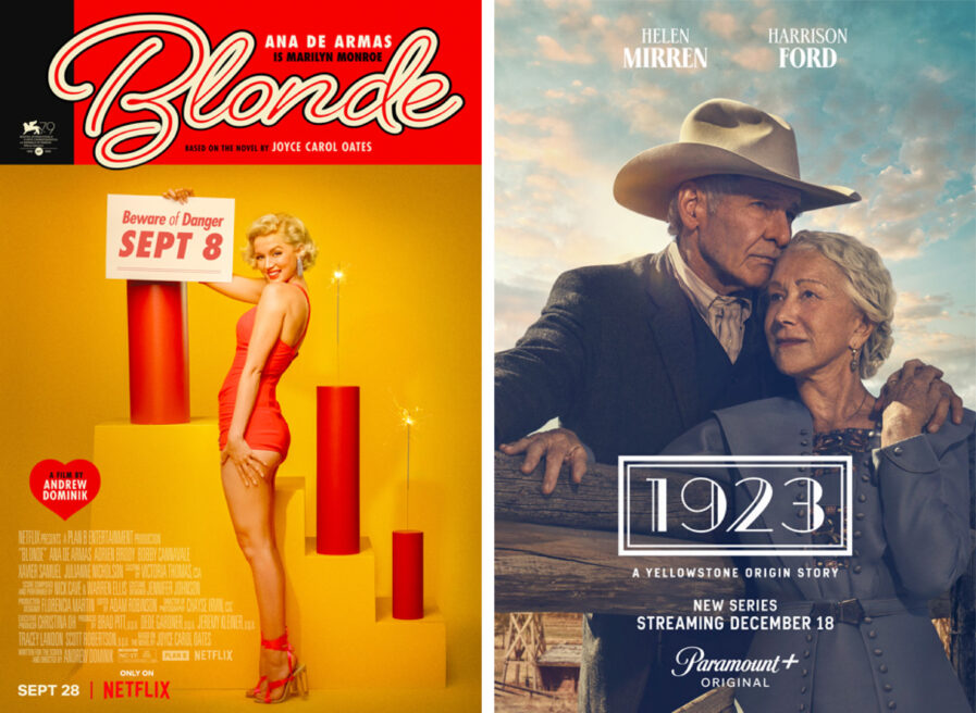
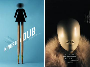
In the bustling world of cinema, where each frame aims to capture the viewer’s soul, the essence of the movie often starts with its poster. At the heart of it is Leroy & Rose, an agency renowned for crafting visual masterpieces. From the vintage glamour of “Blonde” (above, left) for the premiere at the Venice Film Festival to the evocative beauty of the “1923” (above, right) series art, their work transcends expectations, capturing the eye and the very spirit of cinematic key art.
By: Matthew Sampson and Jamie Klausner
Blonde – Venice Film Festival Poster
Given the high-profile nature of this title and its subject, we knew that any piece of artwork created for Blonde would need to be of the highest quality.
Based on Joyce Carol Oates’s biographical fiction novel of the same name, the film boldly reimagines the private life of Marilyn Monroe in a way that matches how she was perceived in the public eye: mesmerizing, font-and-center, drawing the viewer in. Even today, 61 years after her untimely passing, her image still commands a room. We were lucky to work with an abundance of gorgeous photography capturing Ana de Armas as the spitting image of the world’s most famous blonde bombshell.
Our agency had the privilege of designing the main key art for Blonde before working on this marketing piece, so right from the start, we had a deep knowledge of the assets and the filmmakers’ vision for the entire marketing campaign. Once the main key art was locked we were tasked with designing a special standalone piece of artwork to create buzz and enthusiasm for the highly anticipated debut release of Blonde at Venice Film Festival. During our client brief, we learned that we needed to create a unique poster that played off of vintage Italian magazine covers, particularly taking inspiration from the Follie! cover that was created for the film. This needed to be something that stood out against an array of exciting films on show at one of the world’s oldest and most prestigious film festivals, just as Marilyn Monroe did and continues to stand out against, well, everyone.
Our Blonde Venice Film Festival poster reaches beyond what one might expect of a typical domestic key art style, into a more artistic realm, portraying a smiling Marilyn posing on a photography set. The color palette helps to create a midcentury European magazine cover vibe—the striking red and yellow help the poster pop on display outdoors at the festival while the film’s Venice debut date sits cleverly on the card she holds.
We were extremely pleased with how this art turned out and was honored to have been the team that helped bring such a stunning piece of art to life.
1923
In shaping the first season key art for 1923, we knew that expectations would be high. Yellowstone had garnered a rabid fan base and was the most-watched cable series on television during its second season. Its follow-up origin series 1883 enjoyed an average of 2.5 million viewers each week, securing its legendary status.
With the art for 1923, we knew how imperative it was to maintain the key visual pillars of the previous two series—theatrical, dramatic, and evocative—to successfully weave each iteration of the saga together. However, we also had to apply new storytelling in the space. One of the thematic threads throughout the series is the Duttons always needing to defend their land. But 1923 is also a love story: love between Helen Mirren (Cara) and Harrison Ford (Jacob), familial love, and love for the land.
Subtlety would be key here. Nuances in posing, expression, and gestures were critical to imply that Cara and Jacob are a couple bound by love, loyalty, and the challenges of an evolving, dangerous world. Cara is no shrinking violet, and certainly no less brave than Jacob. Jacob’s pose and expression would be just as important as Cara’s. His body language would have to reflect the deep intimacy between them, but with his face implying that he is troubled, and that danger is approaching.
Thankfully we were gifted with the extraordinary talents of Helen Mirren and Harrison Ford. With a photo shoot approaching, we submitted sketch concepts to them and the filmmaking team. Talent and really the whole production team were instrumental to the success of the piece, with Helen and Harrison leaning into the concepts, giving us quality, believable assets coming out of the shoot.
From there it was a matter of applying the correct treatments and making the best use of the atmospheric environment to invoke a sense of environment to invoke a sense of scope, drama, and perhaps a bit of looming danger as well.
Leroy met Rose during one of the hottest summers ever recorded in the Peach State. It was the year 2012. After a few exhausting cotillons and debutante balls, they fell in love and moved across the country to the City of Angels. It was there in a Pacific Palisades garage that “Leroy and Rose Inc.” was born. Since then, the family has grown to 50+ valiant and loyal creative stars of all kinds, spreading kindness and love all over the cosmos. Today, they’re known to be “the Best Agency in the Universe!”
Social: Instagram, LinkedIn


