João Machado Design, under the skilled direction of acclaimed Portuguese designer João Machado, earned recognition in the Poster 2024 Awards for projects “Decarbonize” (above, left) and “CINANIMA 2023” (above, right). These projects highlight the agency’s expertise in blending environmental and cultural themes through print for clients Unknowndesign and Cooperativa Nascente. These award-winning posters celebrate João’s ability to convey significant messages through his distinct use of color and design, demonstrating his commitment to both aesthetic appeal and meaningful content.
By: António Augusto Joel, Art Critic
João Machado’s Graphis award-winning posters “Decarbonize” and “CINANIMA 23” underline two important areas of interest in this acclaimed Portuguese designer’s work. Spanning the last five decades, his design encompasses several subjects, with culture and the environment as two main concerns. As early as 1977, João accepted a commission to make official posters for CINANIMA, an international animated film festival, in Espinho. By the end of the 1990s, he also accepted a commission from the city council of Almada regarding the responsible use and management of water resources, leading the way to João creating a wide range of posters—some commissioned, some others of his own initiative—dealing with multiple environmental issues: clean energy, decarbonization, nuclear energy awareness, sustainable and renewable water sources, and wildlife preservation.
Decarbonize
By conceiving this non-commissioned poster, João was able to freely pursue one of his most cherished design principles, which focuses on image and color over text; a minimum amount of words is the basis of his conceptual approach for obtaining a striking visual impact while conveying an effective message. Such a minimalist approach highlights the full impact of a single word or short sentence, which will arise from the plain color background or the colorful forms flowing around.
In this particular example, biomorphic shapes flowering out of the industrial complex create a contrast between their rounded, colorful look and the menacing darkness of the jagged smokestacks. On the other hand, different dark spots, close to the stem of each flower-like shape, evolve into a lighter and more colorful sfumato, concealing diversely colored rounded seeds and suggesting an innuendo with the less natural and menacing vertical and serrated lines, potentially generating hazardous industrial smoke.
Thus, we are left with an obvious contrast between curved and straight lines, and nature and industry. This insinuates a prevalence of the natural and simple, while the confluence of a somewhat watery blue stream and some shades of vegetal-like greens prepares the ground for a more complex multicolored biomorphic universe, suggesting that from less, we may get more.
CINANIMA 23
This poster’s conception faced several key challenges, namely maintaining a consistent visual identity for the festival and expressing dynamics of movement and color in a harmonious set, allowing enough space for an institutional text while still granting some surprise when approaching the subject after almost 50 years of creating images for this event.
A consistent identity relied solely on reproducing CINANIMA’s 1977 original lettering, which João has been using since. Harmony was obtained by creating 12 balanced nuclear sections, hence the use of two black circles superimposed on four blue circles together with six horizontal bands, resulting in these superimposed different layers having a 3D perception.
A sense of surprise arises from the fact that each one of these layers evokes different technology in movie production and image reproduction, from classical film strips to DVD and digital support. Furthermore, a subtle nod to Metropolis by Fritz Lang and Yellow Submarine by George Dunning arises from the six horizontal bands, either by evoking the iconic image of Brigitte Helm’s ethereal encirclement or the encirclement of the Blue Meanies by the red and yellow inner surfaces.
A final touch emerges from the close-up of what resembles to be a head, whose black and yellow discs seem to prepare projections toward the viewer.
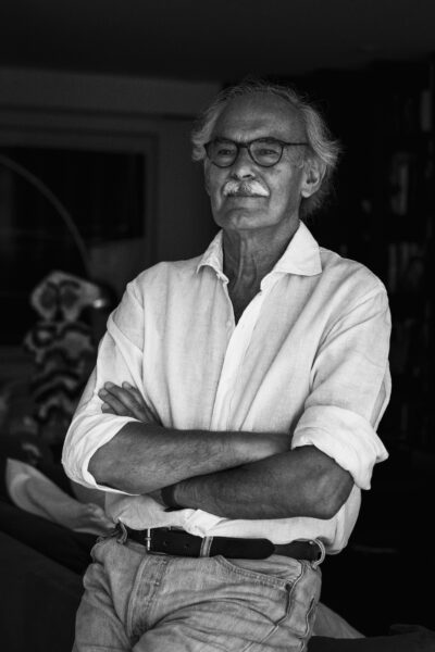
Born in Coimbra, João Machado studied sculpture at the Porto School of Fine Arts, but it is in graphic design that he is uniquely and internationally recognized. He was a teacher at ESBAP (1976-1981) but soon decided to dedicate himself exclusively to graphic design and opened his own studio in 1981. Since 1983, he has participated in numerous group and solo exhibitions that have brought him several national and international awards, including the Icograda Excellence Award, the title of ‘Design Master’ from the renowned American publisher Graphis, and his appointment as a member of AGI (Alliance Graphique Internationale). Creator of a vast body of work, his passion for posters is notorious. It is undoubtedly his piece of choice. Color and shape are his hallmarks. His posters are characterized by bright colors, a playful arrangement of well-defined geometric elements, and bold contrasts between flat surfaces and textured patterns. He also does editorial design in the areas of illustration and philately, always marked by a persistently built identity.