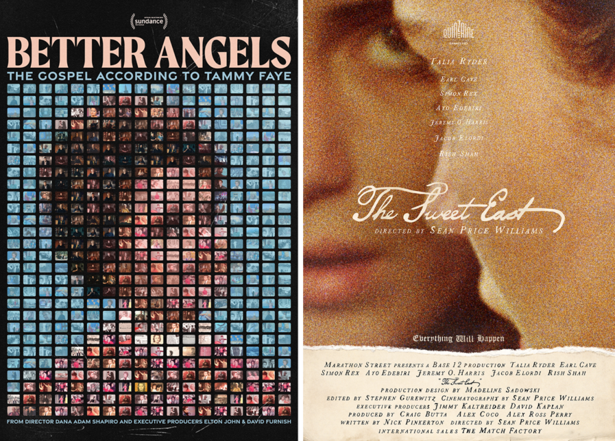
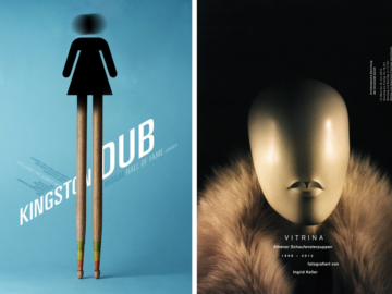
French art director and poster designer Célie Cadieux carves a distinctive path, marrying traditional artistry with contemporary flair when it comes to entertainment advertising. Her award-winning work for “Better Angels: The Gospel According to Tammy Faye” (above, left) and “The Sweet East” (above, right) elevates the art of storytelling into iconic visuals that linger in the cultural consciousness. With a portfolio spanning collaborations with Vice Studios, The Match Factory, and international film festivals, Célie’s designs transcend the ordinary, offering viewers an intricate narrative invitation—bold from afar yet profoundly nuanced up close.
By: Célie Cadieux, Freelance Art Director
Better Angels: The Gospel According to Tammy Faye
Released by Vice Studios, Better Angels: The Gospel According to Tammy Faye is a four-part documentary series directed by Dana Adam Shapiro and produced by Elton John and David Furnish. The episodes reflect on Tammy Faye Messner’s life as the “First Lady of the Electric Church,” sharing perspectives about her from her family, friends, and even her detractors.
Vice Studios needed some key art for the series’ world premiere during the 2024 Sundance Film Festival. I had a fantastic time exchanging ideas with the director and Vice Studios’ head of production, Guillermo Garcia. The idea was to remain faithful to the unconventional story of Tammy Faye Messner while setting this series apart from previous films about her and breaking away from clichés.
TV imagery was a major inspiration in shaping the concept, as Tammy was known mainly through the small screen and spent extensive time on set. Both the series and her persona demonstrate a beautiful complexity that I wanted to acknowledge. To do so, I created a portrait of her with more than 375 shots from the series, all placed by hand. I carefully chose interviews from relatives, old personal photos, live show images, and new clips for their aesthetic appeal and significance. This design is a mise en abyme— an image within itself, an icon that captures attention from afar yet reveals intricate details and more profound meaning upon closer view.
I take particular care when portraying women to reveal the depth of their individuality beyond societal expectations. The portrait is representative of Tammy’s multifaceted personality and the way she gathered people around her, but also of how she was put in a box. While it may seem like we see the whole picture at a distance, life is often more complex, and what appears to be reality could just as well be a TV screen.
The Sweet East
The key art for The Sweet East was designed for its world premiere at the 2023 Cannes Film Festival Directors’ Fortnight. The film, directed by Sean Price Williams, is a modern day retelling of Alice in Wonderland, exploring the social and political disarray of the United States as seen through the disjointed journey of Lilian (Talia Ryder).
Collaborating closely with The Match Factory marketing team and the producers, we discussed a visual reminiscent of the film’s vintage inspirations: fairy tales, picaresque novels, and the Declaration of Independence while prominently showcasing the main character.
In the poster, Lilian is brought to the forefront using a mirror motif as a metaphor for Through the Looking-Glass, which gives depth and intrigue to the composition. I purposefully embraced the film medium and sublimed its natural grain, crafting an image from speckles of color reflecting the dreamy and disjointed storytelling.
The talented Lenny Vigden designed the splendid handwritten title before I joined the team contribution. From it, I crafted the billing block—the credits traditionally found at the bottom of film posters, listing critical contributors to the production—then created a custom paper texture derived from personal vintage archives to add to the symbolism. This was a unique opportunity to make the billing block an integral part of the artwork, enhancing its impact and meaning.
Overall, the poster is a sort of collage of different vintage aesthetics, blending the end of the 18th century with 1970s New Hollywood. The traditional techniques used make it evidently manmade, reminding the viewer of the craftsmanship of the narrative.
This key art premiered with the film in May 2023 and accompanied it to screenings at the Karlovy Vary and Melbourne International Film Festivals. After it was set to be released in the US by Utopia, I designed the American version, which was featured at the New York Film Festival in October 2023. The film then opened in US theaters in December, followed by releases across several European countries in Spring 2024, running for over 200 days.
Conclusion
Working alongside bold filmmakers and collaborators who are passionate about exploring thought-provoking, impactful design is not just rewarding; it’s essential to craft meaningful cultural moments. Through attention to each story’s unique themes and thoughtful design, I designed both posters to offer a visual entry point from afar yet invite a deeper connection up close that draws viewers in. That way, they can resonate with the audience on the way into and after leaving the movie theater. Contributing to bringing inspiring stories to audiences worldwide is a responsibility I’m excited to carry forward, one image at a time.
Célie Cadieux is a French entertainment advertising art director and movie poster designer championing bold perspectives. She collaborates with visionary filmmakers, distributors, and advertising agencies, highlighting the uniqueness of each production she works with. Committed to turning narratives into captivating original visuals, she’s implicated from concept to craft, using various traditional and digital techniques.
Célie is a recurrent lecturer at Sciences Po Paris and the Estienne Graduate School of Arts and Graphic Industries. Her work has been recognized by the Clio Entertainment Awards, the Golden Trailer Awards, the Communication Arts Design Awards, the 3×3 International Illustration Awards, the World Illustration Awards, and the Graphis Awards, and is part of the collections of the Margaret Herrick Library of the Academy of Motion Picture Arts & Sciences as well as the Staatliche Museen zu Berlin Kulturforum.
