
Capturing the simple essence of everyday objects can sometimes transcend into a profound artistic exploration, and classic treats can transform into iconic art pieces, as shown in this playful and artful project titled “Doughnuts.” Craig Cutler, an accomplished photographer, and Karen Evans, a food stylist, collaborated on a series of photographs that garnered a Platinum in the 2024 Photography Awards. The entry, presented under the banner of Craig Cutler Studio, features a whimsical and pop-art-inspired collection reminiscent of Andy Warhol’s iconic style. Each doughnut emphasizes bold contrasts and shadows, transforming these everyday bakery goods into striking pieces of visual candy. This innovative twist on food photography proves that even seemingly ordinary subjects can become extraordinary through creative vision and collaboration.
By: Craig Cutler, Photographer, & Karen Evans, Food Stylist
Craig
I started my career using a 4×5 and 8×10 view camera, which eventually evolved into the digital world that we all know today—a world where film became almost obsolete. With everyone using their phones to take pictures of any and everything, I thought it would be interesting to treat something as simple as a doughnut as a fine art study. I wanted this project to be about color, so I used silk-screened Color Aid paper behind each doughnut because of its vibrant color. I also used Fujichrome Provia color transparency film because it captured vivid color. Finally, I had each transparency drum scanned, which gave me the result I was looking for.


Before the shoot, I sent my food stylist, Karen Evans, my sketches so she could start thinking about the colors and textures. Sketching is a big part of my process, and it allows me to envision the shoot before it happens. I consider Karen more of a collaborator because her vision adds to the idea. It is important to surround yourself with people who bring ideas to the table.
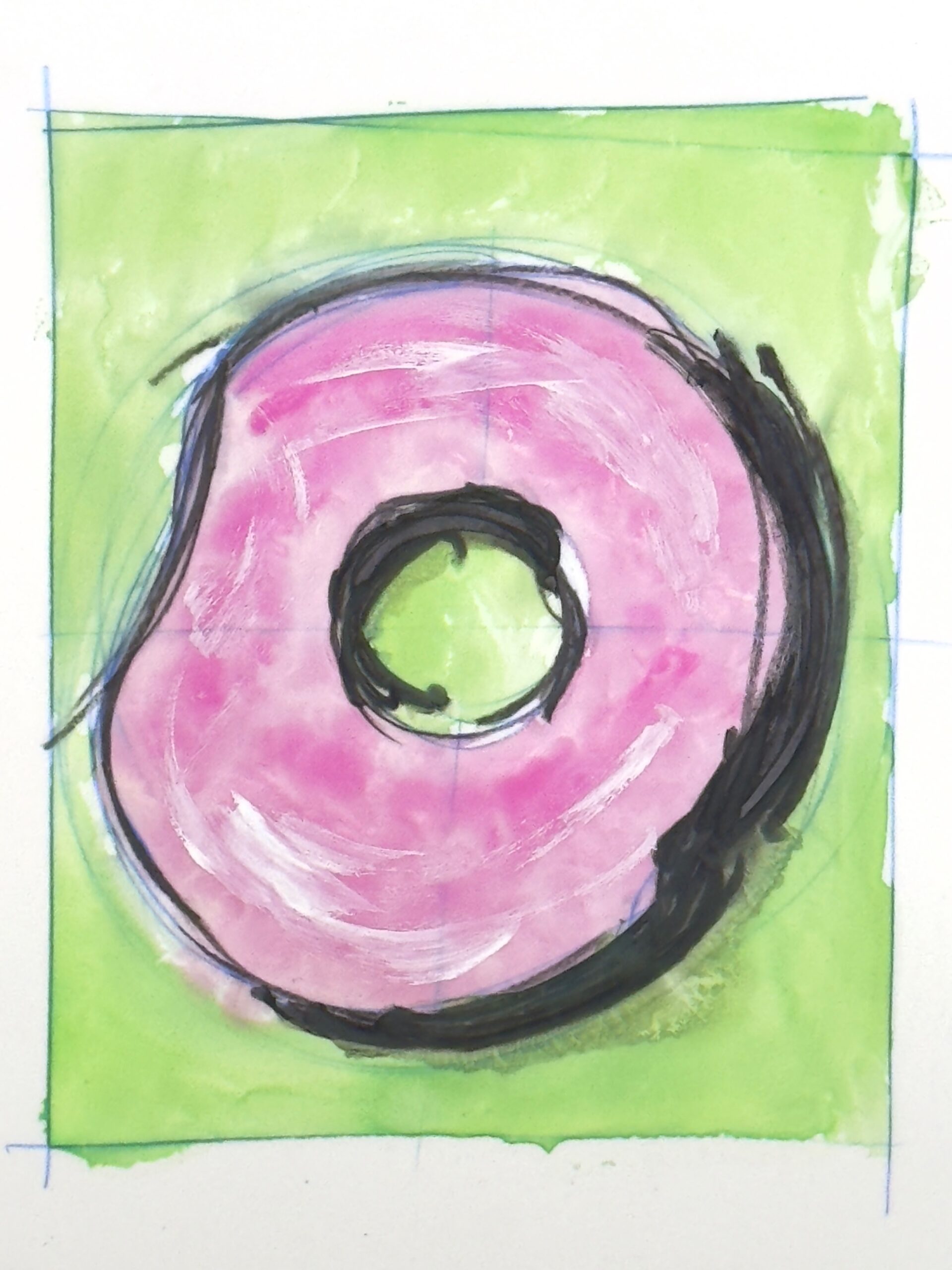
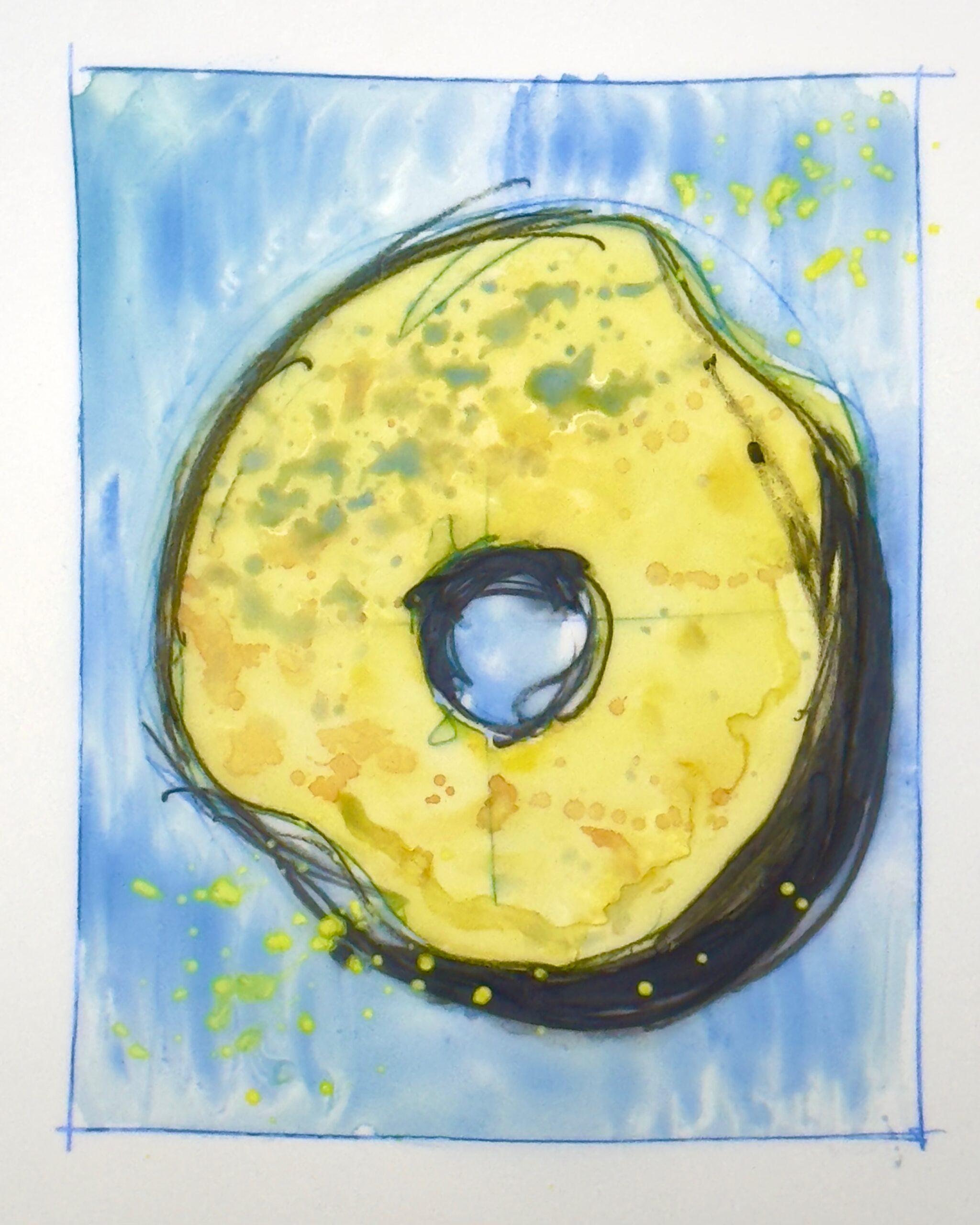
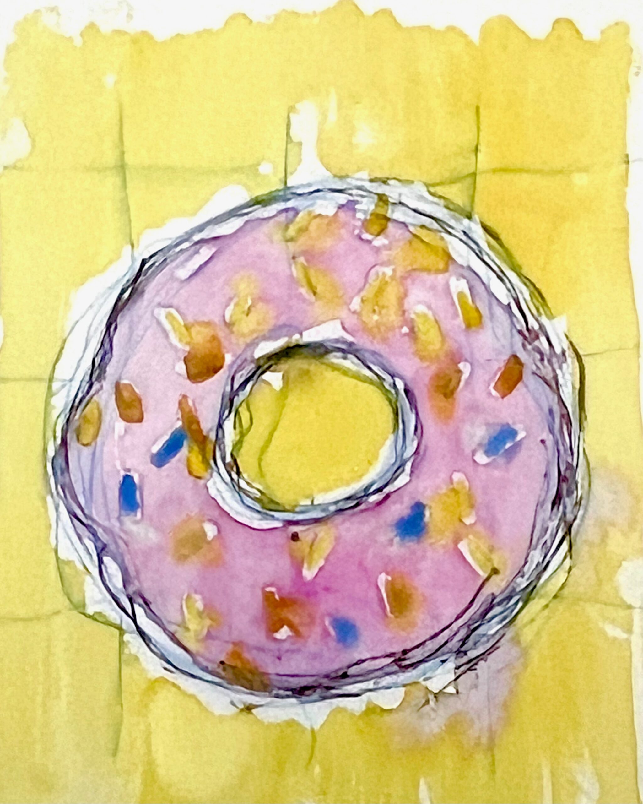
Once the process was decided, I created a set that allowed us to work quickly. I set the view camera straight down and set up only one HMI fresnel as my direct light source. I wanted a light with a lot of contrast and a crisp, dark shadow. We selected background colors to compliment the doughnut on the spot. We only had a small window of time to photograph, and we didn’t have a digital reference or a monitor to review anything.
I created a series of large prints that complement each other through a range of colors. They received multiple awards this year.
As simple as these images look, they are anything but that. The process was very intricate and well-planned out. Using a view camera and 4×5 sheet film is anything but easy, but…
Karen
Craig and I discussed the doughnut idea before I left for California, so I packed my arsenal of sprinkles and luster dust to take with me on the plane. I also grabbed some of my child’s craft paint leftover from making fingerprint tea towels for her grandmothers the previous Christmas.
There wasn’t a kitchen available for the shoot, so I ordered a dozen unglazed donuts to choose from. There was a great donut place a few blocks from the studio.
We were working on the donut shoot after hours, immediately following a different shoot, so it was a quick dash to get cleaned up and reset for glaze making. I had mixed a basic glaze in my hotel bathroom the night before and now set out to get the colors right. Over a dozen paper cups with different glaze colors and consistencies littered the work table. I mixed each one by hand with a small, half-smashed travel whisk I carry. I added color and more powdered sugar to thicken them as needed. Some colors did not turn out well and were pushed to the back, frosting gloops dripping down onto the table. Into some I mixed some luster dust or edible glitter to give them a sparkle.
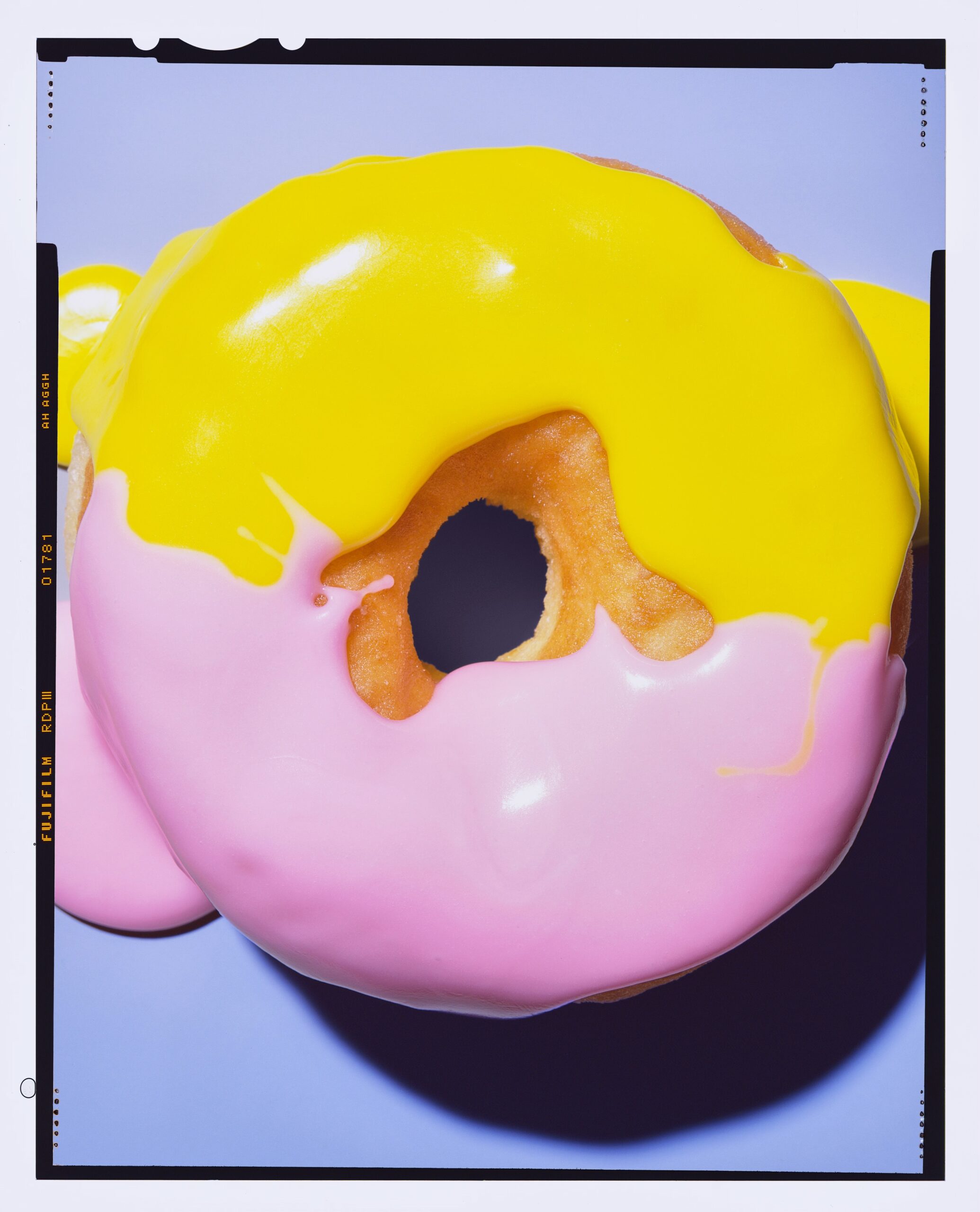
For our surface, we used very small sample sheets of Color-Aid. I’d get a color that I liked, and then we’d hold it up to the papers and find one that complemented it. Once the donuts were on the paper, they couldn’t be moved because of the growing grease ring each would leave.

By the end of the shoot, the table was a disaster and sprinkles would crunch under every step I took, but all the donuts had turned out amazing.
Craig Cutler‘s meticulous combination of craft and style brings an element of art to his work as a director and photographer. Conceptual thinking lays the foundation for both his print and film approach. Each of his projects, editorial or commercial ads, begins with concepts that take shape initially as sketches and evolve through a series of revisions and additions until a final direction is honed. Craig’s work is further differentiated by his focus on lighting. He strips each piece of its setting and uses lighting to evoke the message integral to his concept.
A frequent recipient of awards, Craig blends his experience with contemporary vision to create timeless art. He frequently collaborates on projects with his creative agency, CutlerBremner. An avid swimmer, Craig travels around the country with his wife and their dog.
Clients include Samuel Adams, National Geographic magazine, American Express, IBM, The New York Times magazine, Lululemon, Glossier, Neutrogena, Barron’s, and The Atlantic.
Social: Instagram: (Studio, Personal), Facebook, X, LinkedIn
Karen Evans is a food stylist based in Salt Lake City, UT. Before moving to Salt Lake City, she lived in New York City for 12 years. She often travels to NYC, LA, and SF to work. In addition to food styling, she loves making stop-motion and time-lapse films.

Social: Instagram, LinkedIn
To see more Photography 2024 competition winners, click here.


