Perplexing Patterns: Poster Annual 2022 Winners & Poster Annual 2023 Entries

These posters are inspiring us all with their distinct artistry and unique patterns! Created for a variety of causes, these designs have been wildly successful.

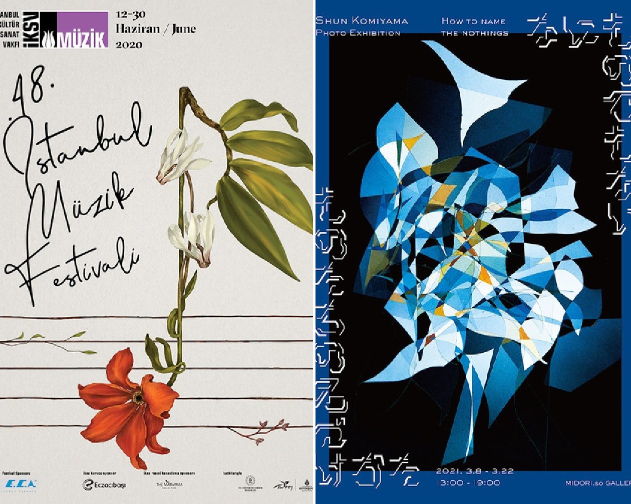
Firstly, from our Poster 2022 competition, we have the gold-winning “48th Istanbul Music Festival” (above, left). Designed by Geray Gencer for the IKSV Istanbul Foundation for Culture and Arts, this poster was inspired by Beethoven’s work and life; after all, a key aspect of the festival was “The Enlightened World of Beethoven”. Known for having a love of nature, humanity, and the novel and libertarian ideals of the Enlightenment, Beethoven was certainly a creative force. These ideals were relied upon for the poster design, which features flowers combined with different musical concepts to integrate the springtime, when the festival took place, with the musican’s love of nature. In this way, Beethoven, his music, and a love for nature all converge within this wonderful design.

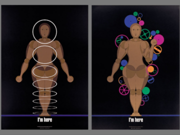
From our Poster 2023 competition, “How to Name the Nothings” (above, right) was designed by Chihiro Otsuki of Diotop in the service of Shun Komiyama for an exhibition that featured photographs that had been overdeveloped to the point that the original subject could no longer be identified. Running with this idea, the look of this poster focused on the human act of “seeing” and its basis in the recognition of an object, with the designer using typography to create the effect. Similar to the images, the typography can only be recognized fully if all the letters are lined up in a row. This design resulted in quite a bit of media coverage and gathered a big crowd, which made it a great success!
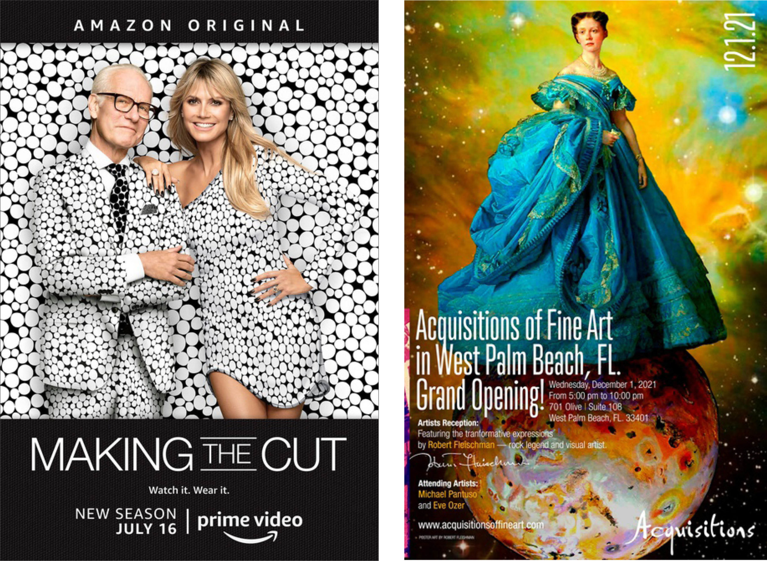
Taking a turn from an exhibition design to one for a television show premiere, “Making the Cut Season 2” (above, left) was designed by Masha Kupets Navarre of Plastic Palmtrees, Inc. for Amazon Prime Video. The designer’s goal was for the ad to pop on platform and outdoor executions so in order to create an execution that felt playful and premium at the same time, Navarre chose a playful black and white fabric pattern to create the “chameleon concept”; with Heidi and Tim’s camouflaging with it, it makes a playful and elevated feel for this campaign. The tagline “Watch it. Wear it.” was employed to play up the shopability of the show, as each look featured are available for purchase on Amazon after episodes have aired. In the end, the artwork chosen for this “from screen to closet” idea stood out well on the Amazon platform as well as on its outdoor placements; the work was released as print, taglines, and digital/social banners. 

Finally, “Exhibition Poster” (above, right) was designed by Michael Pantuso for Acquisitions of Fine Art to announce the grand opening of the gallery’s branch in Palm Beach, Florida. To celebrate the event, Acquisitions created a special exhibition, featuring the transformative expressions of Robert Fleischman, a rock legend and visual artist. Alongside the work of Fleischman was the artistry of renowned creators Eve Ozer and Michael Pantuso himself, whose work you have the pleasure of viewing with this masterful design.

If you’ve enjoyed these poster designs, or would like the chance to submit your own, come check us out at graphis.com. To see all the amazing posters we feature, take a look at our Posters Awards Annual 2022!

Author: Graphis