Despite the connotations that come to mind when you think of posters, they are not as simple as they seem. It takes smart choices to fill up the surface in a way that is artistic while also making a point, whether that’s promoting something or bringing attention to an issue. Thankfully, design students past and present seem aware of this, as shown by their lovely work!
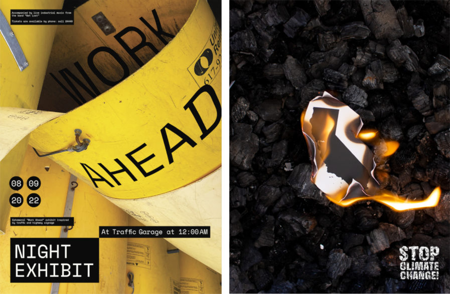
How does type interact with images? That’s what Adèle Roncey, a French artist and designer who recently received her BFA from Rhode Island School of Design, explored with her Platinum-winning, four-part poster series “Night Exhibit, Work Ahead” (above, left) from our 2022 competition. Roncey started her project by choosing something that interested her, and she settled on the textures and details of a parking lot. Using her camera’s viewfinder, she isolated interesting forms—cars, road signage, and construction objects— and paid close attention to composition and framing when shooting. In post-production, the photographs were edited to construct abstracted, industrial-like images. They were overlayed with type that was fused, separated, and fragmented by the pictures as Roncey tested various ways to combine form and meaning within a poster space. The final series promotes a fictitious exhibit and music event, perfectly balancing text with images to channel a sense of dynamic, industrial grunge.
Climate change is a serious issue affecting the world, and its effects continue to make themselves more noticeable and more permanent. Erwin Barrientos, a graphic design student at California State University, Fullerton, wanted to do his part to bring attention to this critical issue, and in doing so designed “Stop Climate Change” (above, right), another Platinum-winning poster from 2022. It was an easy yet fun process to create the piece. First, Barrientos printed a picture of the state of California on white cardstock. He then placed the cardstock over wood charcoal being used as the background and set the cardstock on fire at multiple edges. Multiple photographs were taken, and the best of the best was edited and given the phrase “STOP CLIMATE CHANGE!” in Photoshop for editing. Thanks to the angle of the image, it looks as if the poster has a California-shaped hole in it, basically implying that the state is overheating and it’s going to keep getting hotter and hotter if nothing is done.
