The color red can convey a lot of different messages depending on the context, but no matter what, it’s always a surefire choice for catching people’s attention. This week, both past gold-winning poster entries and new entries from our Poster 2024 competition took this to heart, using red to turn some heads.
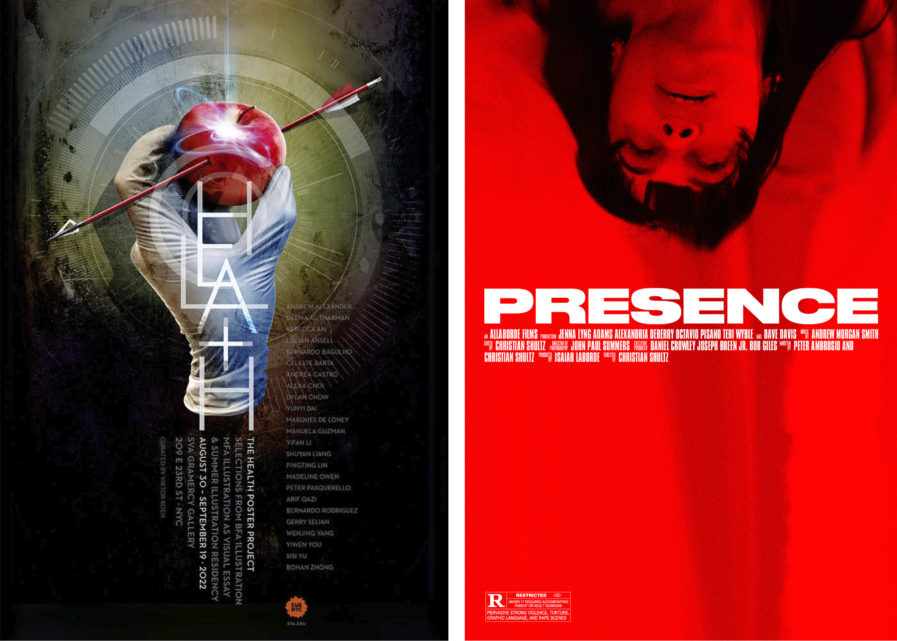
“The Health Poster Project” (above, left) is a new entry from our 2024 Poster Annual competition and serves as a perfect example of red’s eye-catching qualities. Created by designer Viktor Koen from design firm Attic Child Press, Inc., this poster was created to promote the Health Poster Project exhibition, a selection of 24 posters from the BFA Illustration program, the MFA Illustration as Visual Essay program, and the 2022 Summer Illustration Residency at the School of Visual Arts’ Gramercy Gallery. The poster is a laconic yet engaging visual, punctuating the dualities of medicine with the use of an apple that recalls the classic “an apple a day” saying. Held in a latex-gloved hand, the piece of fruit is presented as either a remedy or poison, and its bright red coloration immediately draws the viewer’s attention against the dull greens, blues, and browns of the background.
Our next poster, “Presence Film Poster” (above, right), is a gold winner from our 2023 Poster Annual. Commissioned by movie director Christian Schultz and created by designer Jeff Hunt, this poster was designed to promote the 2022 horror film Presence while telegraphing the movie’s mood and tone. Hunt wanted to evoke the feeling of dread that persists throughout the film, which tells the story of two young business partners who are invited to a week-long yachting voyage with a potential investor. The trip quickly turns nightmarish when it’s revealed that one business partner, Jennifer, may have unknowingly brought something evil on board. The final manipulated image is frightening, consisting of bright red stills from the film combined with a stark, unfussy typographic approach that creates a bold, impactful singular poster that maintains an air of ambiguity regarding the plot, yet makes the viewer intrigued and uneasy regarding the film’s possible outcome.


